Advanced. Pie Chart Rose, Nested Pies, Sunburst and Treemap
Footprint Analytics offers users four styles of pie charts, allowing users to more flexibly and creatively customize and present their data as needed. The Rose Chart, Nested Pie, Sunburst Chart and Treemap are all somewhat related to their pie chart, the difference being that the Rose Chart and Nested Pie are used for two dimensional data, and Sunburst and Treemap are used for three dimensional data.
The Rose Chart shows a more intense style for showing data percentage in one dimension. Each directional axis shows values increasing outwards
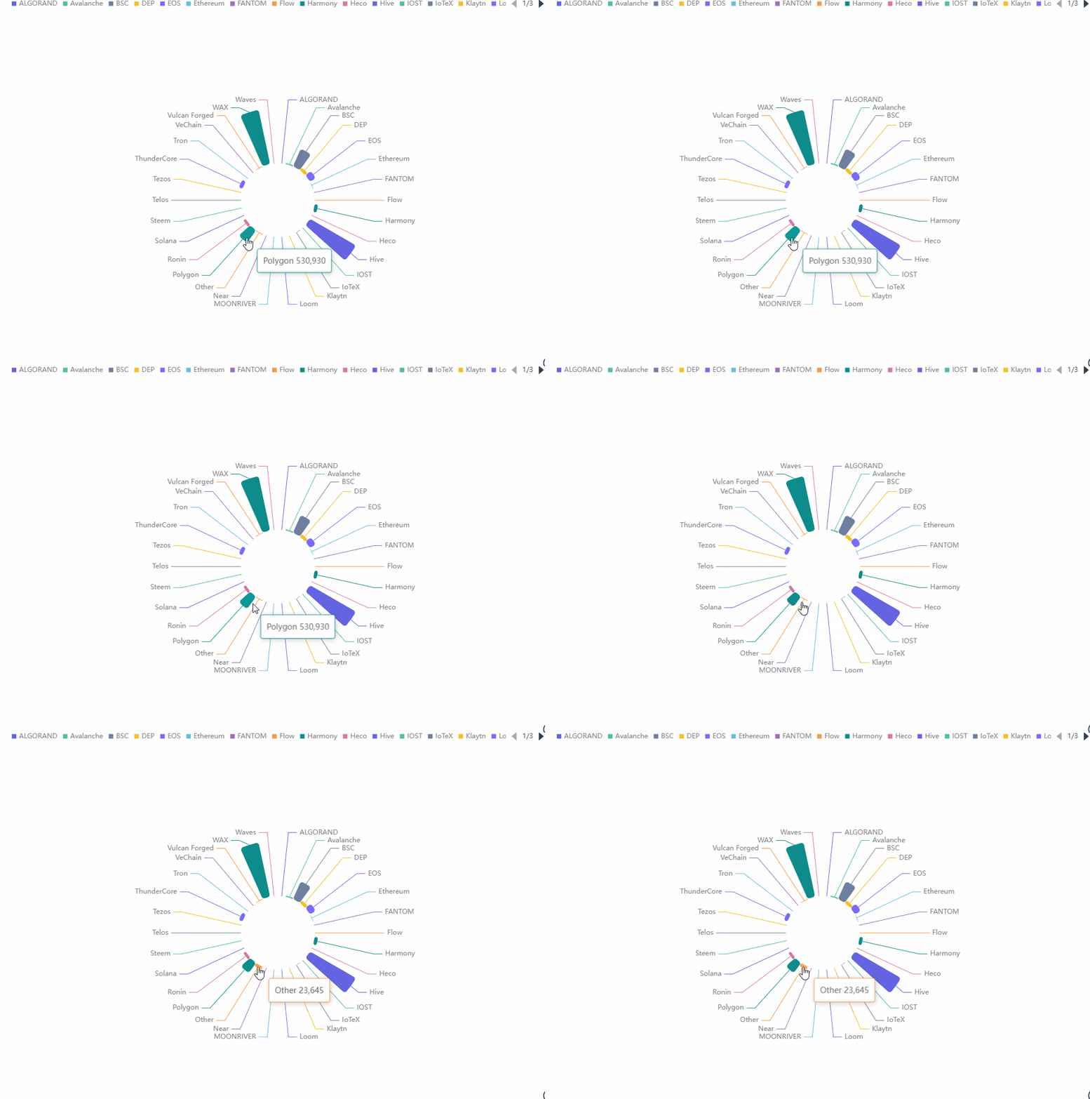
Let’s go through the process of making our own Rose Chart using the Sum of Users from Different Chains.
Use case: Rose - Sum of users of different chains****
Step 1: Click on Create, then click on New Chart.
Step 2: Click on GameFi from the list on the left of the screen, then select the data gamefi_protocol_daily_stats.
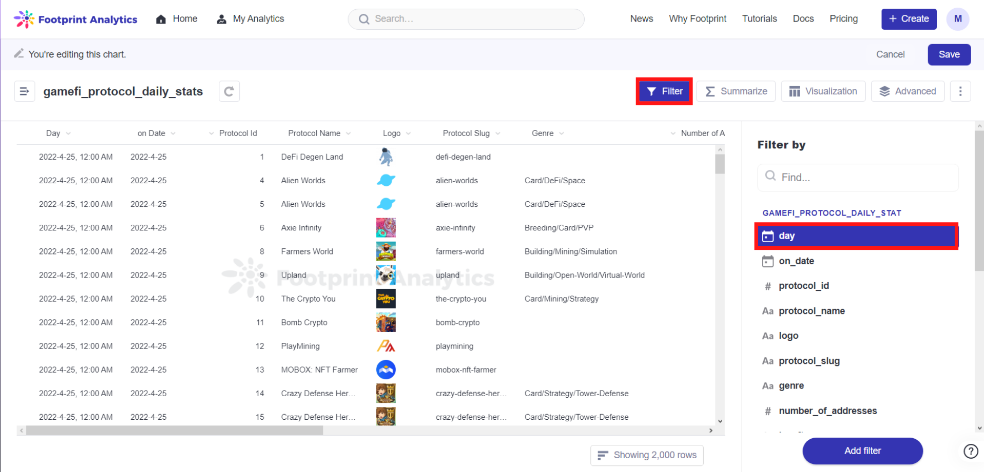
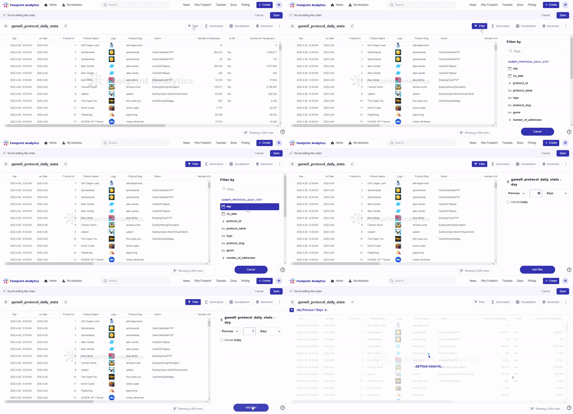
Step 3: Click Filter. In this case, we will be focusing on a sum of users from different gamefi chains for the previous 7 days. So, click day and set the filter to Previous 7 Days. Click Add filter.
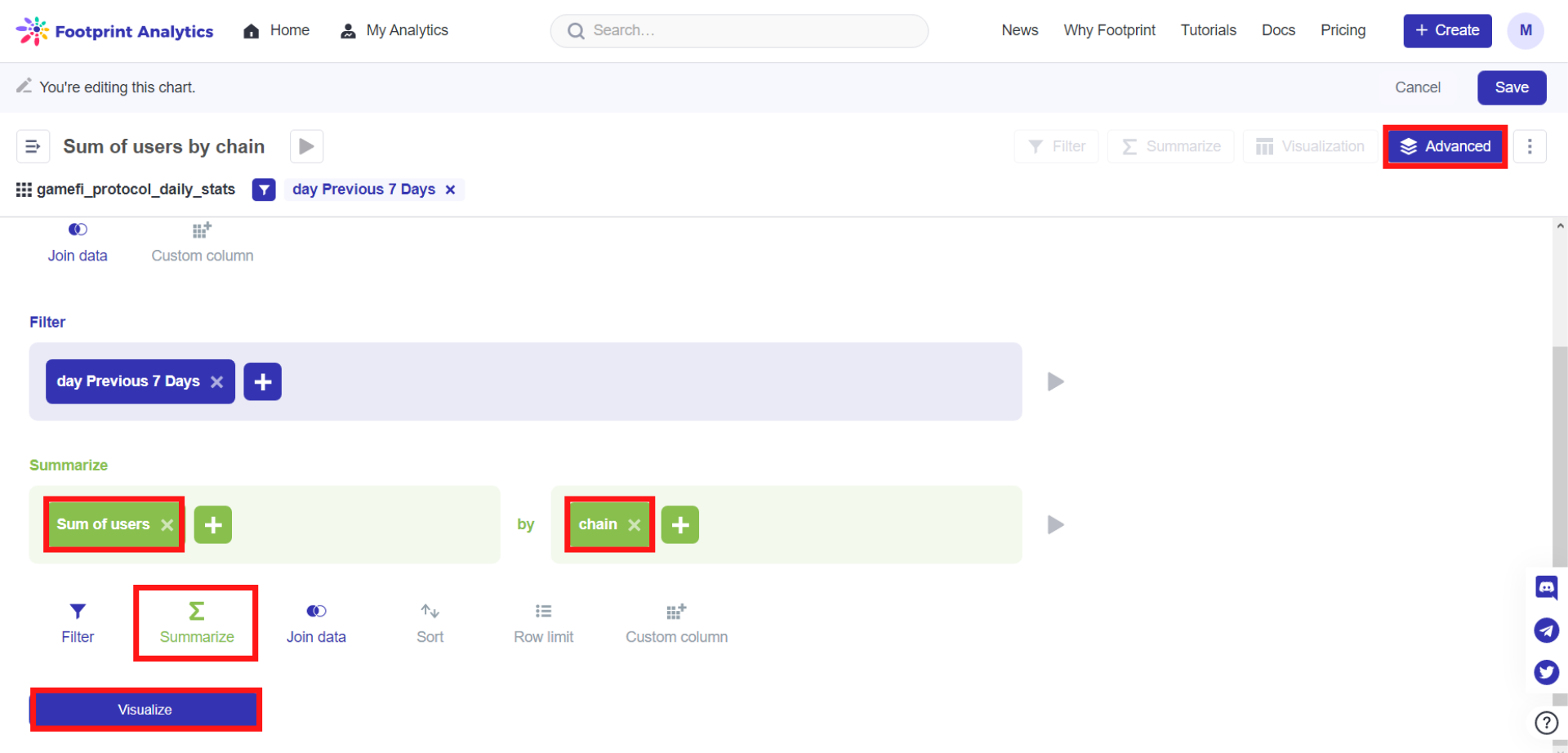
Step 4: Click Advanced on the top right corner of the screen. **** Click the Summarize button Click on Pick the metric you want to see and set it to Sum of users. Click on Pick a column to group by and set it to chain.
Step 5: Click Visualize, then choose Rose. Then, set the data as required.
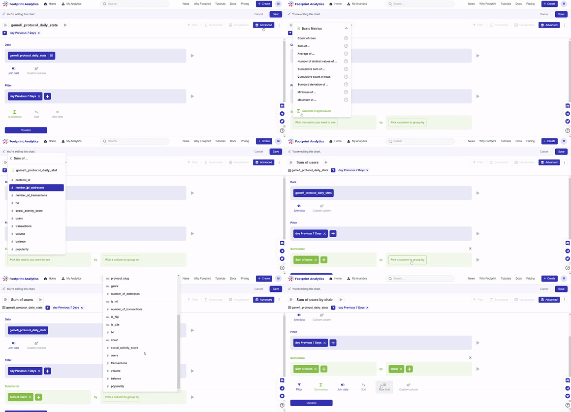
In our case, we will be leaving the Name as default and changing the Numerical Value from chain to sum of users using the downward arrow icon, then click Done.
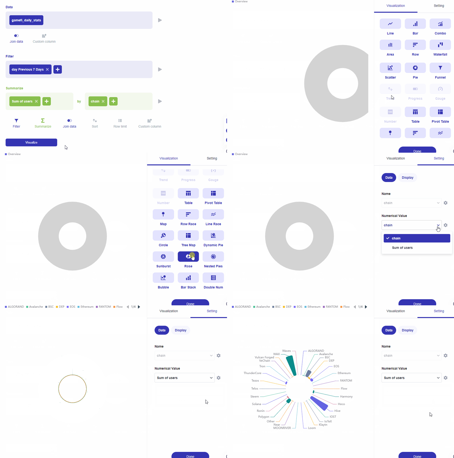
Step 6: Click on the Display tab next to Data. This is where you can set how your chart will be displayed.
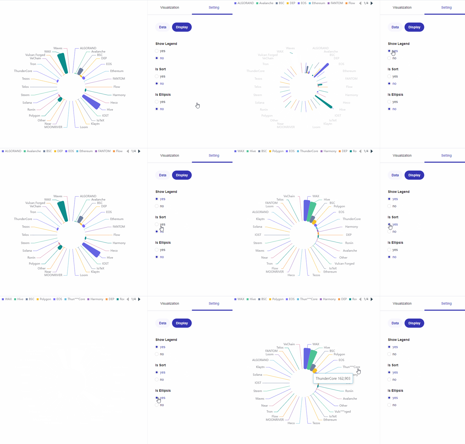
Your chart is finally complete, just don’t forget to Save it.
Nested Pie Charts, also known as a Nested Donut Chart, display the given data in multiple levels. Nested Pie Charts are used to show data percentages in two dimensions.
Note: Nested Pie Charts are only available to membership holders.
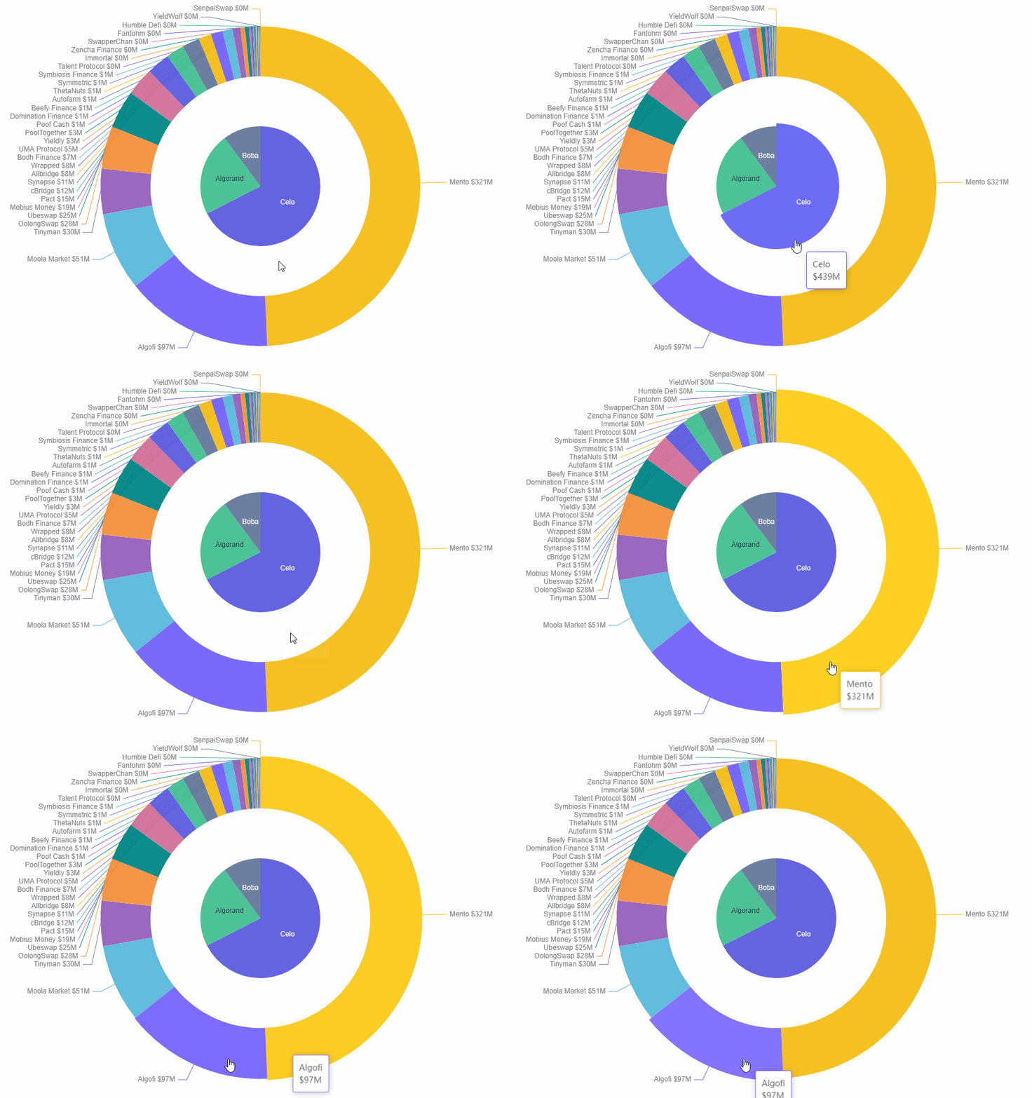
We will be using the Sum of TVL from different chains as an example to create our own Nested Pie Chart from the beginning.
Use case: Nested Pies - Sum of tvl of different chains
Step 1: Click on Create, then click on New Chart.
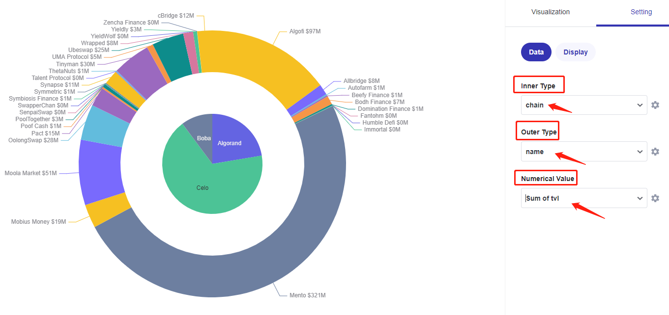
Step 2: Click on DeFi from the list on the left on the screen, then select the data defi_protocol_daily_stats.
Step 3: Click on Filter. In this case, we are making a sum of tvl from three DeFi chains for yesterday. So, we choose day, then set it to Previous 1 Day. Click on Add filter.
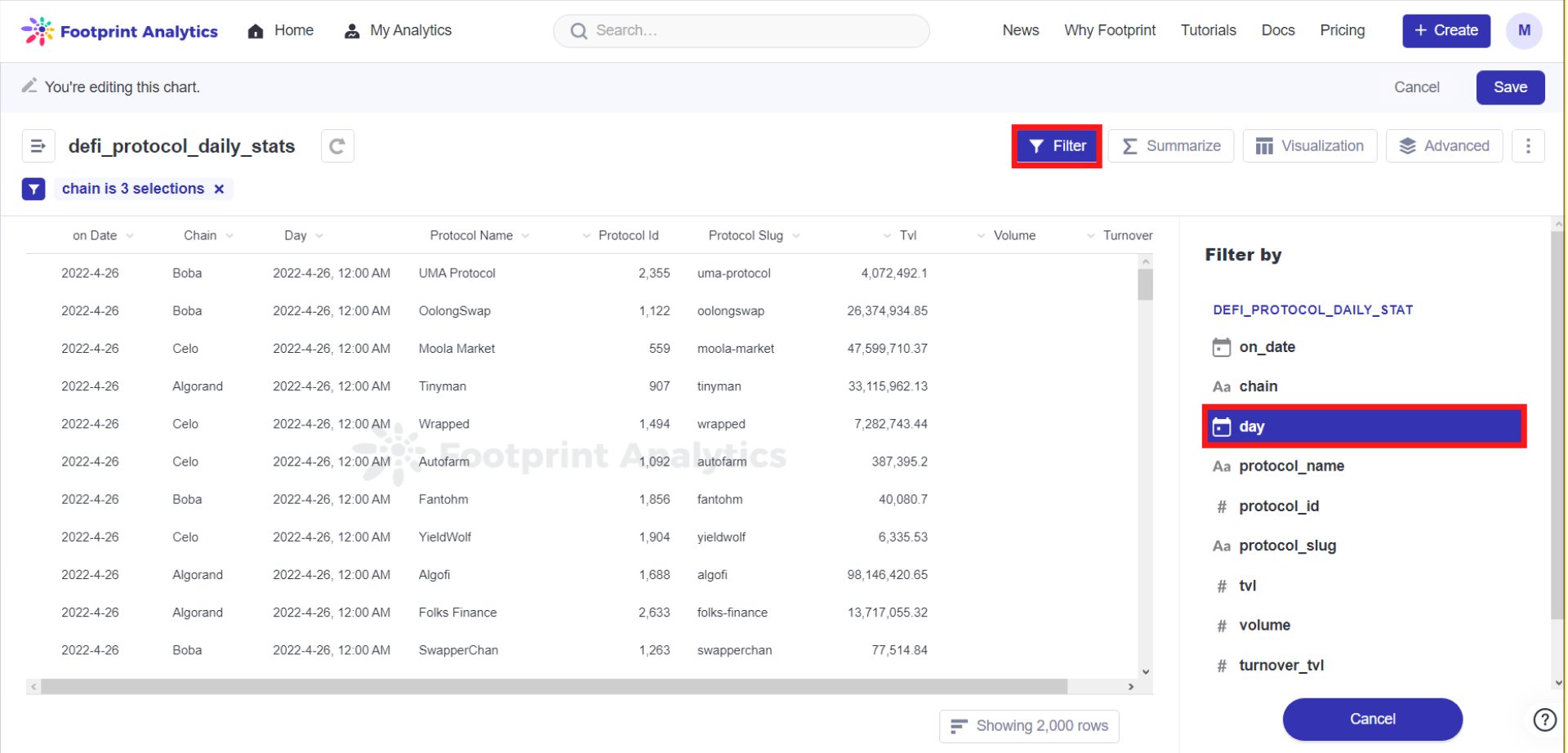
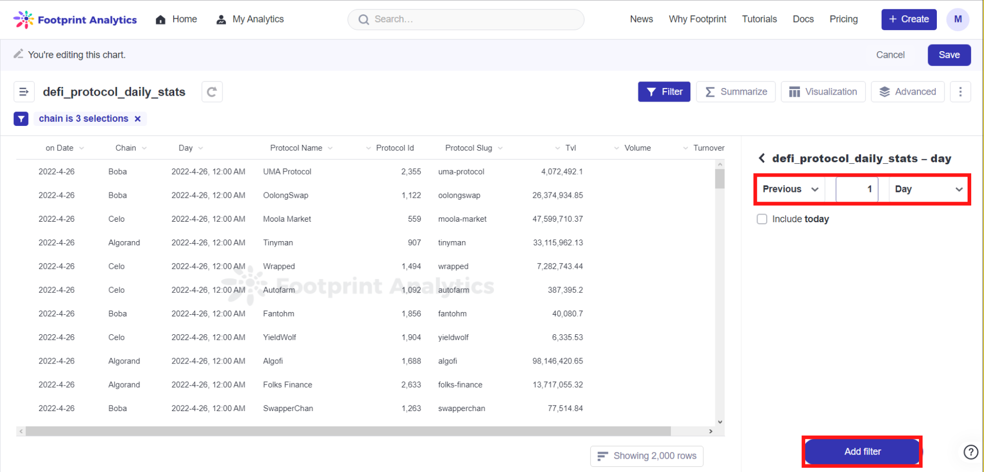
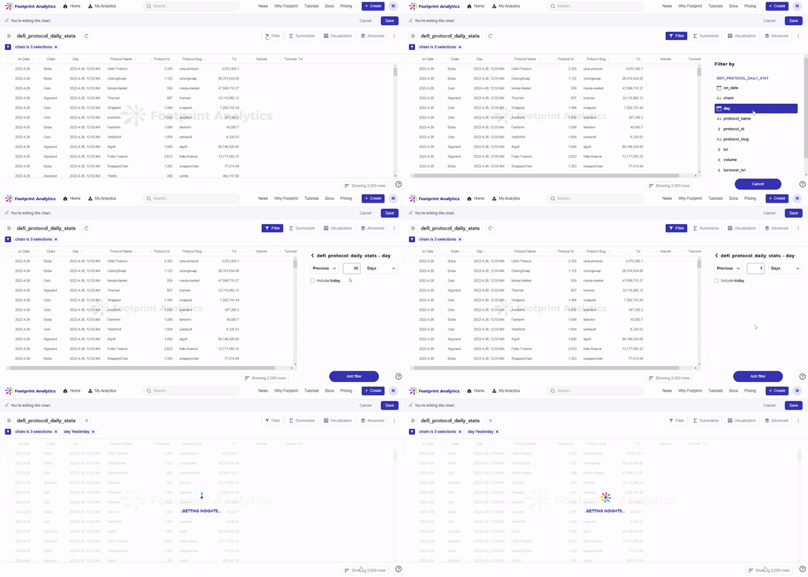
Step 5: Click on Advanced on the top right corner of the screen. Click on Summarize. Click on Pick the metric you want to see and select Sum of tvl.Click on Pick a column to group by and select chain and protocol_name.
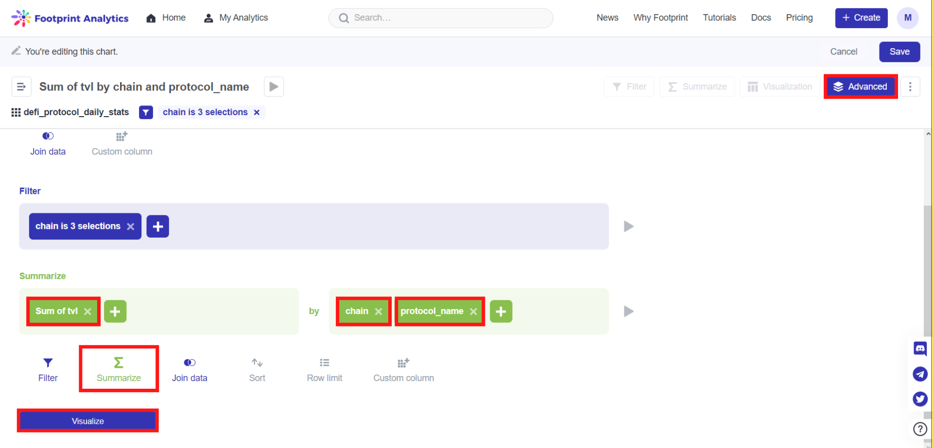
Step 6: Click Visualize, then choose Nested Pies.Then, set the data as required.
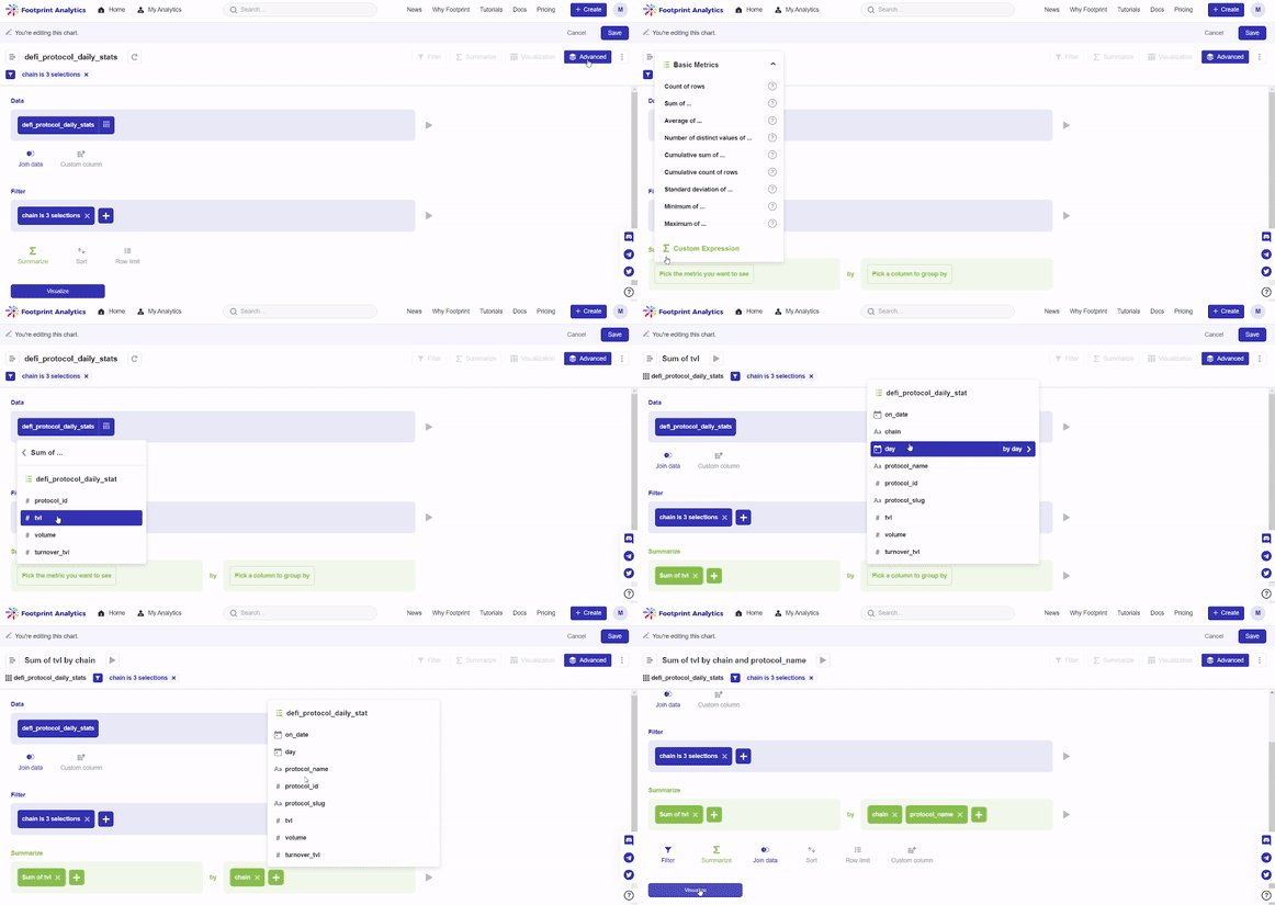
In this case, we will be choosing chain for the Inner Type, name for the Outer Type, and sum of tvl for the Numerical Value by clicking on the downward arrow for the respective fields.
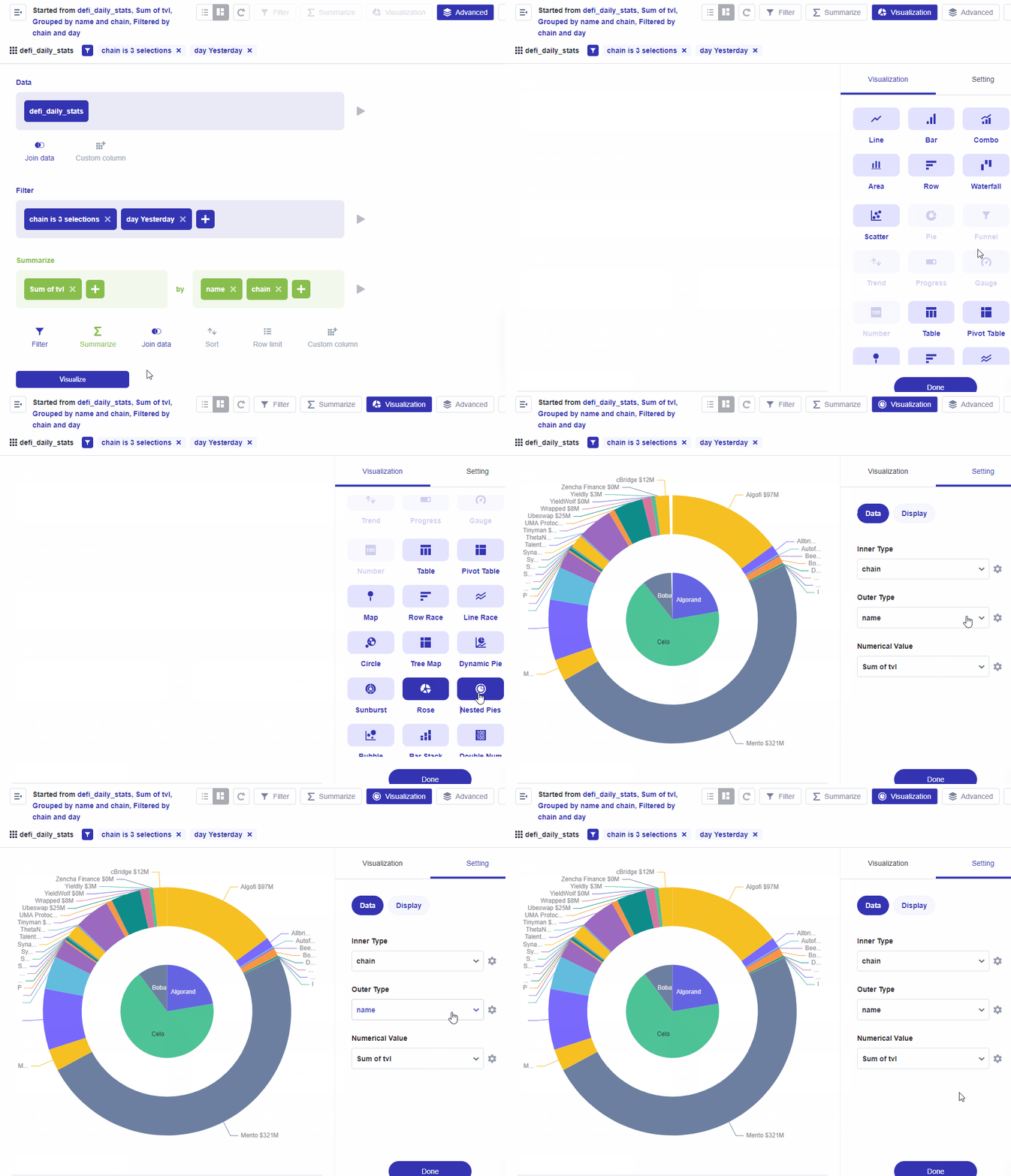
Step 7: Click on the Display tab next to Data. This is where you can set how your chart will be displayed.
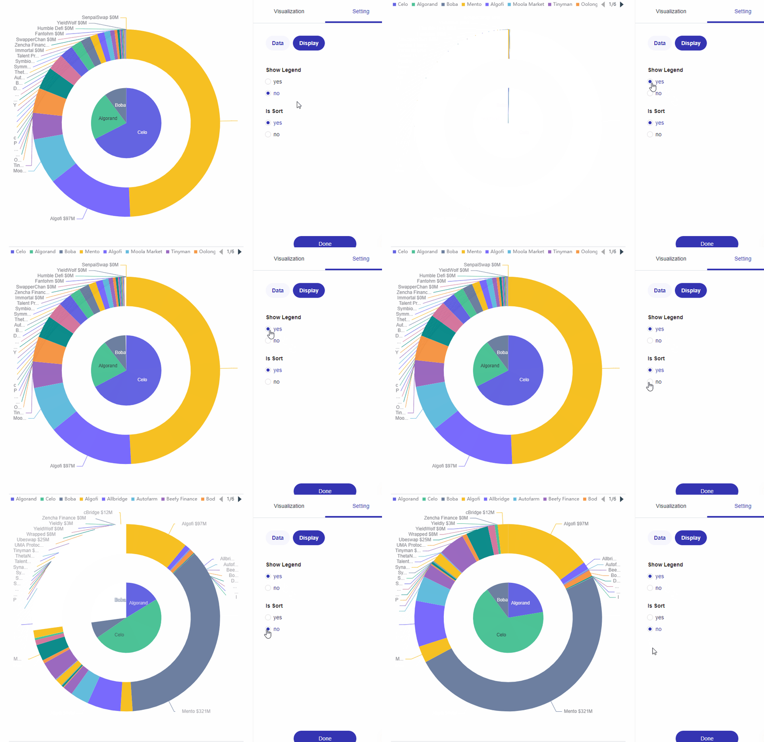
Don’t forget to save your chart.
Sunburst Charts are useful for visualizing hierarchical data structures. A sunburst chart consists of an inner circle surrounded by rings of deeper hierarchy levels. The angle of each segment is proportional to either a value or divided equally under its inner segment.
Let’s make our own Sunburst Chart using the sum of tvl from different chains.
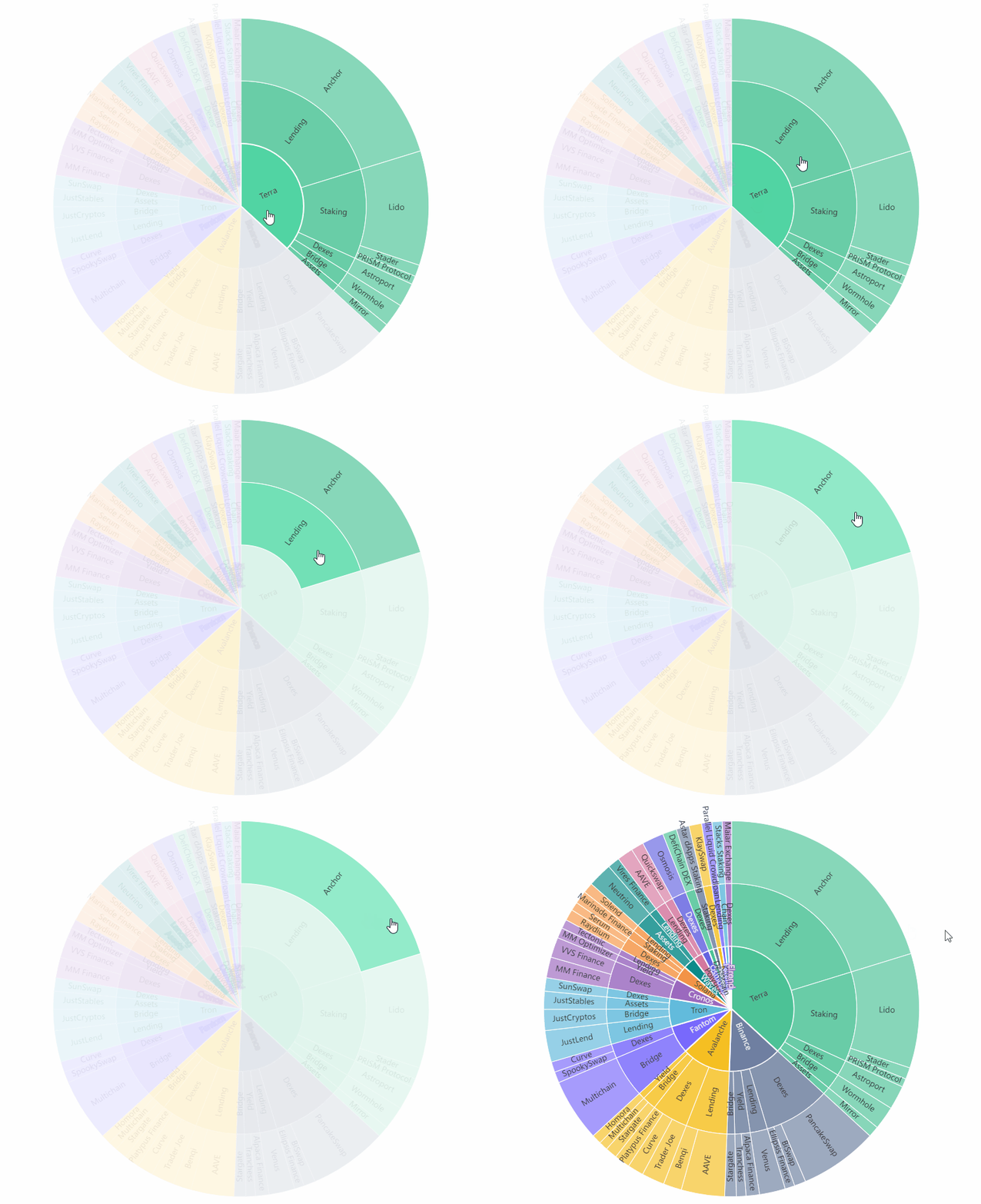
Use case: Sunburst - Sum of tvl of different chains
Step 1: Click on Create, then click on New Chart.
Step 2: Click on DeFi from the list on the left on the screen, then select the data ud_defi_token_growth.
Step 3: Click on Filter, click on day, then set to Previous 1 Day. Click on Add filter.\
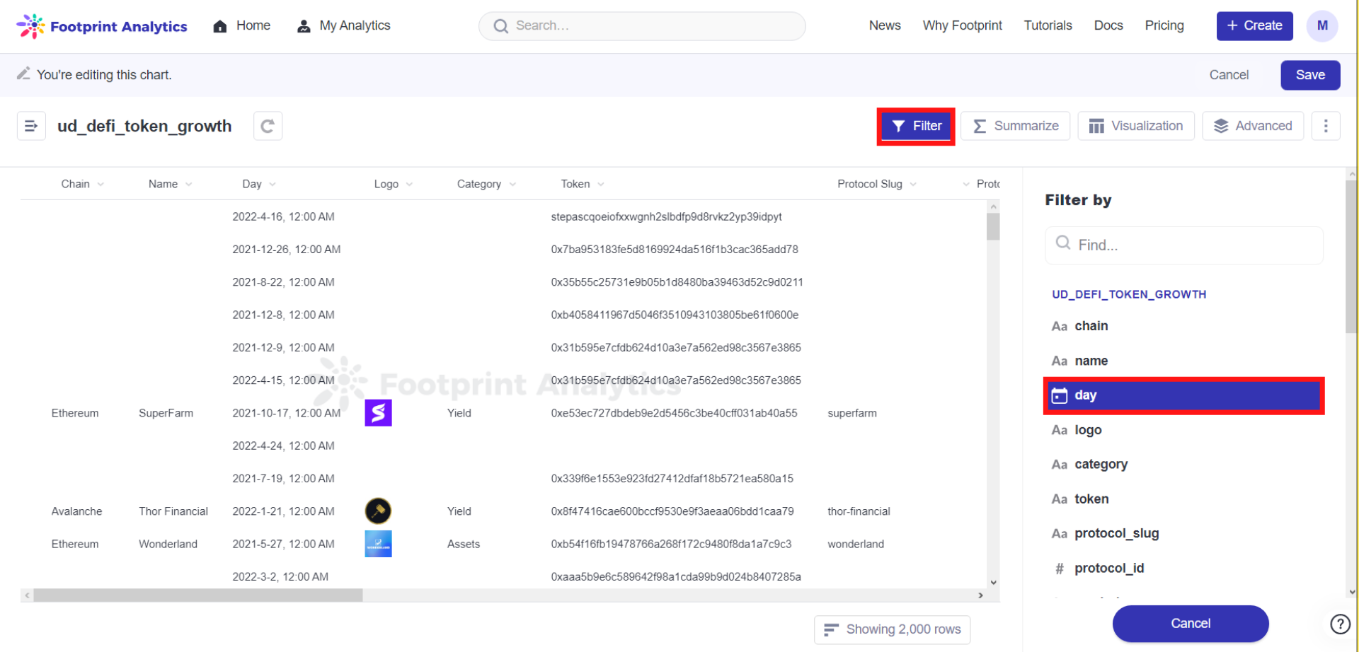
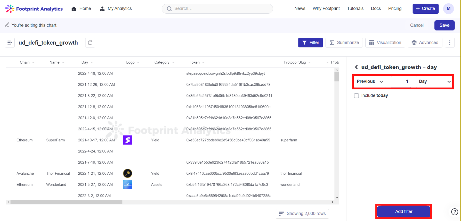
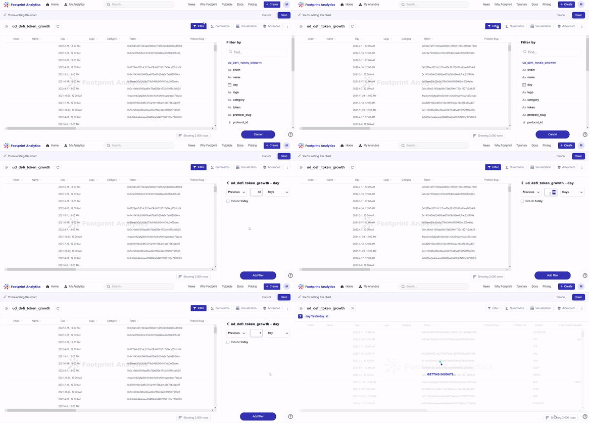
Step 4: Click on Filter. Select sum of tvl, then set it to greater than 500,000,000. Click on Add filter.
Step 5: Click on Filter. Select chain, In this case, we set it to does not contain and type in Ethereum,to show the distribution of other public chains. Since Ethereum would take over 60% of the chart, it would be difficult to identify the data for the other chains on the chart if Ethereum were added, so for our case, we will be excluding it. **** Click on Add filter.
Step 6: Click on Advanced on the top right corner of the screen. Click on Summarize. **** Click on Pick the metric you want to see and select Sum of tvl. Click on Pick a column to group by and select chain, category, name and day.
Step 7: Click **** on Advanced, then click on Visualize and choose Sunburst. Setting the data as required.
For our example, set chain as the First Level, category for the Second Level, name for the Third Level, and Sum of tvl for the Numerical Value by clicking on the downward arrow for the respective fields.
Step 8: Click on the Display tab next to Data to set how you want your chart to look.
Always save your chart.
Treemaps are used for showing data percentage in three dimensions. Treemaps capture relative sizes of data categories, allowing for quick perception of the items that are large contributors to each category by the shade of color. Color can identify items that are underperforming or over performing compared to their siblings from the same category.
Let’s create our own Treemap based on the sum of tvl from different chains.
Use case: Treemap - Sum of tvl of different chains
Step 1: Click Create and then click New Chart.
Step 2: Click on DeFi from the list on the left of the screen. Select the data ud_defi_token_growth.
Step 3: Click on Filter. Click on day, then set it to Previous 1 Day since we are making a sum of tvl of different chains for yesterday.
Step 4: Click on Filter. Click on chain, set it to not empty, then set category to not empty as well.
Step 5: Click Advanced, then click Summarize. Click on Pick the metric you want to see and select Sum of tvl. Click on Pick a column to group by and select chain, category, name and day.
Step 6: Click Visualize, then choose Treemap. Set your data as required.
In this case, we will be setting the First Level as chain, the Second Level as category, the Third Level as name, and the Numerical Value as Sum of tvl by clicking on the downward arrow for the respective fields.
Step 8: Click on the Display tab next to Data to set how you want your chart to look.
Your chart is done, don’t forget to save it.
Was this article helpful for you? If you have any advice or feedback for this tutorial, please feel free to let us know in the community or contact us on Twitter or Telegram. Here at Footprint Analytics, we always aim to improve user experience.
Updated 6 months ago
