Dynamic Pie
The Line Chart is best suited for data that displays a trend over time, meanwhile the Pie Chart indicates the proportion of a category in the total. The Dynamic Pie Chart combines the two categories.
This guide will walk you through the process of creating a Dynamic Pie Chart and demonstrating how to put it to use.
In a Dynamic Pie Chart, you can see how a metric's value changes over time, as well as how the metric's distribution changes. Instead of creating a new pie chart every day, you can examine how the values and pie charts evolve over time.
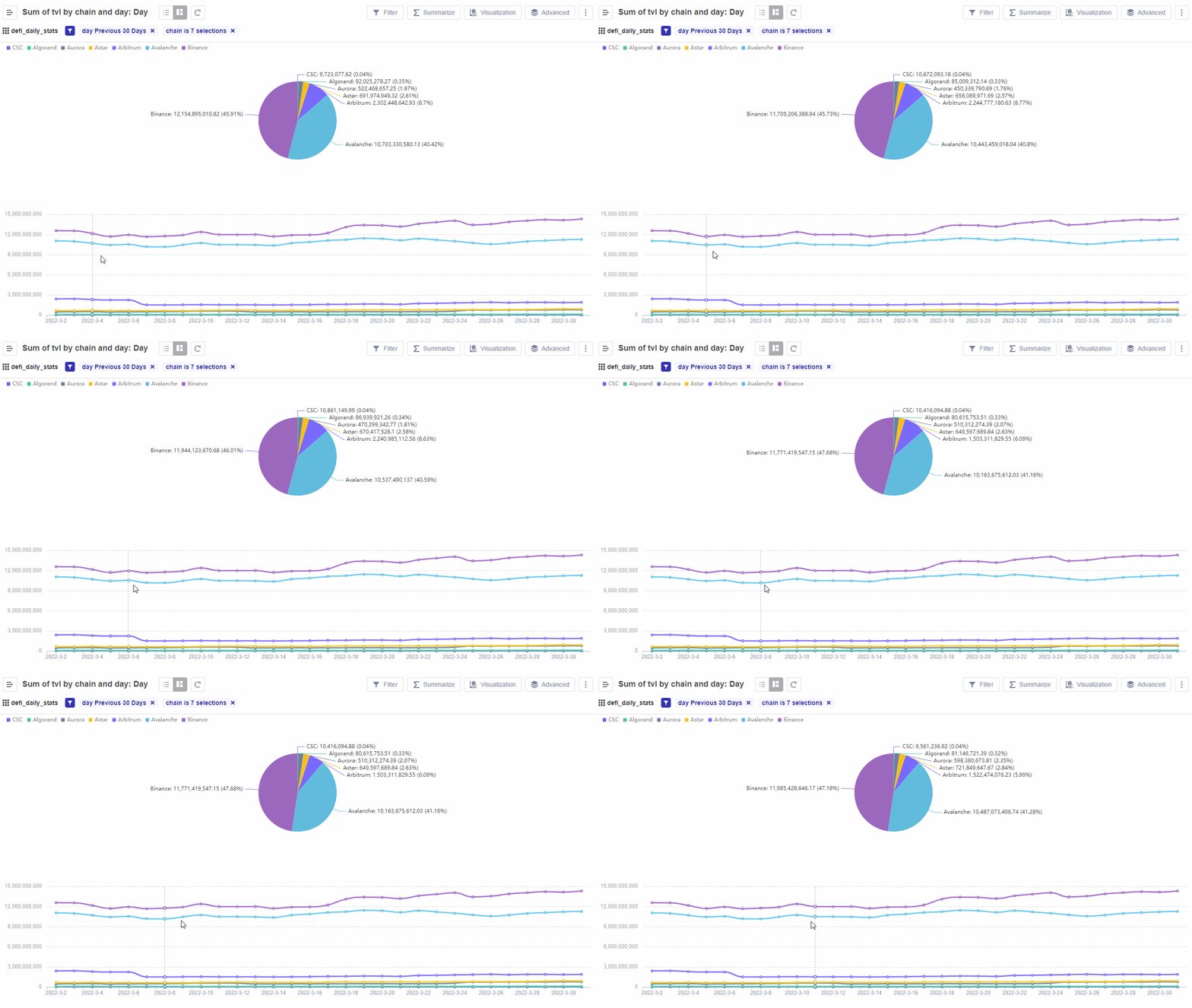
The gif above demonstrates what a Dynamic Pie Chart looks like.
Using Dynamic Chart - TVL of Different Chains as an example is the purpose of this section. You'll also learn how to create your own Dynamic Pie Chart and the properties you'll need to do so.
The Dynamic Pie Chart uses the following setup properties:
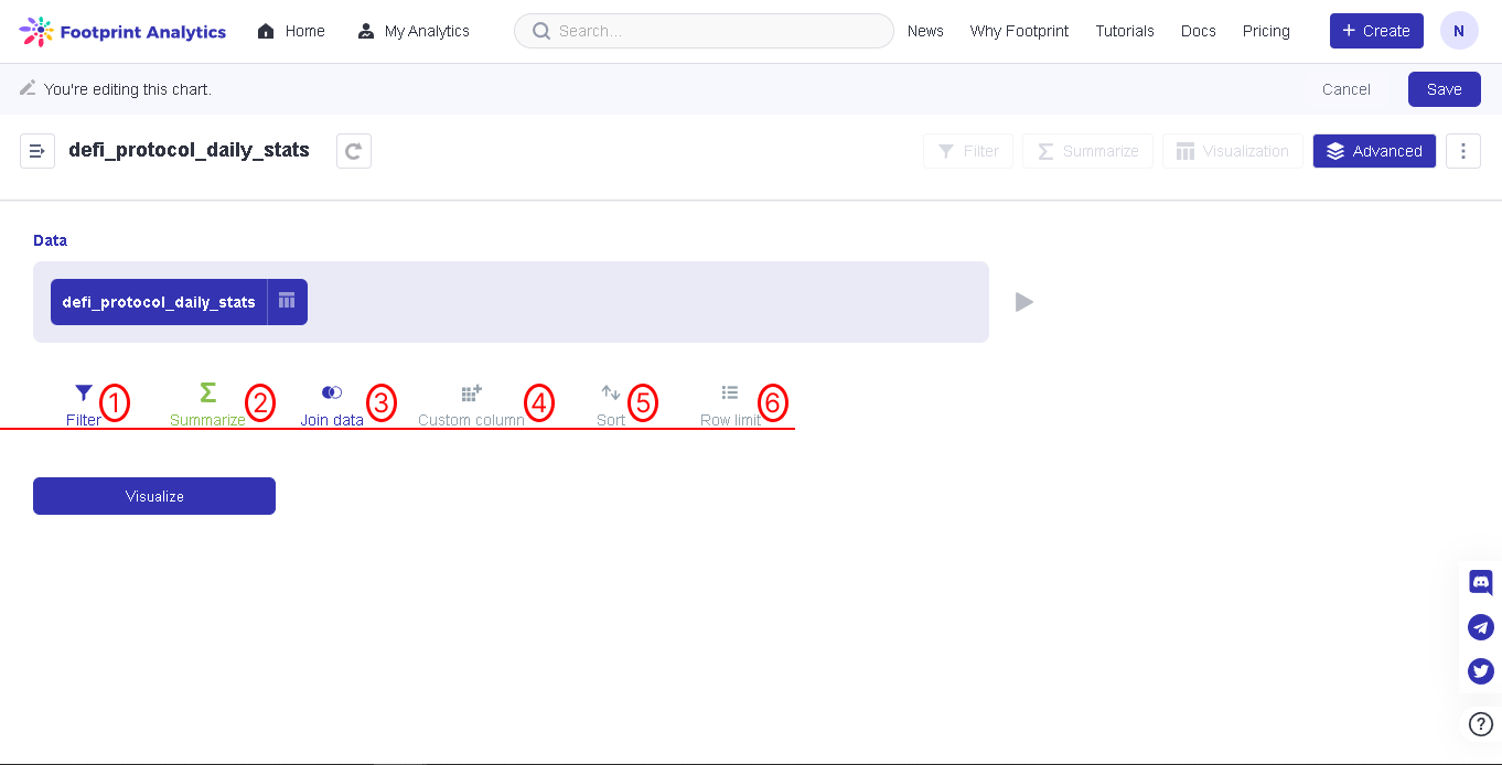
| Number | Configuration Property | Description |
|---|---|---|
| 1 | Filter | This feature allows you to add filters to the data, select the data interval, the data type, etc. |
| 2 | Summarize | This feature allows you to summarize the metrics you need, then choose the field to group by, as well as note the choice of units for the time type field. |
| 3 | Join Data | This feature allows you to combine data between two or more datasets. |
| 4 | Custom Column | This feature allows you to customize your own columns. |
| 5 | Sort | This feature allows the data to be sorted in chronological order, name, or others. When you sort the name, the arrow up means the data is sorted from smallest to largest, and the arrow down means the opposite. If you choose to sort by time, it is similar. |
| 6 | Row Limit | This feature allows you to select the limit of the row. |
To create a Dynamic Pie Chart using the data from Dynamic Chart - TVL of Different Chains:
Step 1: Click on Create and Select New Chart.
Step 2: Select the data defi_protocol_daily_stats. Click Advanced next to the Visualization tab on the top right corner of the screen.
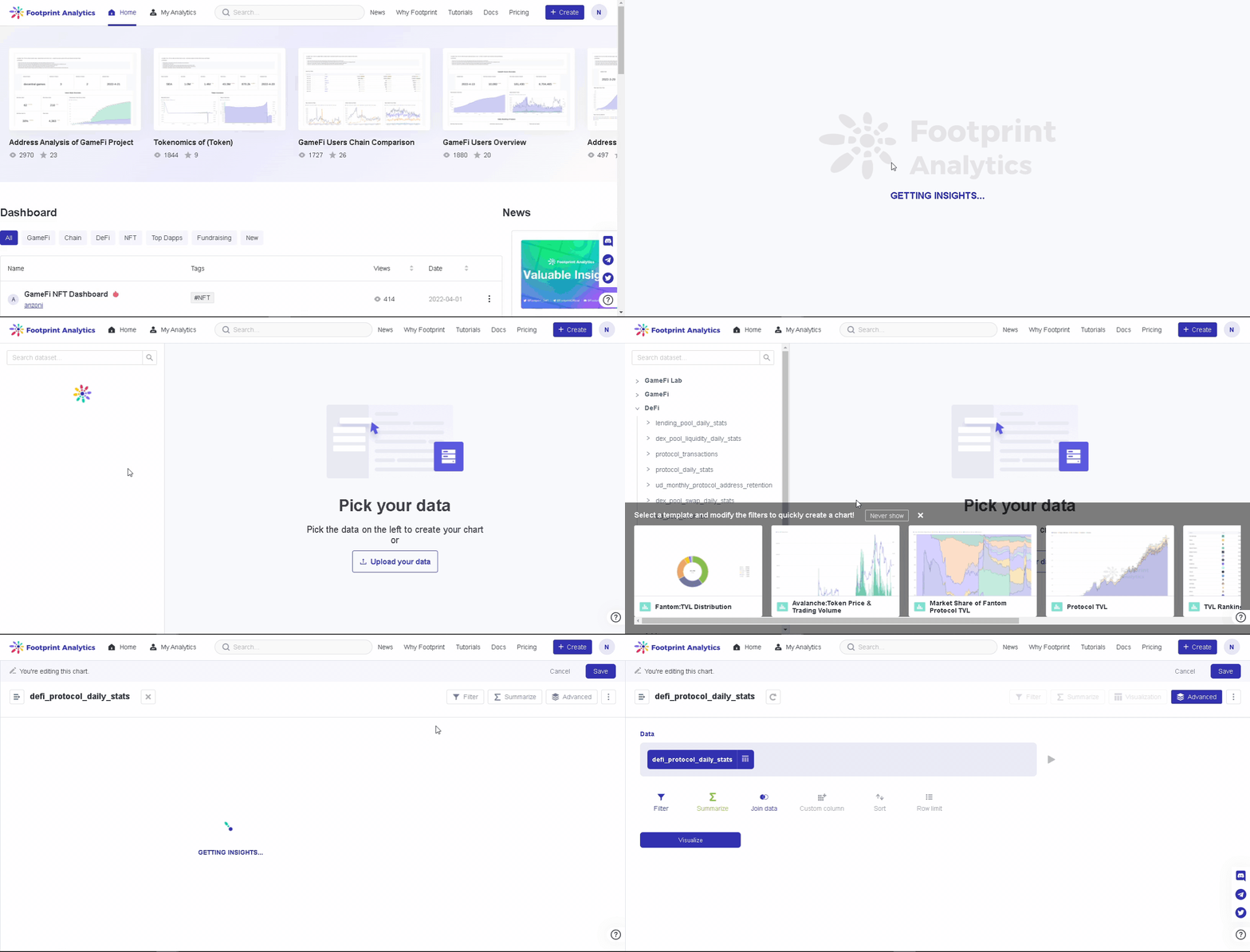
The gif above demonstrates Step 1 and Step 2.
Step 3: Click Filters, then, for this use case, click on day-previous 30 Days, then click Add. **** Click the + Icon, select chain and click the first five chains.
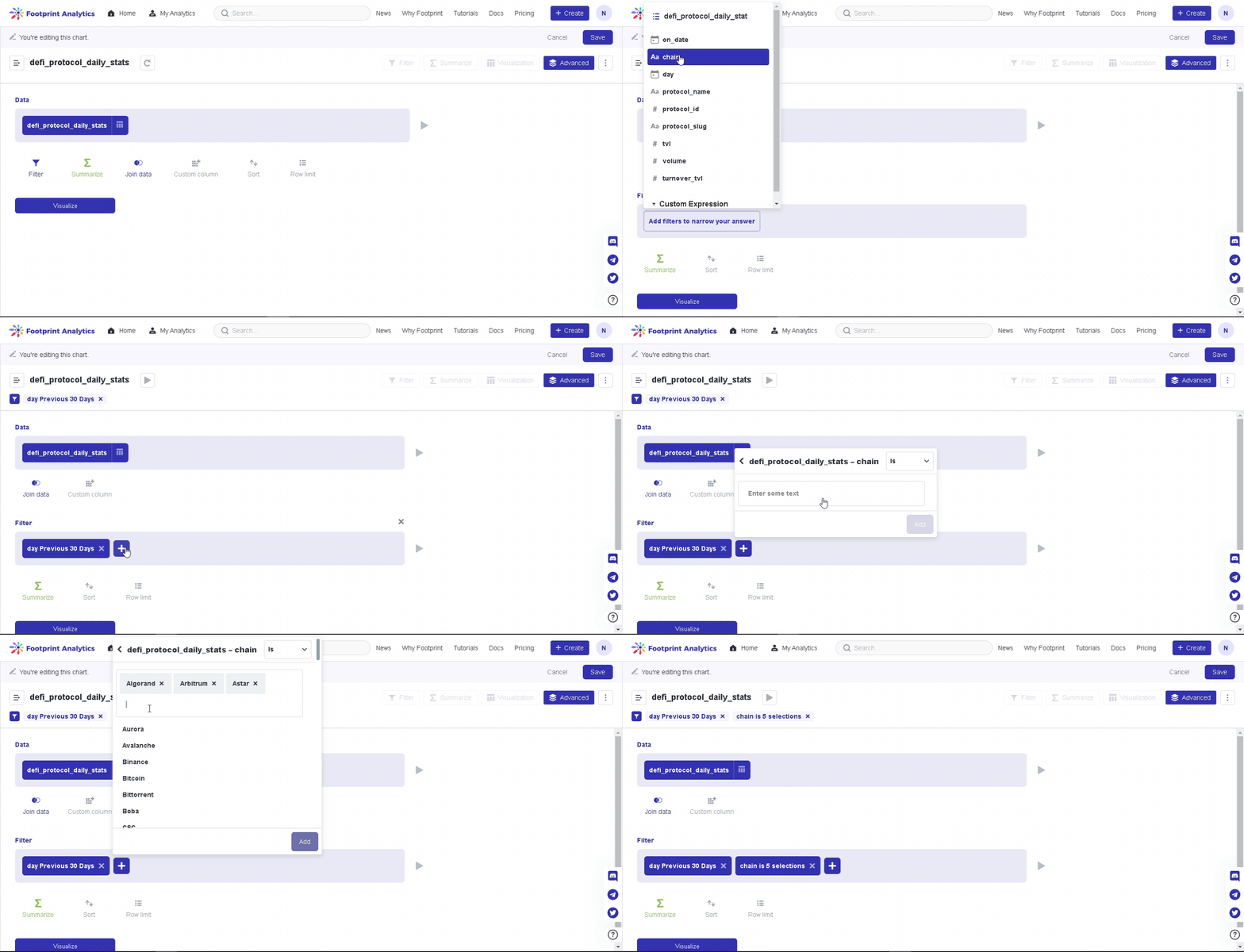
The gif above demonstrates Step 3 in choosing the filters.
Step 4: Click Summarize, in this case, we choose the sum of TVL, group by chain and day (This operation displays data by day).
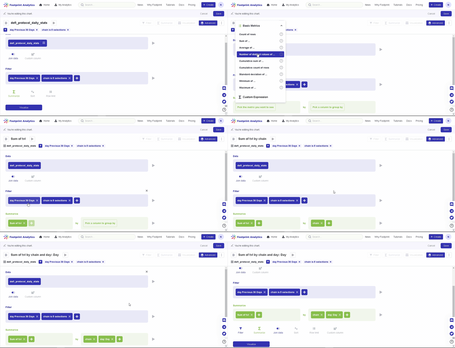
The gif above demonstrates Step 4 in creating the summary of the dataset.
Step 5: Click Sort next to Join Data, and select the Sum of TVL. Then click on the + Icon and select Day.
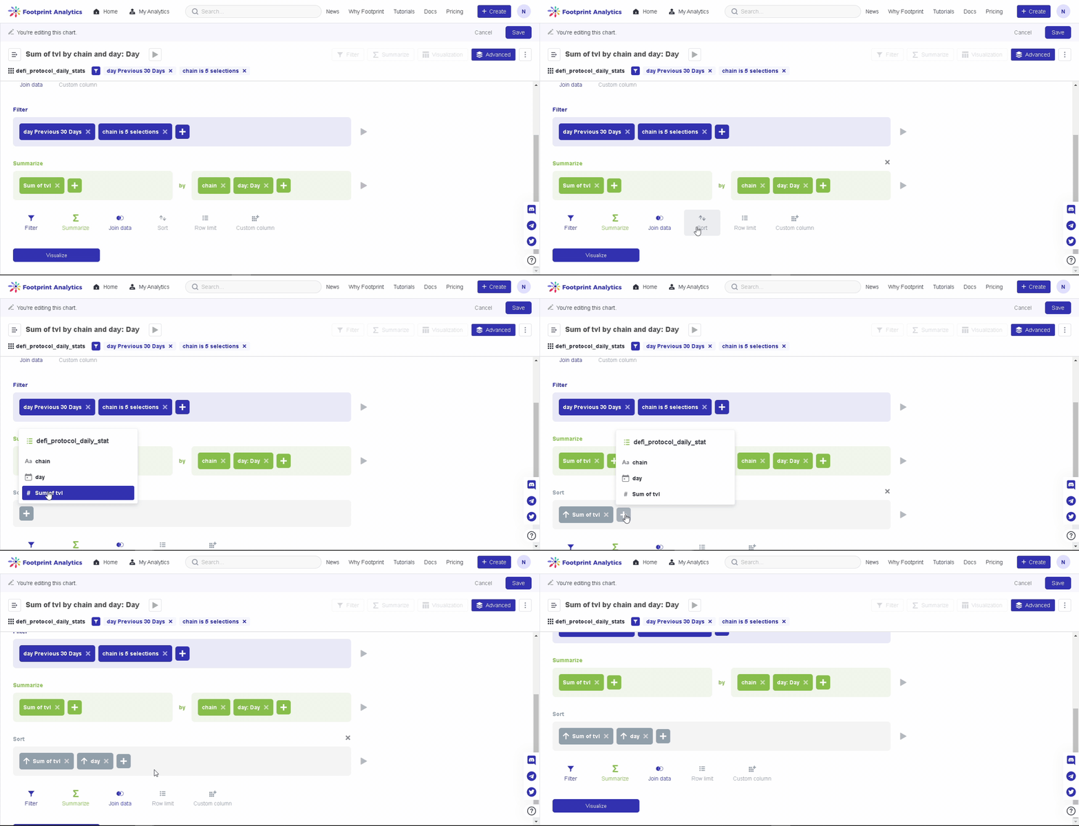
The gif above demonstrates Step 5 in sorting the dataset.
Step 6: Click visualize, then select Dynamic Pie. Select the fields corresponding to x-axis, y-axis, and category as required.

The gif above demonstrates Step 6 to visualize the dataset using the Dynamic Pie Chart.
In this use case, we choose
- x-axis = day;
- y-axis = sum of tvl;
- category = chain;
The gif above demonstrates Step 7 to set up the Dynamic Pie Chart visualization settings.
Your Dynamic Pie Chart is now complete; make sure to save it.
Note: In order for a Dynamic Pie Chart to be useful, you must have at least two metrics to filter.
Updated 6 months ago
