Line and Row Race
Line Race and Row Race are advanced applications of line charts. They provide and present your data in different ways, which can make your charts more vivid and visual. The main difference that sets them apart from line charts and most other charts, is that they are animated to help better show the process and progress of the data.
This article will guide you through Line Races and Row Races as well as walk you through some use cases.
Line Races are used for plotting data captured in several sequences.
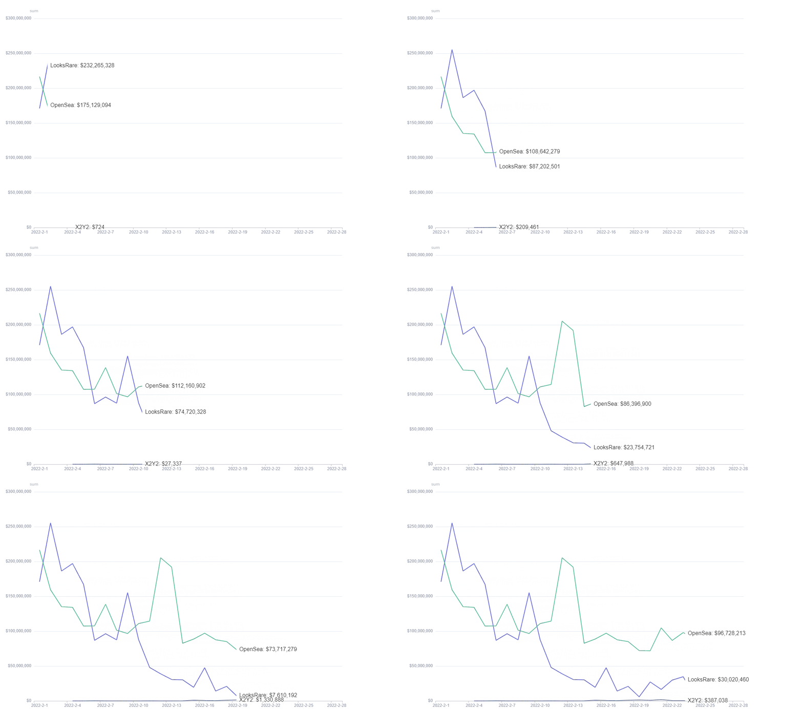
Use case: **** Line Race - Comparison of Volumes
Step 1: Click Create on the top right corner of the screen. A pop-up menu will appear. Click on New Chart.
Step 2: Click on NFT from the list on the left. Select nft-marketplaces-daily-stats.
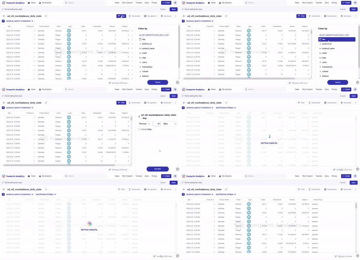
Step 3: In this case, we will be making a comparison of the trading volume of 3 NFT trading markets in the past 30 days. Click on Filter, then click on protocol_name. Search and select OpenSea, X2Y2, and LooksRare, then click Add filter.
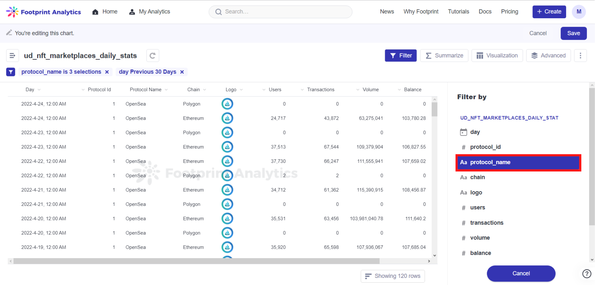
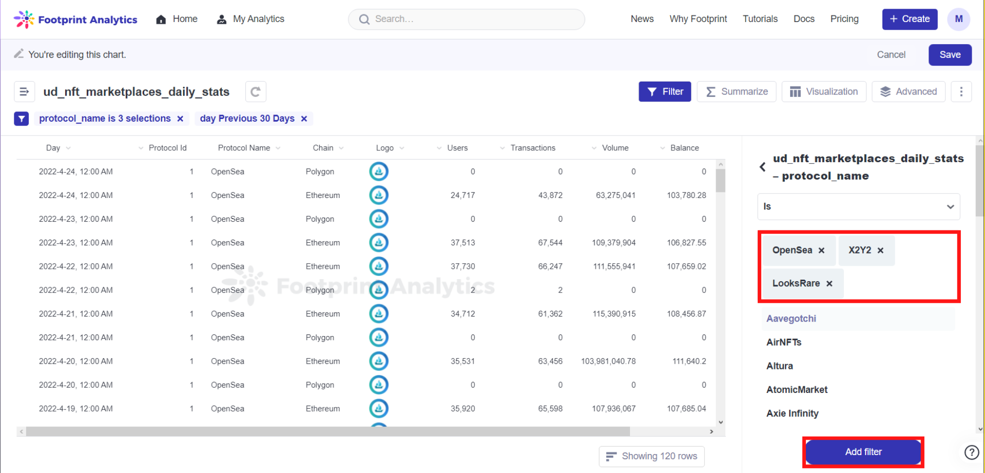
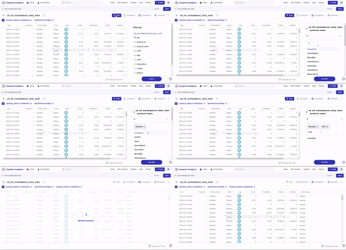
Step 4: Click on Filter, and this time click on day.
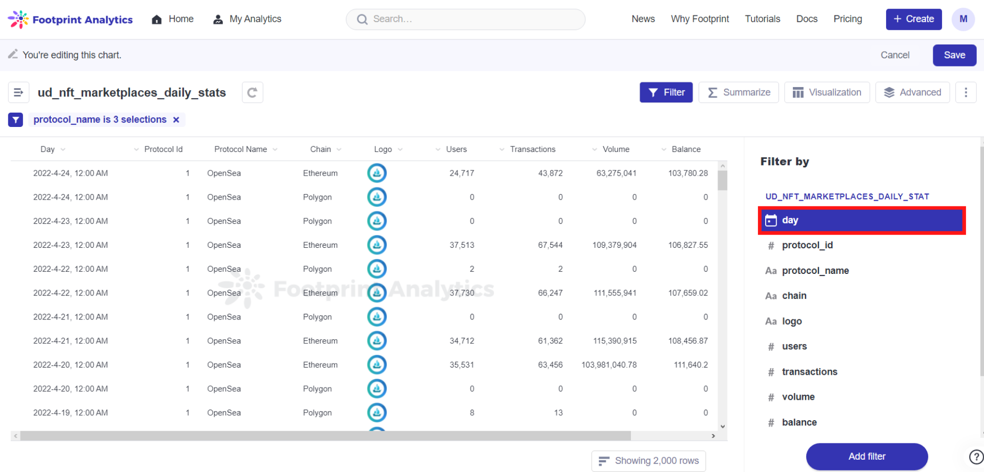
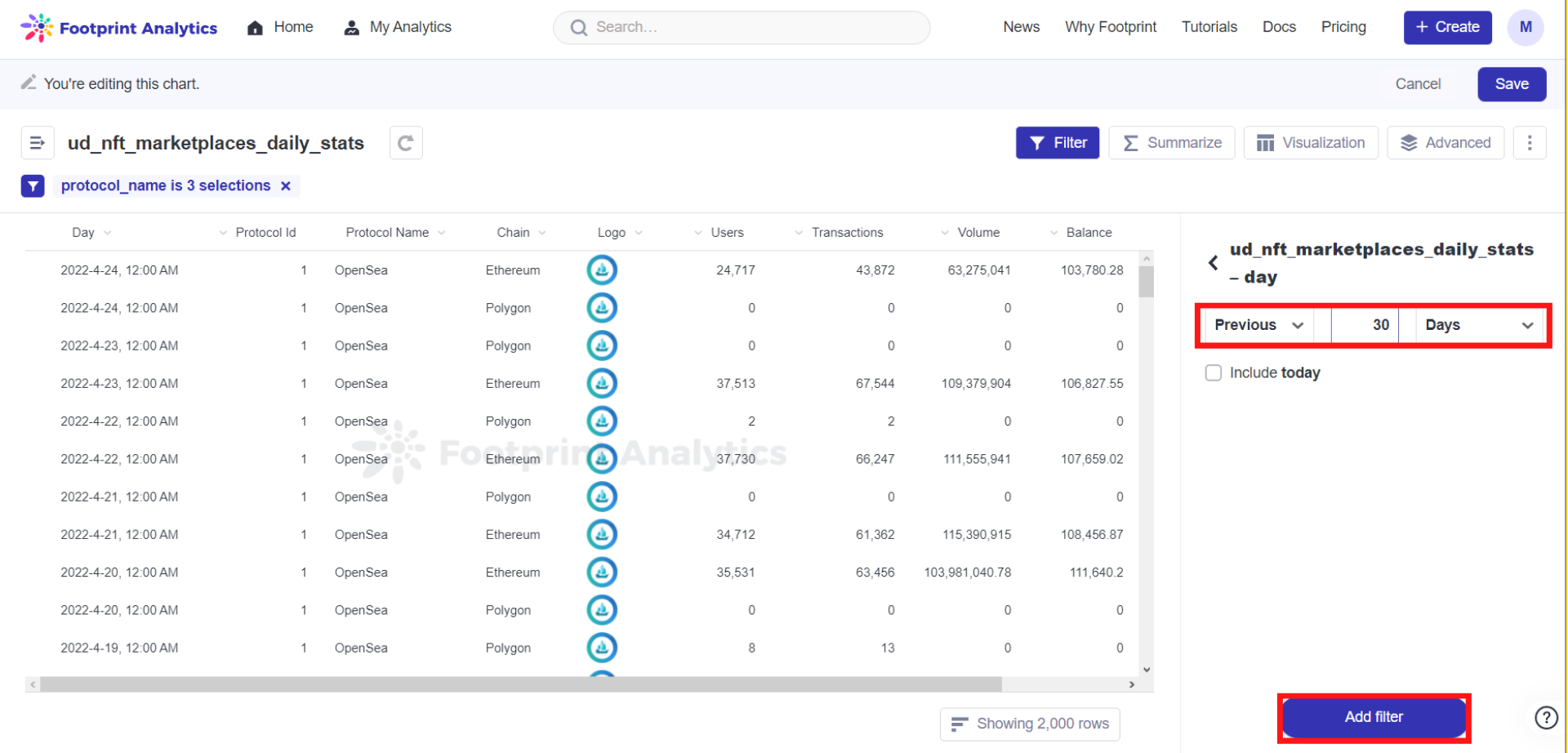
Step 5: Select Previous, 30 and Days, then click on Add filter.
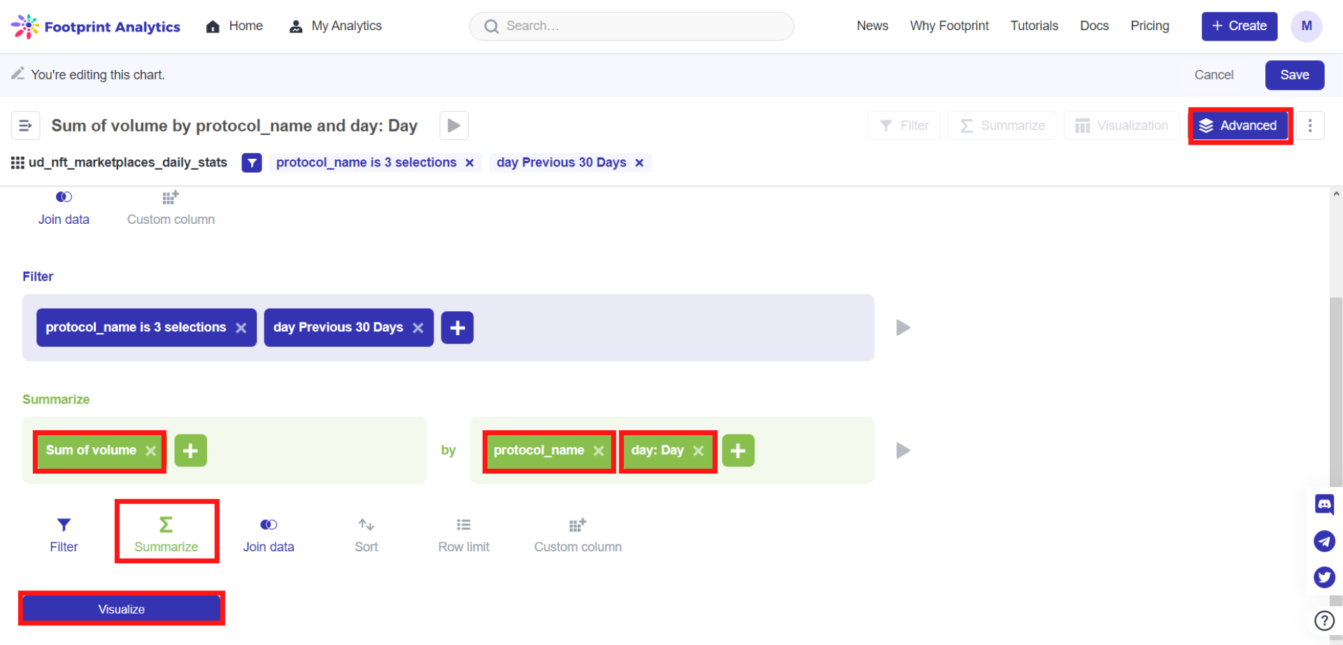
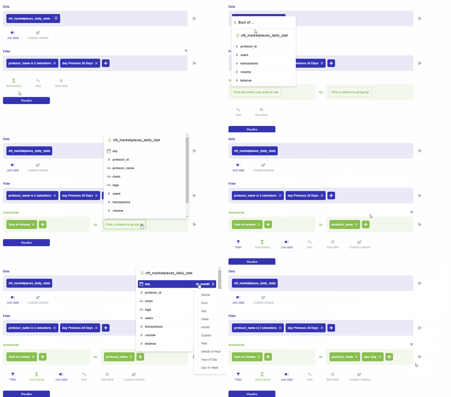
Step 6: Click on Advanced, then click on Summarize..
Step 7: Here you can choose the metrics you need, then choose the field to group by. Click on the Pick the metric you want to see button. Select sum of, then select volume.
Step 8: Click on the Pick a column to group by button. Select protocol_name. Click on the green + button and select day, and then select by day (This operation displays data by day).
Step 9: Click on Visualize on the bottom left corner of the screen.
Step 3: Under Visualization, choose Line Race.Then, select the fields corresponding to x-axis, y-axis and category as required. Click on Done.
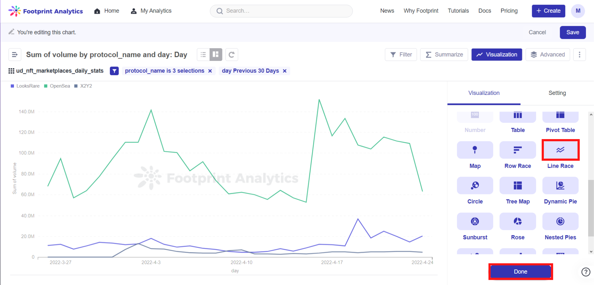
In this case, we choose the following settings for our chart:
X-axis = day;
Y-axis = sum of volume;
Category = protocol-name.
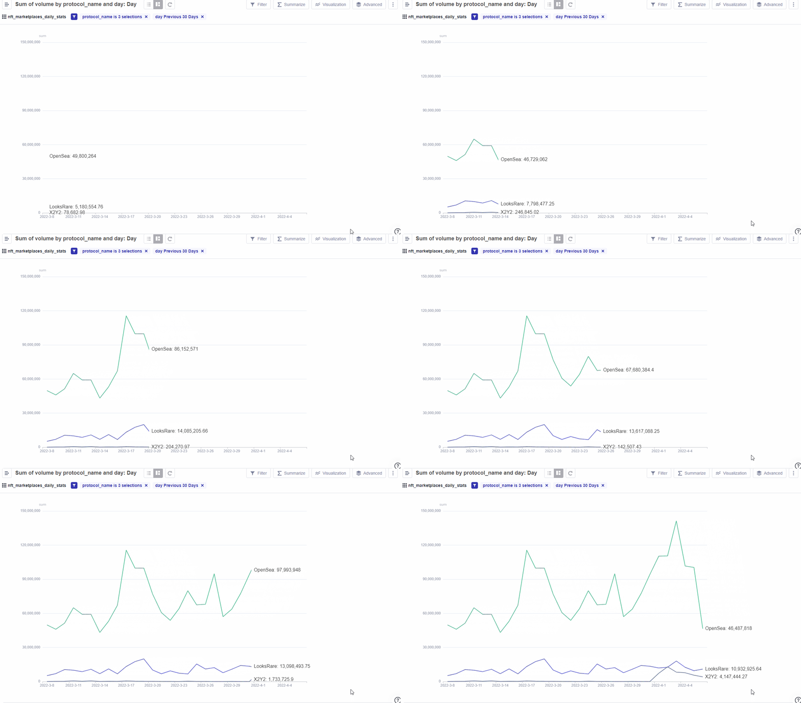
Note: The Line Race chart is only available for membership holders.
Save to complete the creation of the chart.
Row races are sometimes more suitable for multiple metrics than line races. It gives you a clearer view of how the rankings change for each metric.
Use case: Row Race - Comparison of Sum of TVL
Step 1: Click on Create, then click on New Chart.
Step 2: Select the data defi-daily-stats under the DeFi drop-down list found on the left side of the screen.
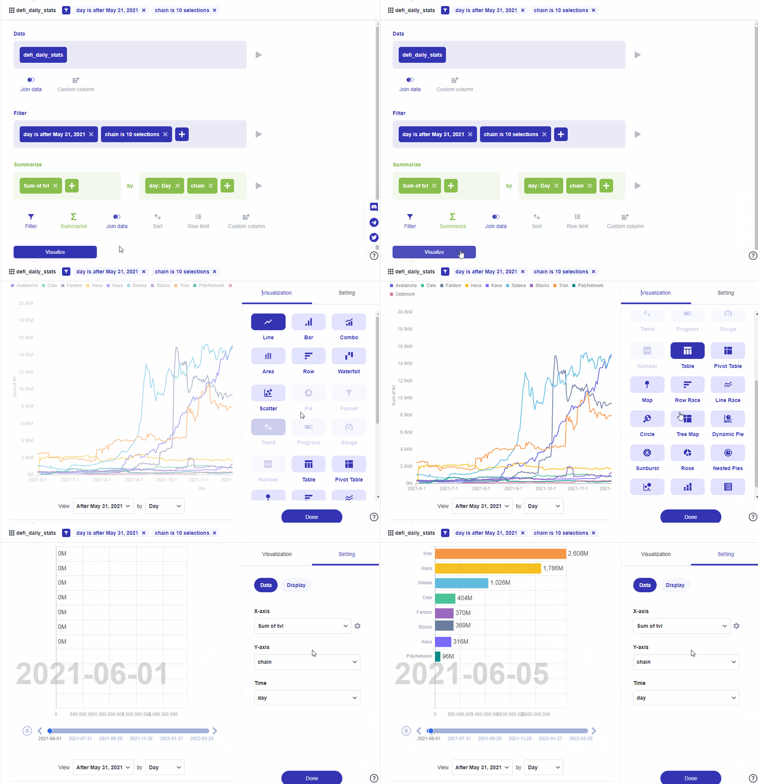
Step 3: In this case, we will be making a comparison of the sum of TVL using 10 chains after March 31, 2021. Click on Filter on the top right corner, and then click on chain. Search and select the chains Heco, Solana, PolyNetwork, Tron, Fantom, Stacks, Kava, Avalanche, Optimism, and Celo.
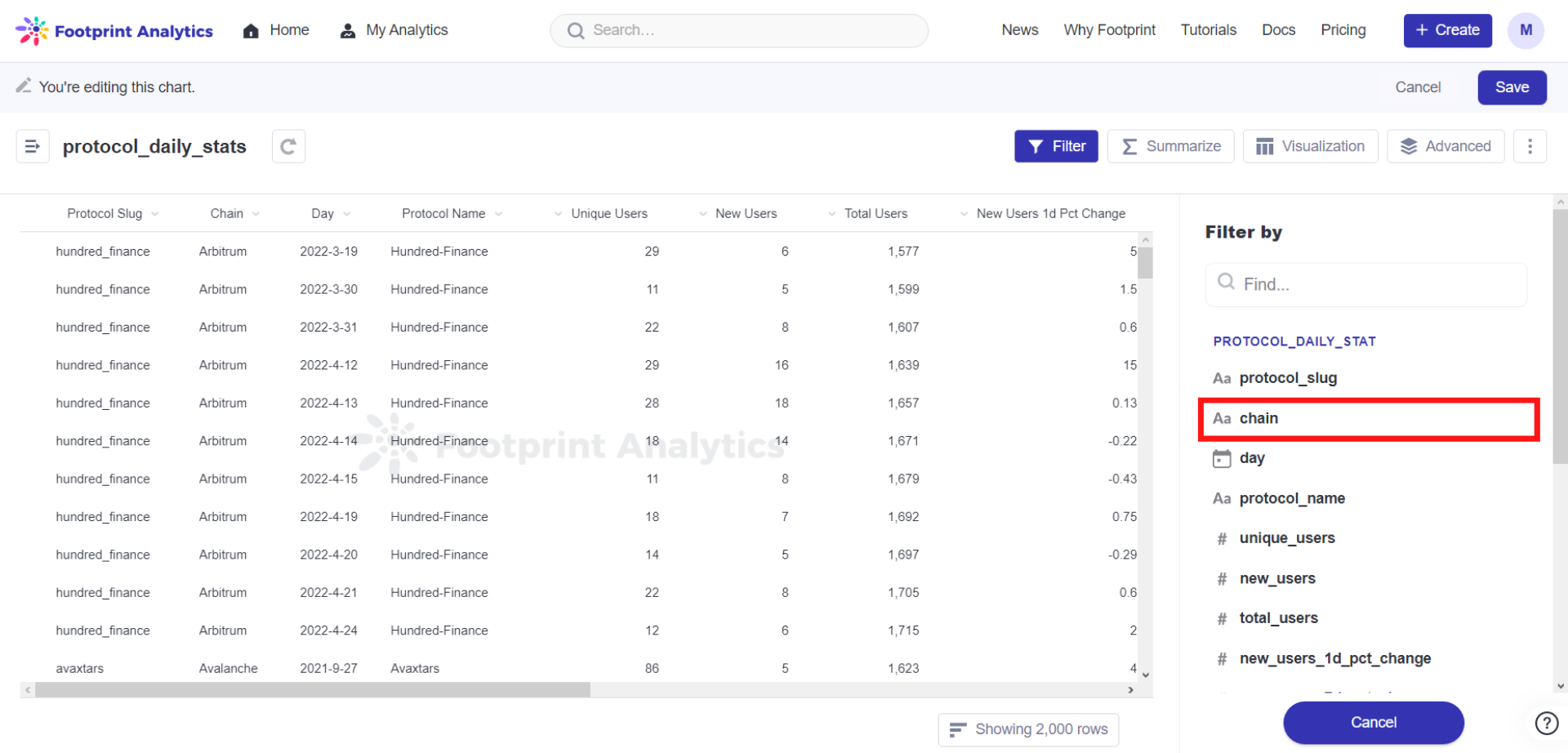
Step 4: Click on Filter, and then day. Select After and choose May 31, 2021 for our example.
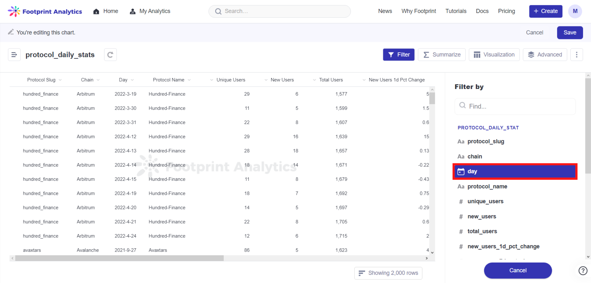
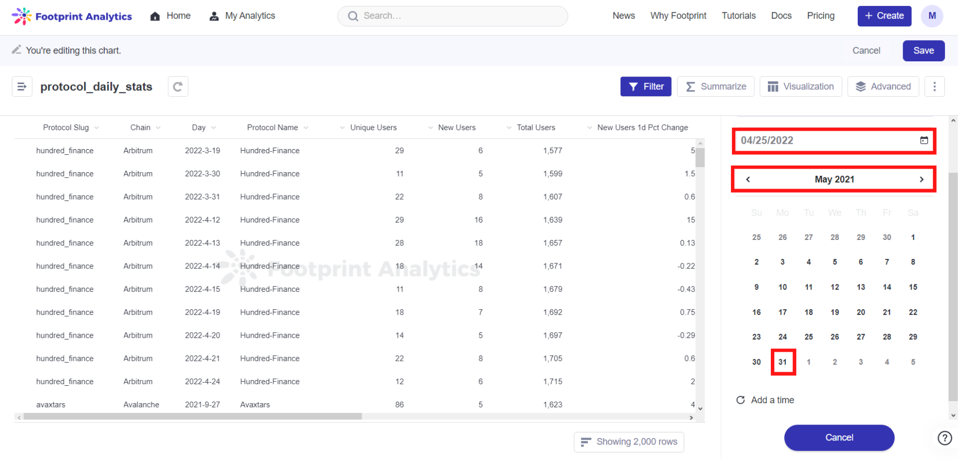
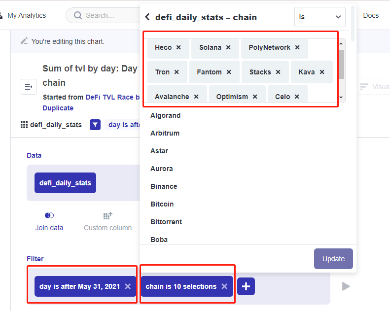
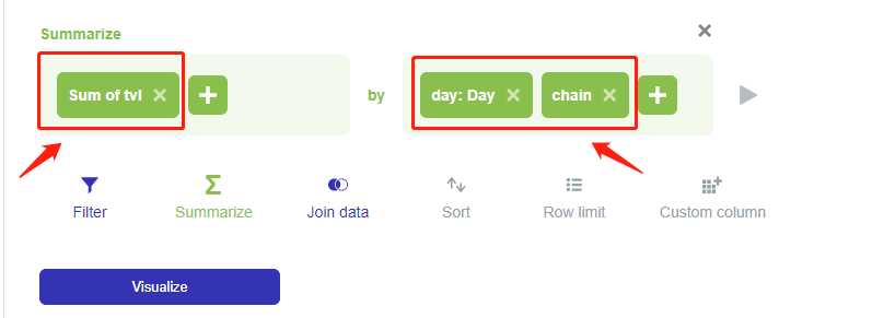
Step 5: Click on Advanced, then click on Summarize. In our case, we will be selecting sum of tvl, grouped by chain and day (This operation displays data by day).
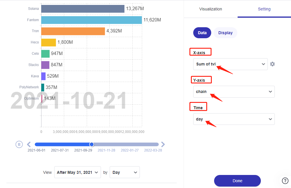
Step 6: Under Visualize, click Visualization, choose Row Race.Then, select the fields corresponding to x-axis, y-axis and category as required. Click on Done.
In this case, we choose the following settings for our chart:
X-axis = sum of tvl;
Y-axis = chain;
Time = day;
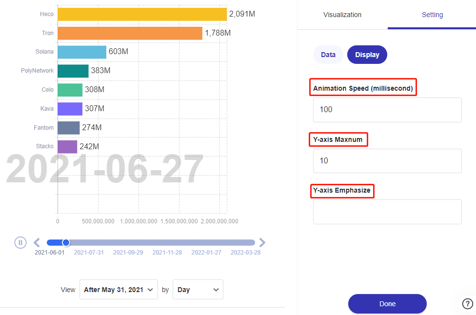
You can change the Animation Speed under the Display Settings, using the Y-axis Maximum and Y-axis Emphasize fields to customize.
Your chart is done, don’t forget to save it.
Updated 6 months ago
