Pivot Table
A pivot table is a data visualization tool that summarizes rows and columns of a table and lets you rotate (“pivot”) the columns to view those summaries in different ways. The summary rows are usually subtotals or grand totals, but they can also be other metrics such as averages and summations. This article will walk you through the creation and use case of a pivot table.
For this article, we will be using the Sum of TVL using different chains for our example in creating a pivot table.
Use case: **** Pivot Table - Sum of tvl of different chains
Step 1: Click on Create, and then click on New Chart.
Step 2: Select the data defi_protocol_daily_stats.
Step 3: Click Filter on the top right corner, then click chain. In this case, we will be making a sum of tvl using different DeFi chains for the previous three days. So for our example, search and select Boba, CSC, and Celo. Click Add filter.
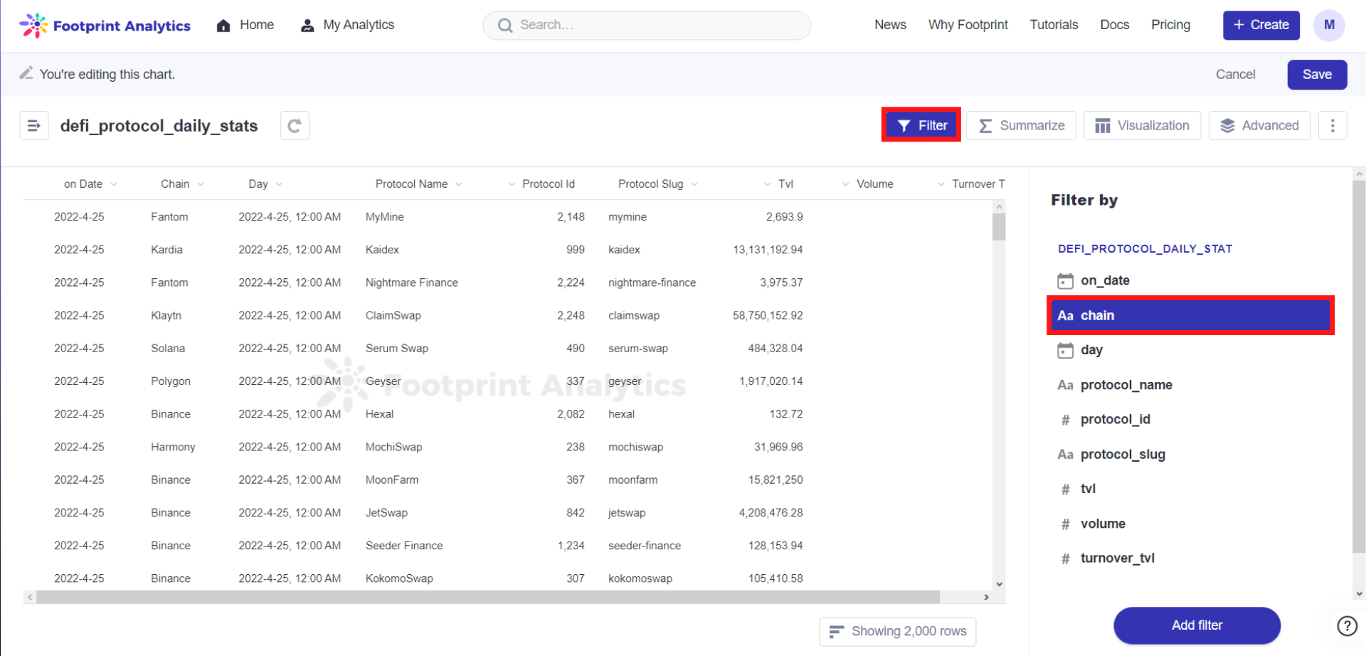
The image above shows where to find the chain filter based on Step 3.
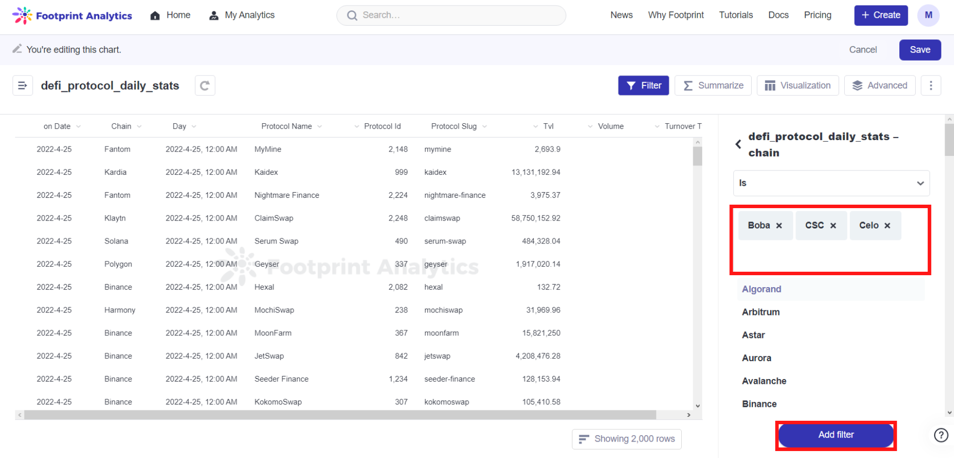
The image above shows the three chains we filtered for: Boba, CSC and Celo.
Step 4: Click on Filter, and this time, choose a day. Set the filter to Previous 3 Days. Click Add filter.
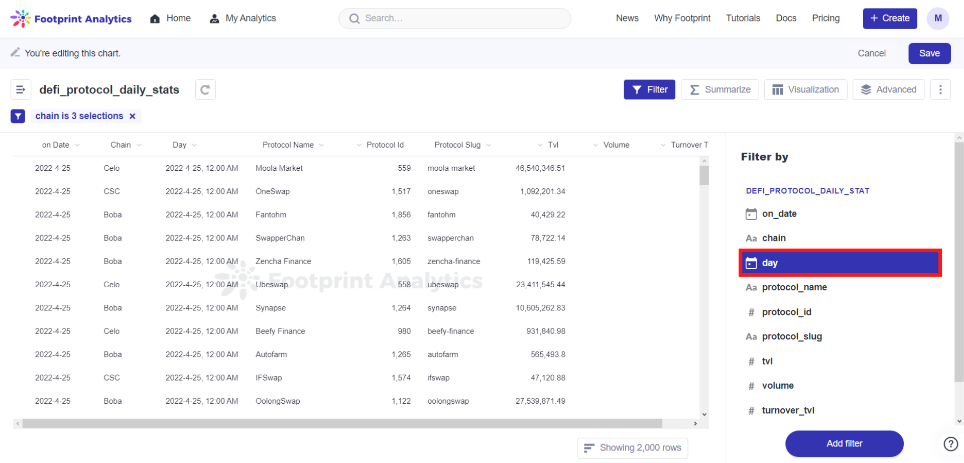
The image above shows where to find the day filter based on Step 4.
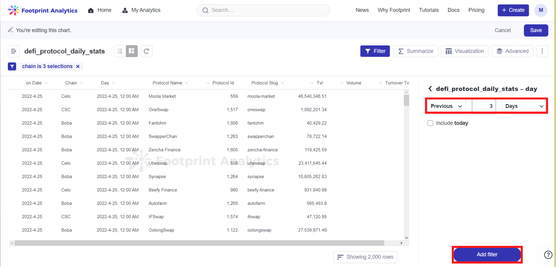
The image above shows the filters chosen based on Step 4.
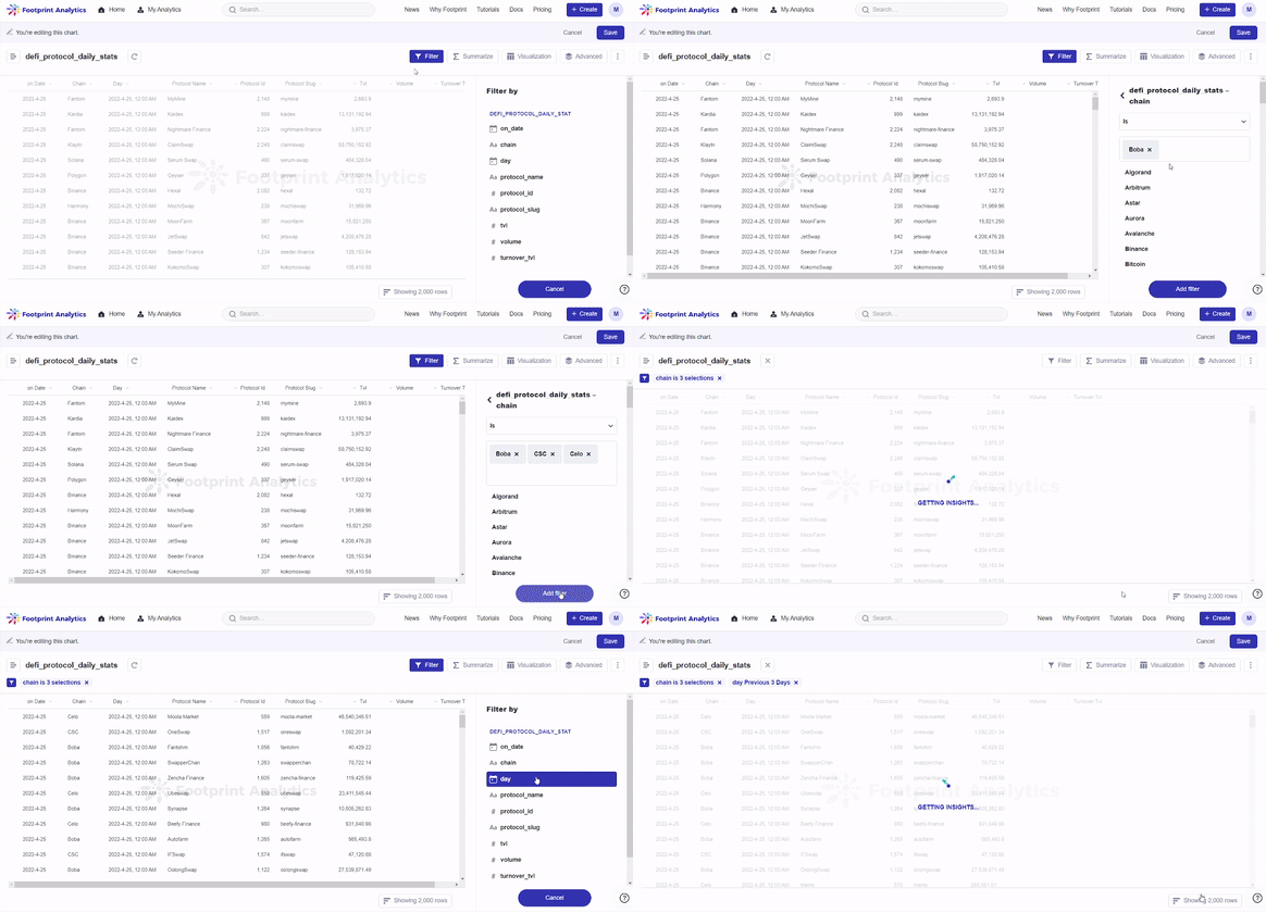
The gif above demonstrates Steps 3 and 4.
Step 5: Click Advanced on the top right corner, and click on Summarize. Click on the Pick the metric you want to see button and select Sum of tvl. Click on Pick a column to group by button and select chain, then day, **** and protocol_name.
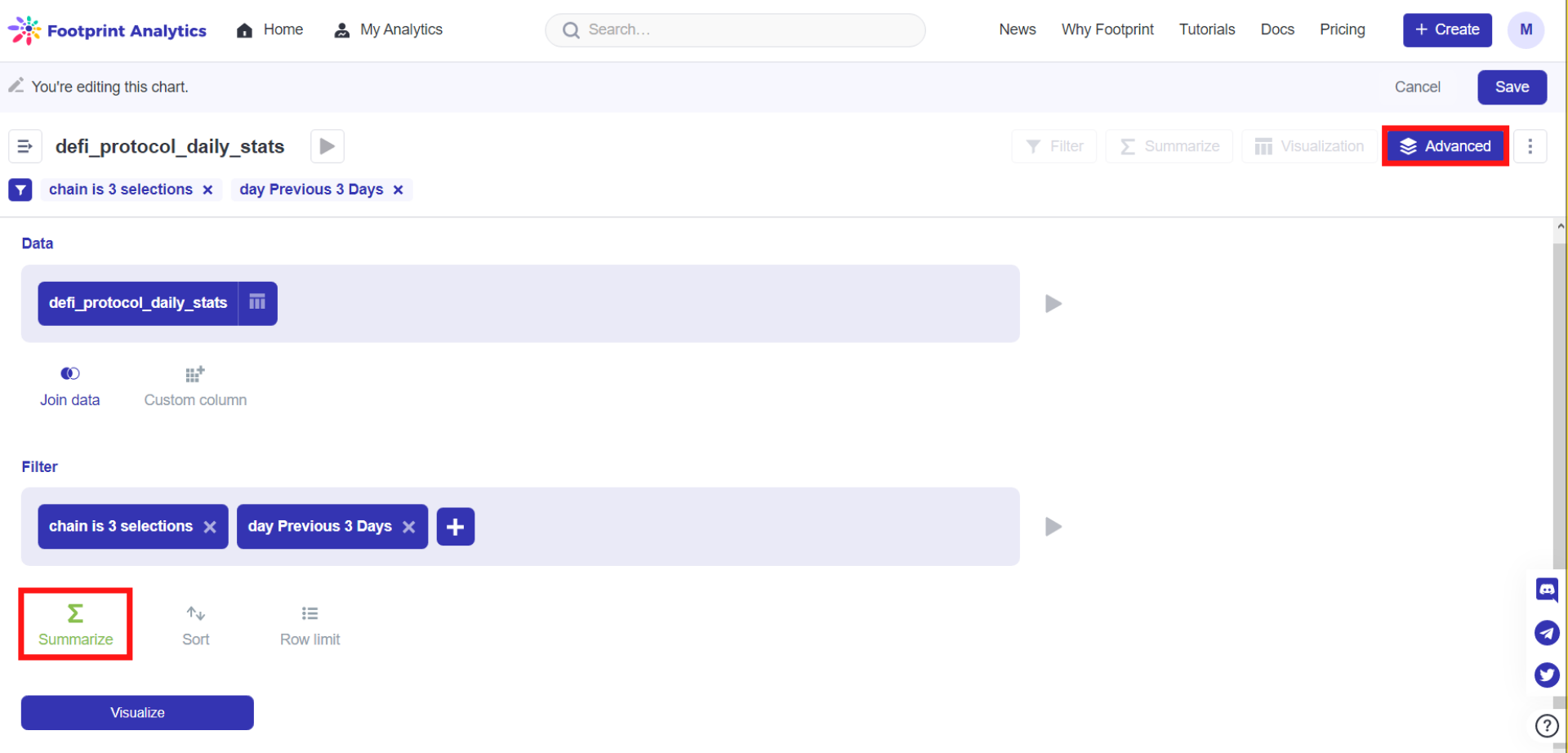
The image above shows Step 5 of clicking Advanced and Summarize.
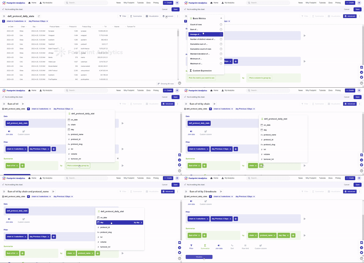
The gif above demonstrates what and where to summarize in Step 5.
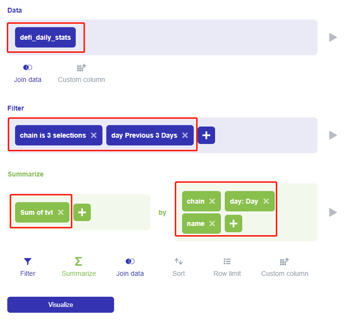
The image above shows the end results of selecting the data set, filters, and what to summarize by.
Step 6: Click on Visualize, then select Pivot Table.
You will see the default settings:
Fields to use for the table rows = chain, name; (default)
Fields to use for the table columns = day;
Fields to use for the table values = Sum of tvl;
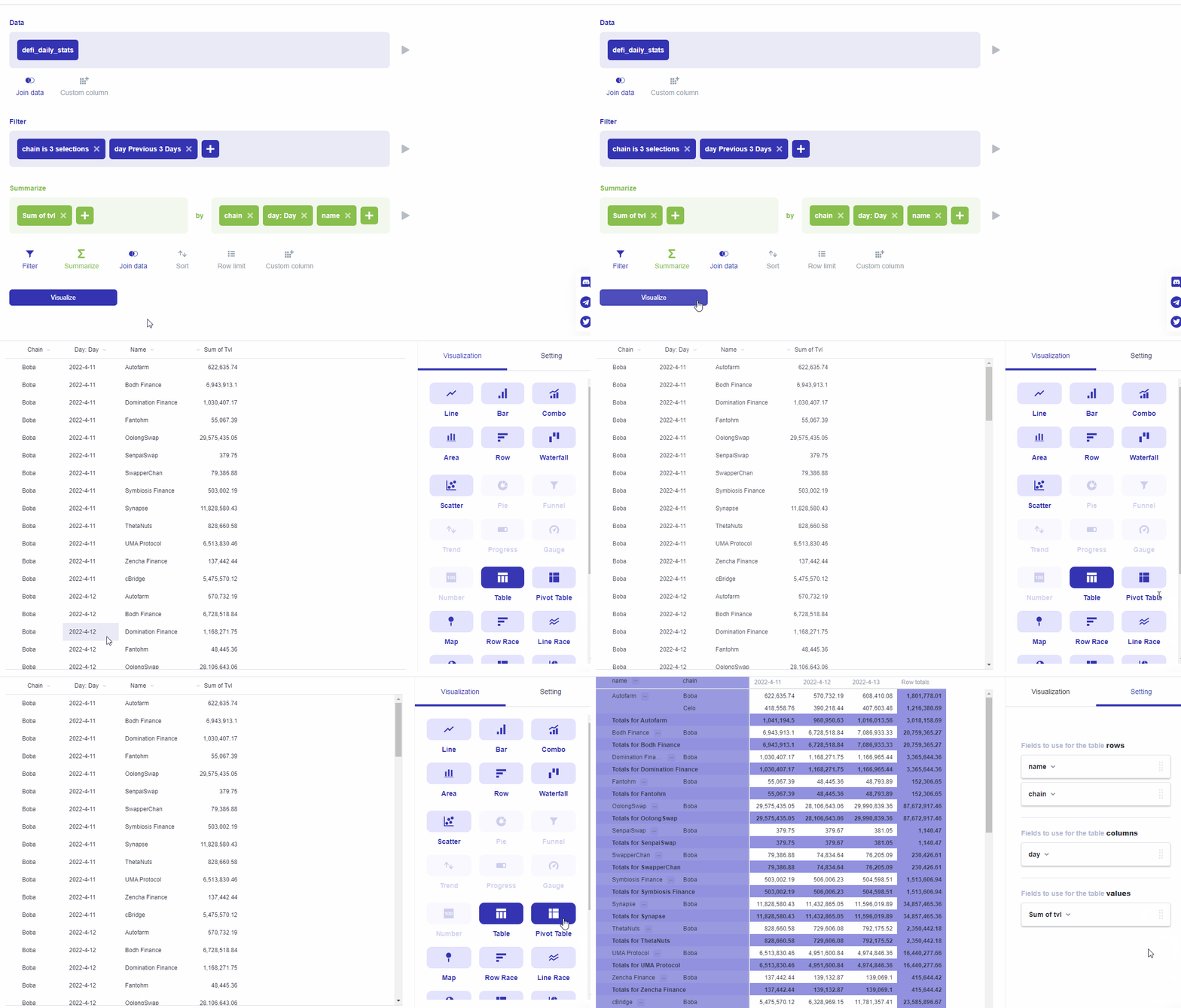
The gif above demonstrates Step 6 of clicking Visualize and selecting Pivot Table.
To rotate the table, you can move the three fields, rows, columns, and values, around by clicking and dragging them above and below each other. This can be done across the other categories as well. The chart will update accordingly.
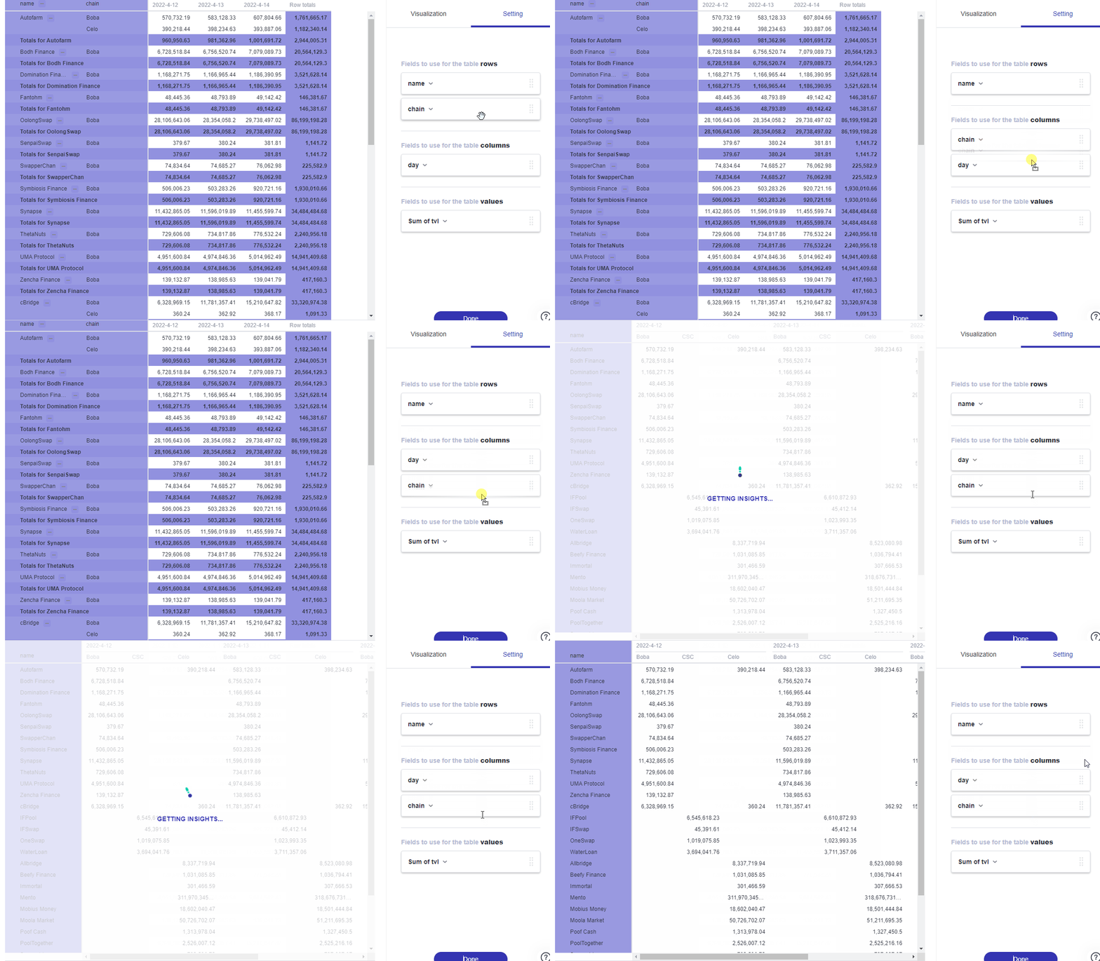
The gif above demonstrates moving a field across the two categories rows and columns.
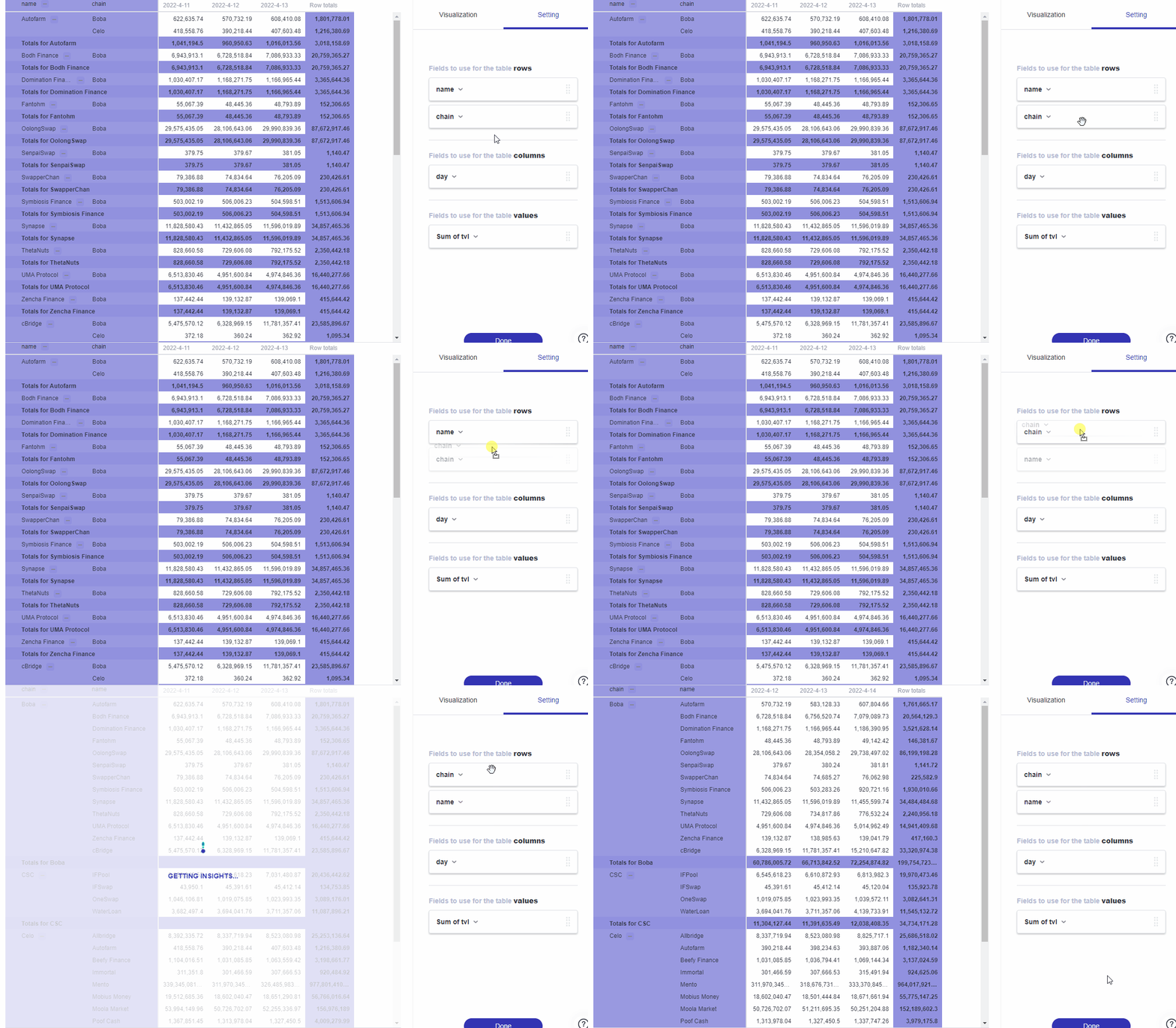
The gif above demonstrates moving a field within the same category of rows.
Step 1: Click on Setting.
Step 2: Click on the downward arrow to expand a category. In our example below, we expanded chain under rows.
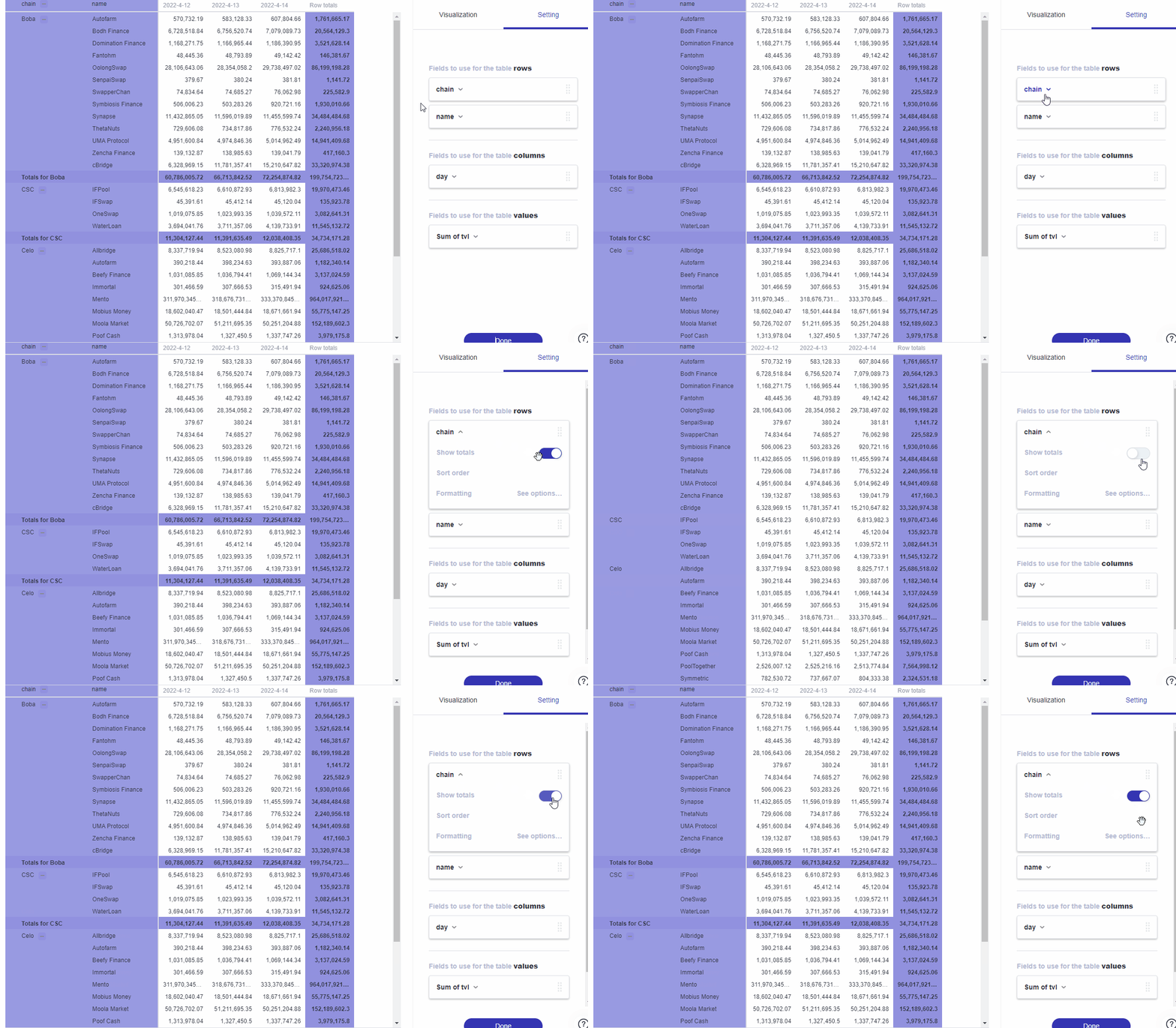
The gif demonstrates where you can find and how you can toggle showing totals under Setting based on Step 2 and 3.
You can navigate the table by collapsing and expanding groups of rows. To expand a group of rows, just click on the downward arrow next to your desired field in your table. To collapse a field, click on the upward arrow next to a field in your table.
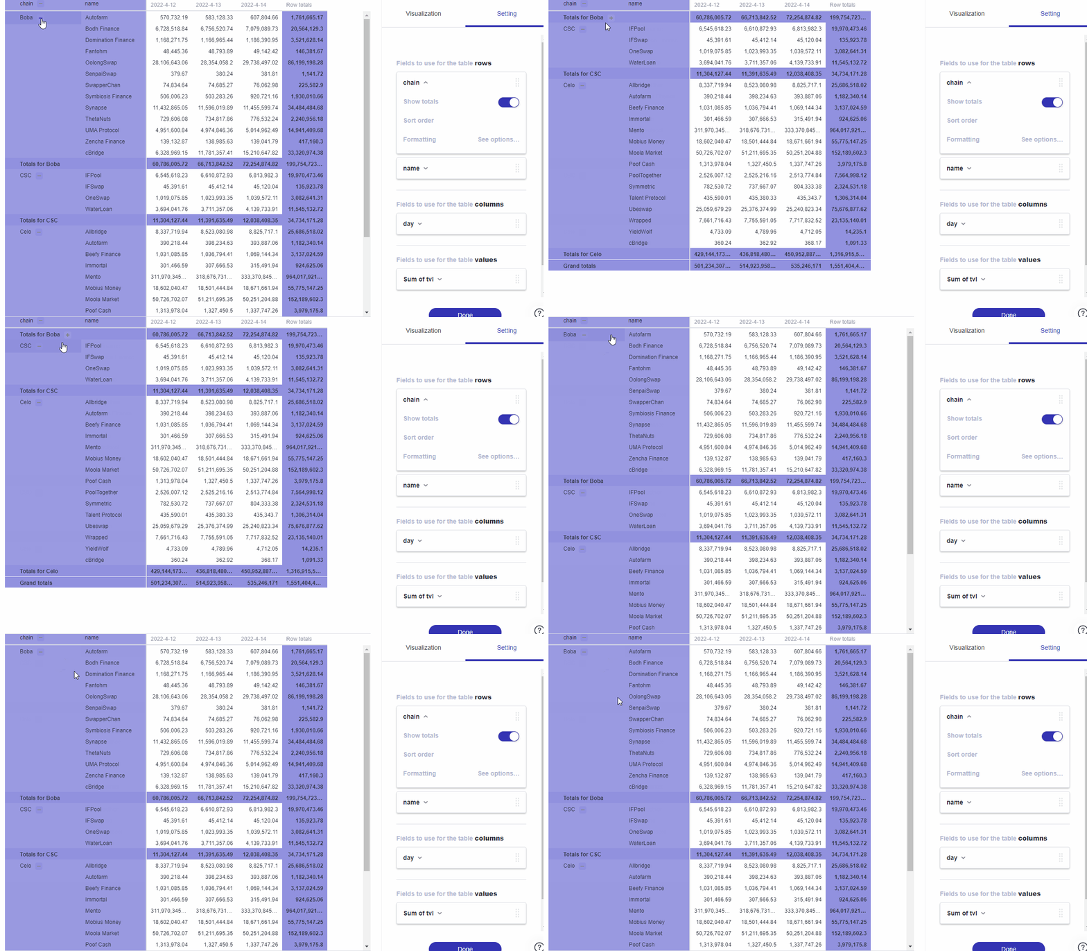
The gif above demonstrates expanding and collapsing a group of rows by using the arrows.
Each of the categories under Setting has their own additional options you can customize. To access them:
Step 1: Click on the downward arrow of your desired category.
Step 2: Click on See options next to the text Formatting to bring up more settings.
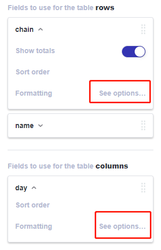
The image above shows users where they can find the See options button.
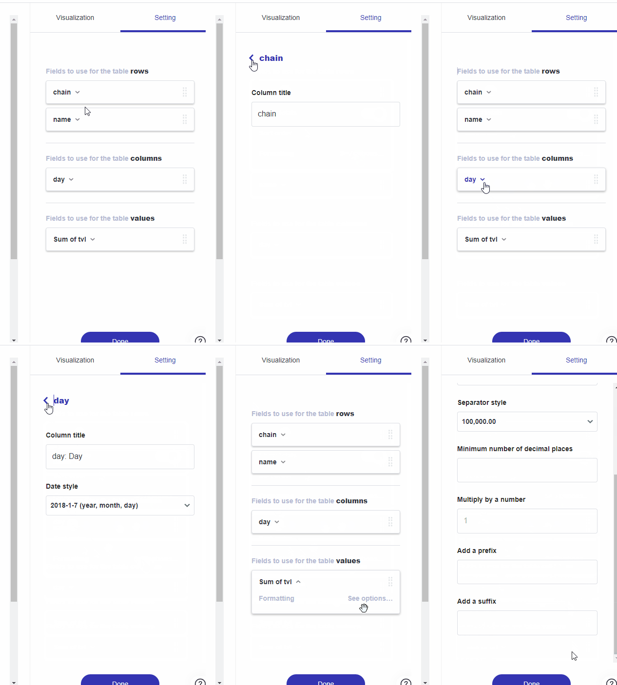
The gif above demonstrates where to find the See options button and an example menu of the kinds of settings it pulls up.
Don’t forget to click Save after setting up your pivot chart.
Updated 6 months ago
