Number and Trend
There are times when you only have one value to work with, and this is where the Numbers visualization comes into play, which is great for at-a-glance quantities such as the number of protocols on a chain.
In order to see the full picture, it's best to look at a dashboard, such as Curve's TVL from yesterday and the day before.
This guide will show you how to make a Number Visualization and Trend Chart, as well as each of their use cases.
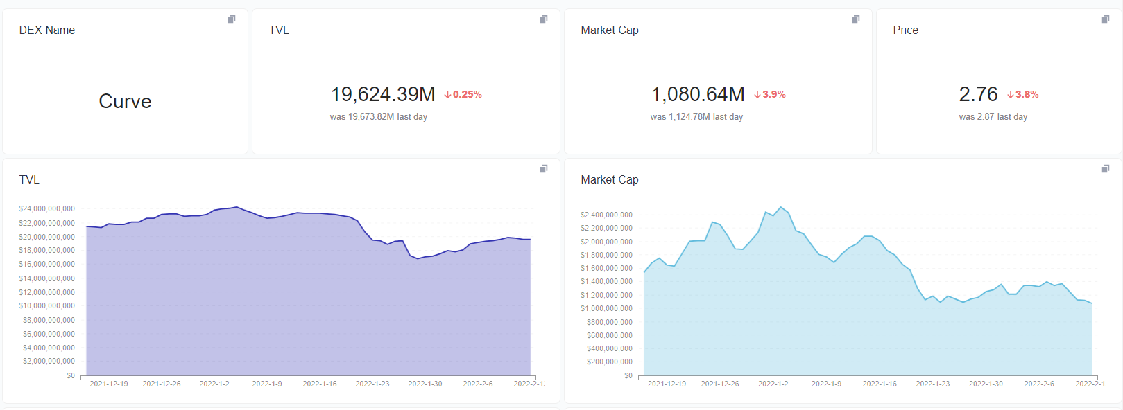
Numbers are a graphic representation of data facts. Using this option, only a huge number will be shown. . When selecting the Numbers, the following properties are available on the visualization settings:
| Configuration Property | Description |
|---|---|
| Field to show | This section is to select the field that you want to show as Numbers. |
| Style | This section is to select the style in which the numbers will be shown. There are four styles; Normal, Percent, Scientific, and Currency. |
| Separator Style | This section is to customize the number separator format by choosing from a variety of separator styles. |
| Minimum number of decimal places | This section is to set the number of decimal places that you want to include. |
| Multiply by a number | This section is to multiply the stat number so that the numbers shown can be set. (e.g, if the stat number is 1,000,000, but you want to display it as 1M, simply multiply it by 0.000001.). |
| Add a prefix | This section is to add a prefix to the stats number. |
| Add a suffix | This section is to add a suffix to the stats number. |
This section demonstrates how numbers may be visualized. Let's make a daily change chart for Curve's TVL using number visualization.
Step 1:Click on Create and select New chart.
Step 2:Search for TVL in the search box and select the data table defi_daily_stats
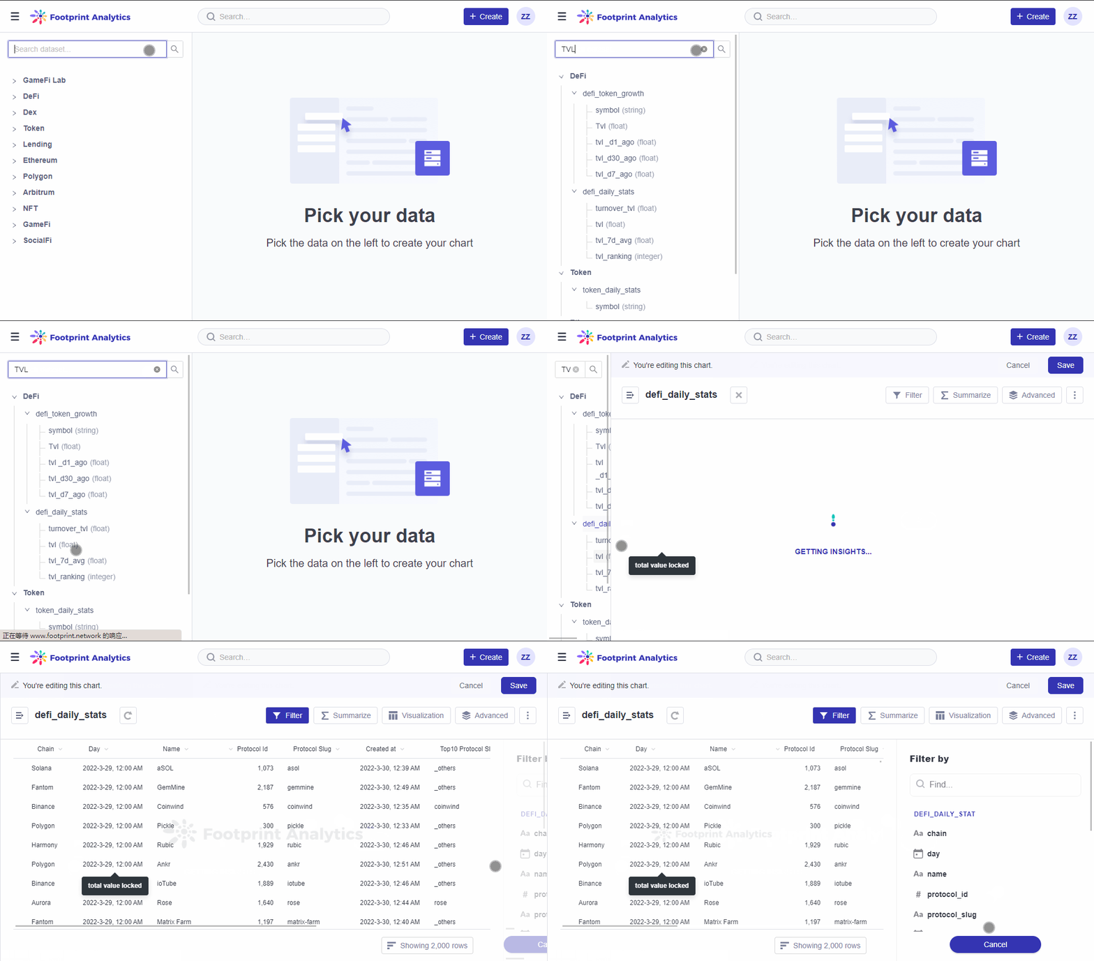
The gif above demonstrates Step 1 and Step 2.
Step3:Click Filter, select name, then search for Curve in the search box.
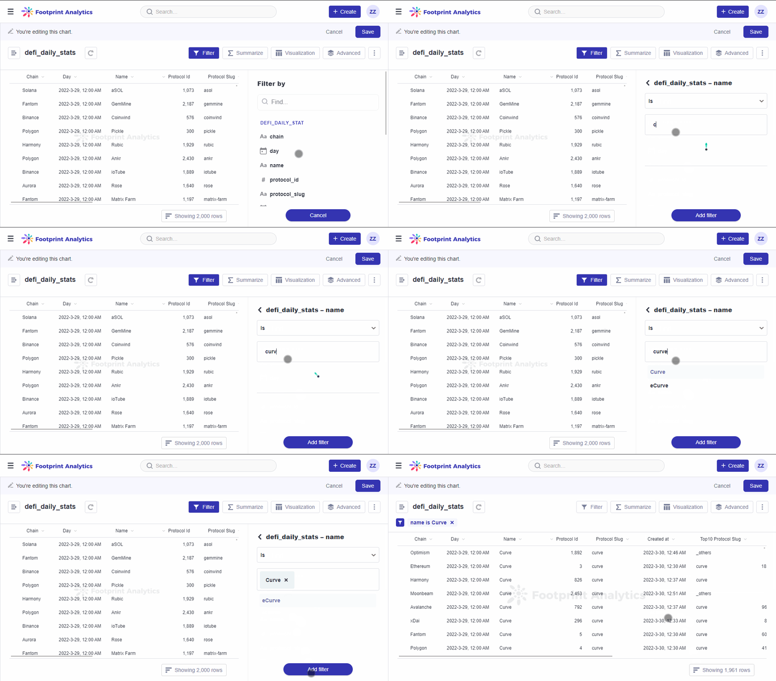
The gif above demonstrates Step 3, choosing Curve in the search box.
Step 4: Click on Summarize. As Footprint defaults to counting the records, click on Count and change it to Sum of, then select the TVL.
Step 5: Grouping the TVL by days is on our next list. In the Group by section, hover over the Day field, then click on the by day to add the grouping, and finally click on Done.
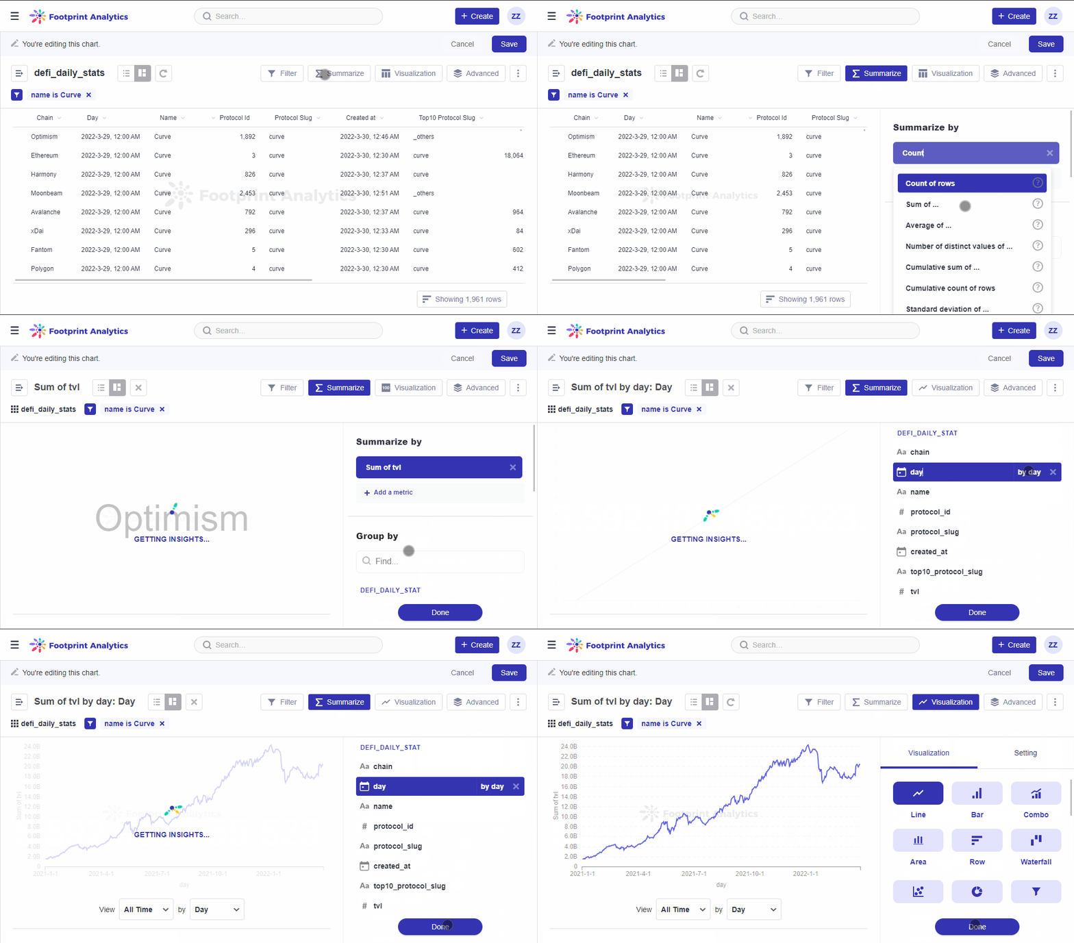
The gif above demonstrates Step 4 and Step 5.
Step 6: Click on Visualization in the top right to bring up the Visualization sidebar. Choose Number, then click on Formatting, and select the Field to show as the Sum of TVL. You can choose to condense the larger number by clicking on Display, and under Value formatting, select Compact and click Done.
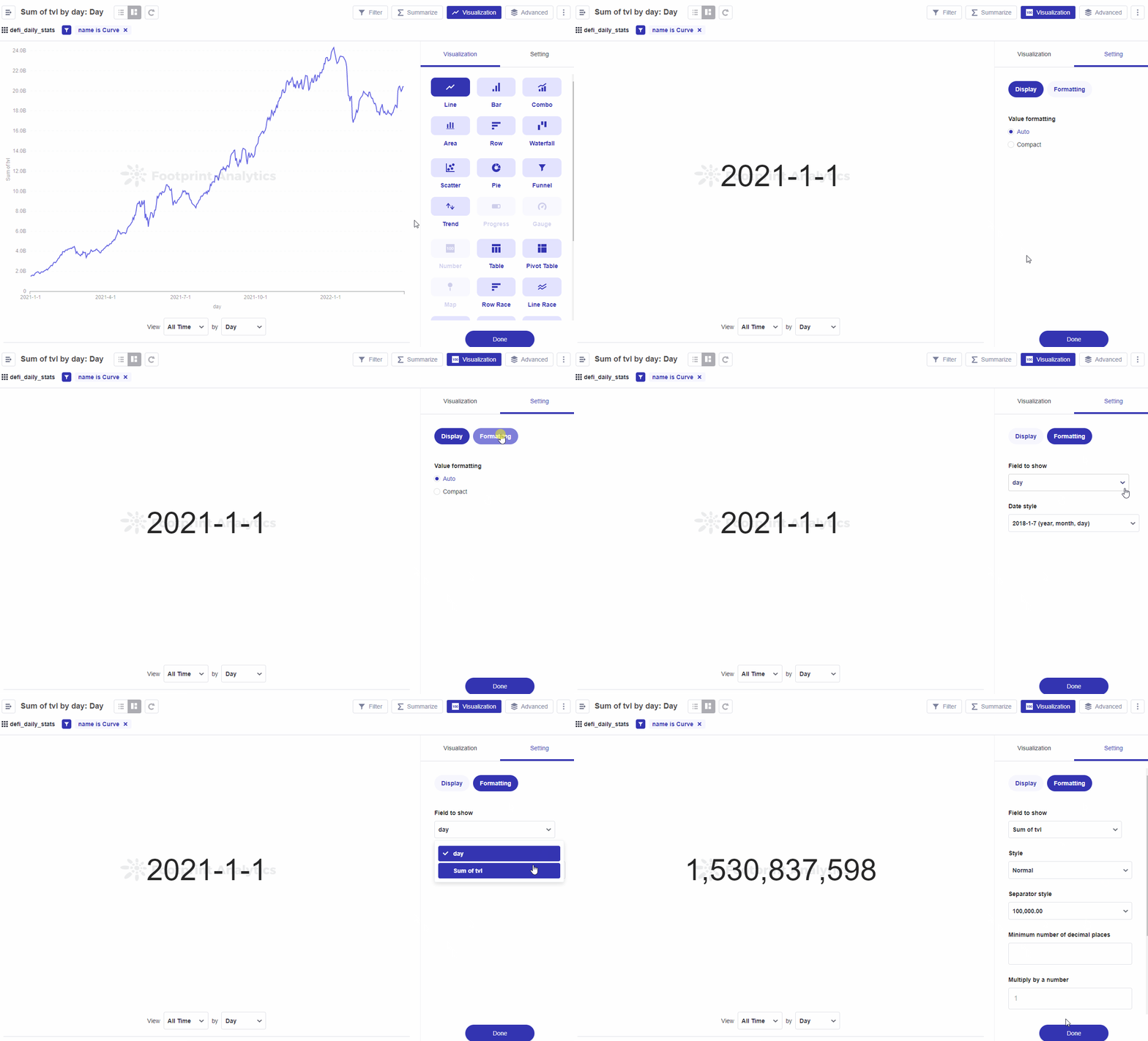
The gif above demonstrates Step 6 for setting and formatting your Number Visualization.
Your number chart is now complete; make sure to save it.
The Trend visualization is great for displaying how a single number has changed over time. To use this visualization, you’ll need to have a single number grouped by a Time field, like the Count of Orders by Created At. The Trend will show you the value of the number during the most recent period, as well as how much the number has increased or decreased compared to its value in the previous period. The period is determined by your group-by-field; if you’re grouping by Day, the Trend Chart will show you the most recent day compared to the day before that.
We can use the results from the previous section Numbers Visualization to also make a Trends Chart. You can do so under the Visualization tab. Click on Visualization, then select Trend and customize your settings as needed.
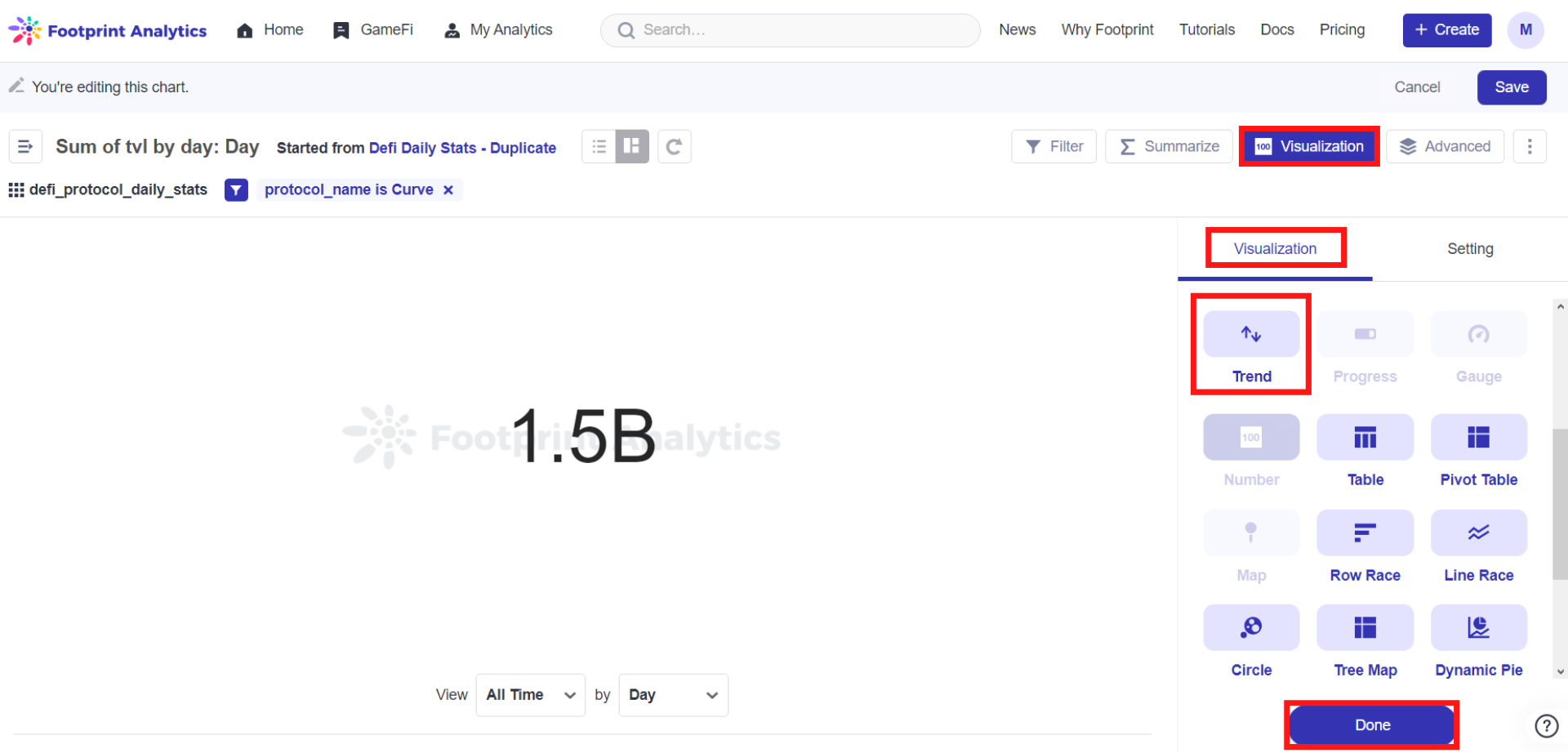
The image above shows users where they can switch their Number chart into a Trend Chart.
Updated 6 months ago
