Bar chart
Bar charts are great for displaying a number grouped by a category.
With bar charts you can compare groups of data with just a glance. One axis specifies the groups, while the other will quantify their count. The goal is to show big differences between the groups involved.
In this article, we will use an example to talk about how to create and edit a bar chart.
Bar Charts are some of the more common forms of charts. To create on with Footprint Analytics:
Step 1: Click on Create on the top right corner of the screen, then click New Chart.
Step 2: After choosing your data, click on Visualization in the upper right corner and choose Bar.
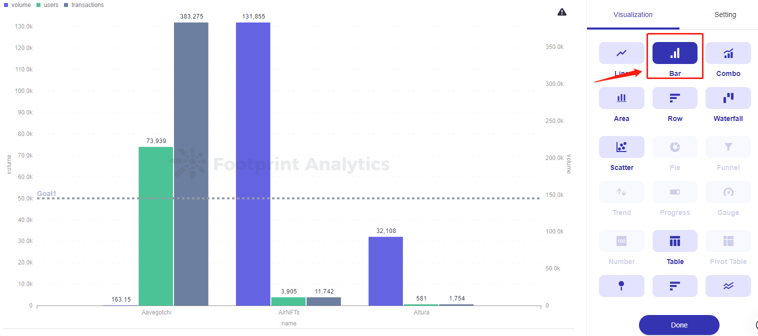
To customize your bar chart, click on Settings. There are four tabs you can use to customize your bar chart including Data, Display, Axes, and Labels. Data
The data section is where you can set your data styles, such as add prefixes and suffixes, change your units of currency, and add and remove columns. Different data sets require different numbers of columns, to add or remove them:
Step 1: Click Setting next to Visualization.
Step 2: Click on Data.
Step 3: Click on Add another series to add a column or click on the x button next to the undesired column to remove it.
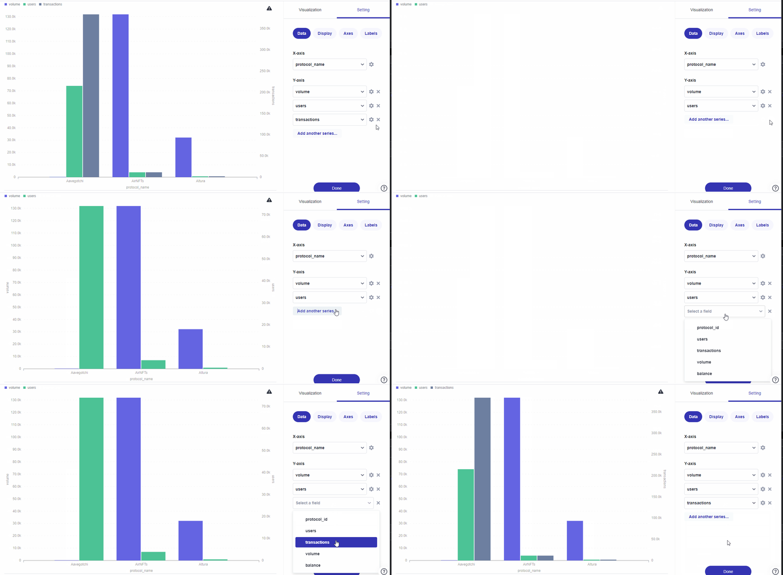
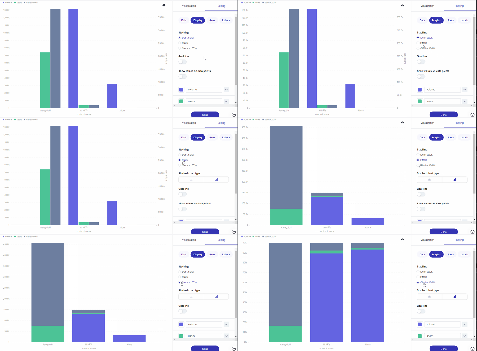
If the data you’re visualizing can be broken down into multiple categories within a whole, consider using a Stacked Bar Chart. Stacked bar charts display these different data points in smaller bars that stack on top of each other, and are useful if you want a visual representation of how these parts make up a whole and how that whole compares to others. A 100% stacked bar chart is similar, but displays those parts as relative percentages, so every bar takes up the entire y-axis.
To adjust this setting:
Step 1: Click on Setting. Display.
Step 2: Click on Display.
Step 3: Click on Stack or Stack - 100%.
You can add a Goal line that specifies where you want your numbers to be in this section as well. Just toggle the button under the same Display tab.
In this example, we will be adding a goal line of 50000 and labeling it Goal1.
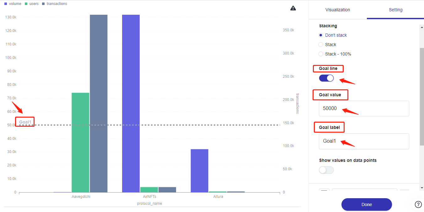
The image above shows users where the Goal line toggle is, where we are putting our value, where we can change the label, and where the results show on the chart.
The Show values on data points option displays each bar’s numbers on top of their corresponding bars. The toggle for it can be found under the Goal line settings in the same Display tab.
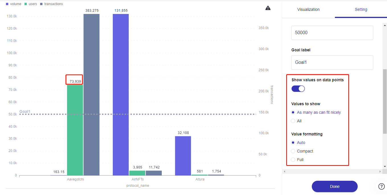
The image above shows users where they can find data point settings and where those values can be seen on the bar chart.
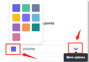
To further personalize your bar chart, you can even change the color of your bars. Right under the Show values on data points settings, you can click on the colored box and select a color to change it into from the pop-up menu. You can also click on the downward arrow icon next to it to reveal more color options.
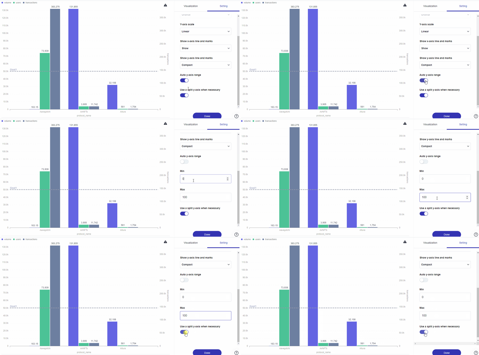
You can adjust the scale of the x and y axes, to do so:
Step 1: Click Display.
Step 2: Click Axes.
Step 3: Customize as desired using any of the options as described in the table below.
| Customizable Options | Description |
|---|---|
| X-axis scale | This option lets you choose between time series, which will limit the number of values displayed, or ordinal scales, which will list each value in the series along the x axis (this is great for if you’re plotting steps in a sequence). |
| Y-axis scale | This option lets you choose between linear, power, or log scales. The linear option is selected automatically and for our example, provides the most accurate representation of our data. The power option gives more details while the log option gives the most details and is great for showing the rate of change over time, especially when your data has an exponential rise or decay. |
| Show x-axis line and marks | This option lets you change the way the categories and quantities are represented on each axis. The options for the x-axis include Hide, Show, Compact, Rotate 45˚, and Rotate 90˚. |
| Show y-axis line and marks | This option lets you change the way the categories and quantities are represented on each axis. The options for the y-axis are Hide, Show and Compact. |
| Auto y-axis range | This option automates the range of your y-axis. |
| Use a split y-axis when necessary |
The Labels section is where you can choose to show labels or not. To set your labels:
Step 1: Click on Setting.
Step 2: Click on Labels.
Step 3: Toggle on or off your labels for your x and y axes as needed. In this example, we named the label on the x-axis as name and named the label on the y-axis as volume using the fields underneath each option to customize our labels for each axis.
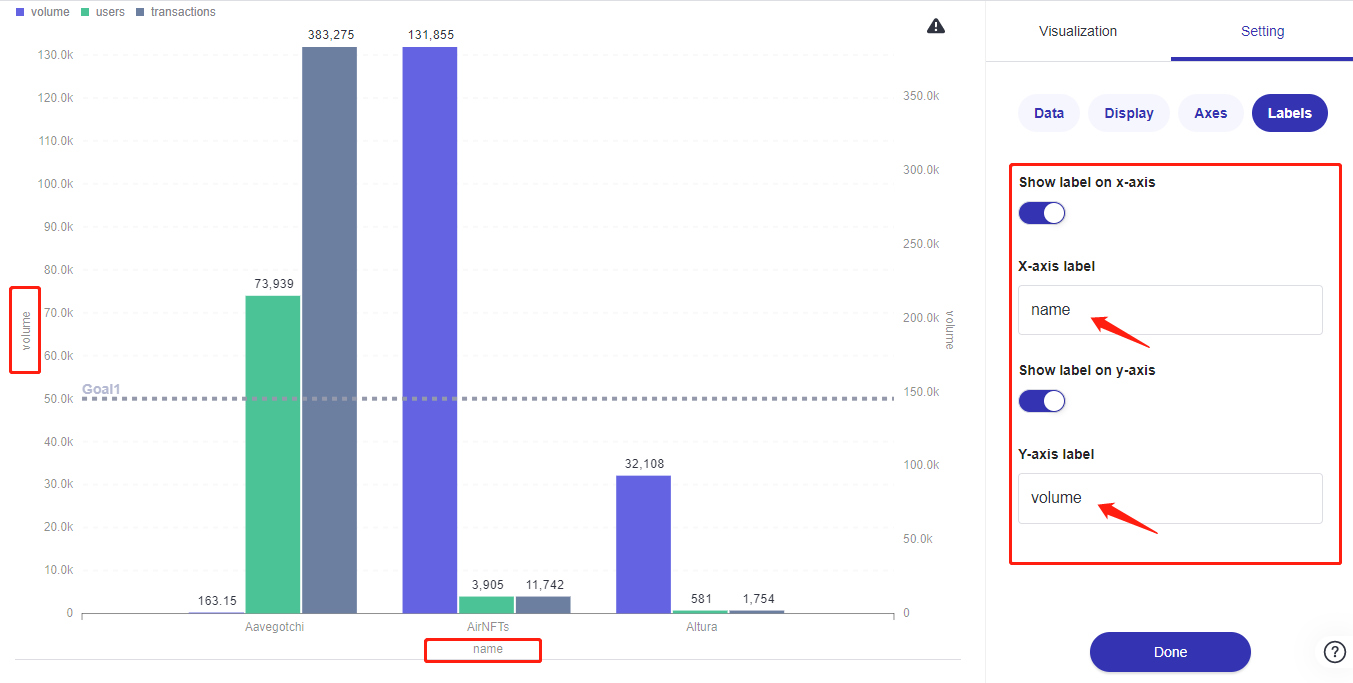
It may take some back-and-forth to figure out which display settings are suitable for your data. Go ahead and try a few different options to see what works best for you here.
Updated 5 months ago
