Tables
Tables are often what you need when you’re working with a lot of fields. The table visualization in Footprint Analytics comes packed with features. We will be exploring some frequently used and practical functions of data visualization. Data visualization is an efficient way of communicating the graphic representation of data through the use of various charts.
After creating your table, you can further customize it by adding, removing and editing columns from this table to better represent the necessary data.
You can select which columns you’d like to include in your tables. To add a new column:
Step 1: Once on your chart or table, click on Visualization.
Step 2: Click on Setting.
Step 3: Click on Columns.
Step 4: Scroll all the way down and click on the + icon..
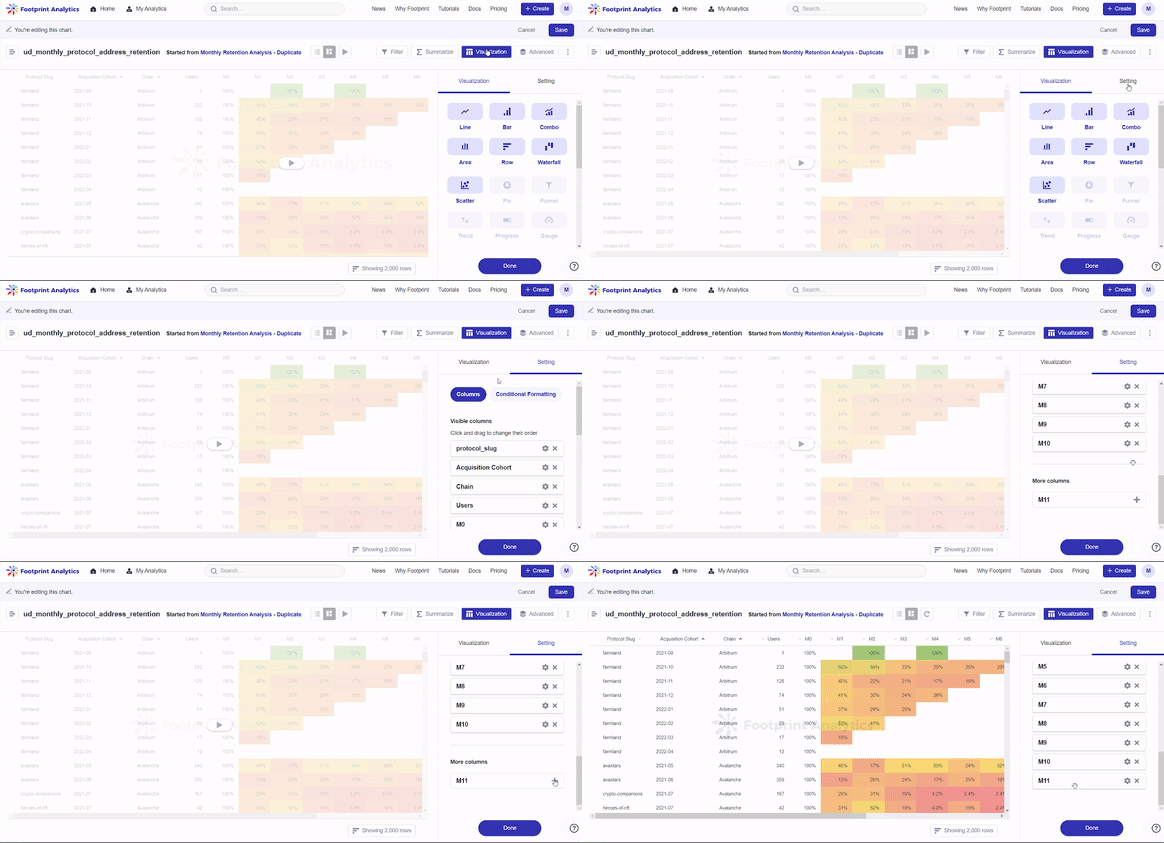
The gif above demonstrates how to add a column to your Table.
To removing columns in your table:
Step 1: Once on your chart or table, click on Visualization.
Step 2: Click on Setting.
Step 3: Click on Columns.
Step 4: Scroll to your desired column and click on the x icon.
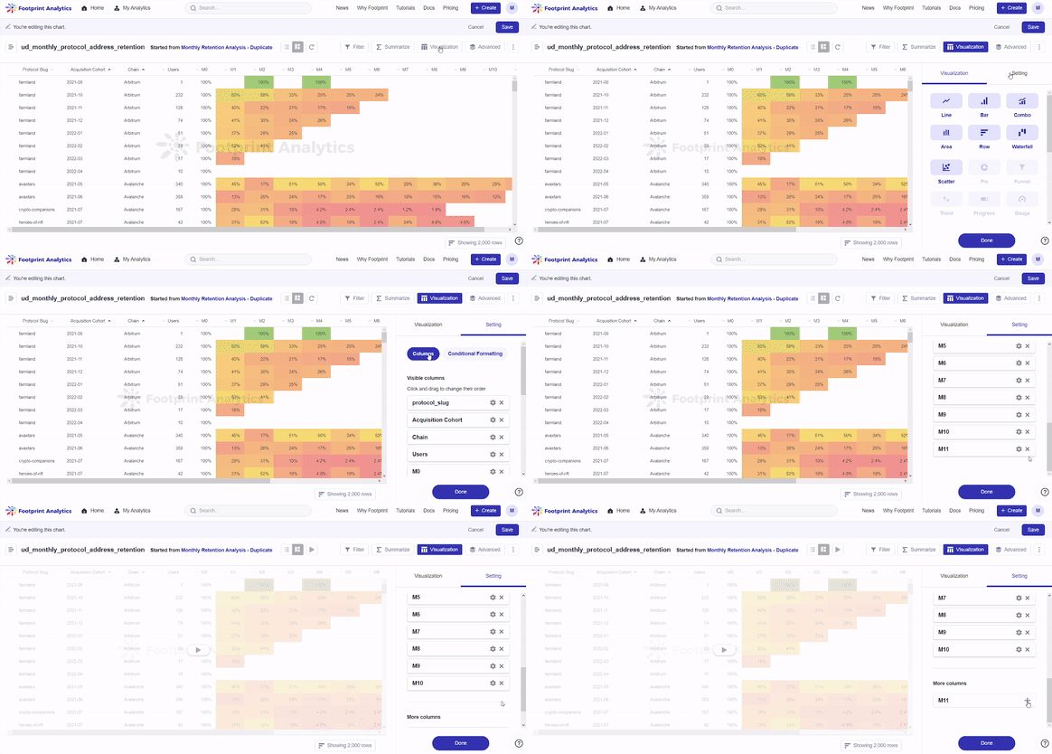
The gif above demonstrates how to remove an unwanted column from your Table.
To edit columns in your table:
Step 1: Once on your chart or table, click on Visualization.
Step 2: Click on Setting.
Step 3: Click on Columns.
Step 4: Click and drag the columns up and down to change their order of appearance on the table. The results will be shown in real time in the table to the left as shown below.
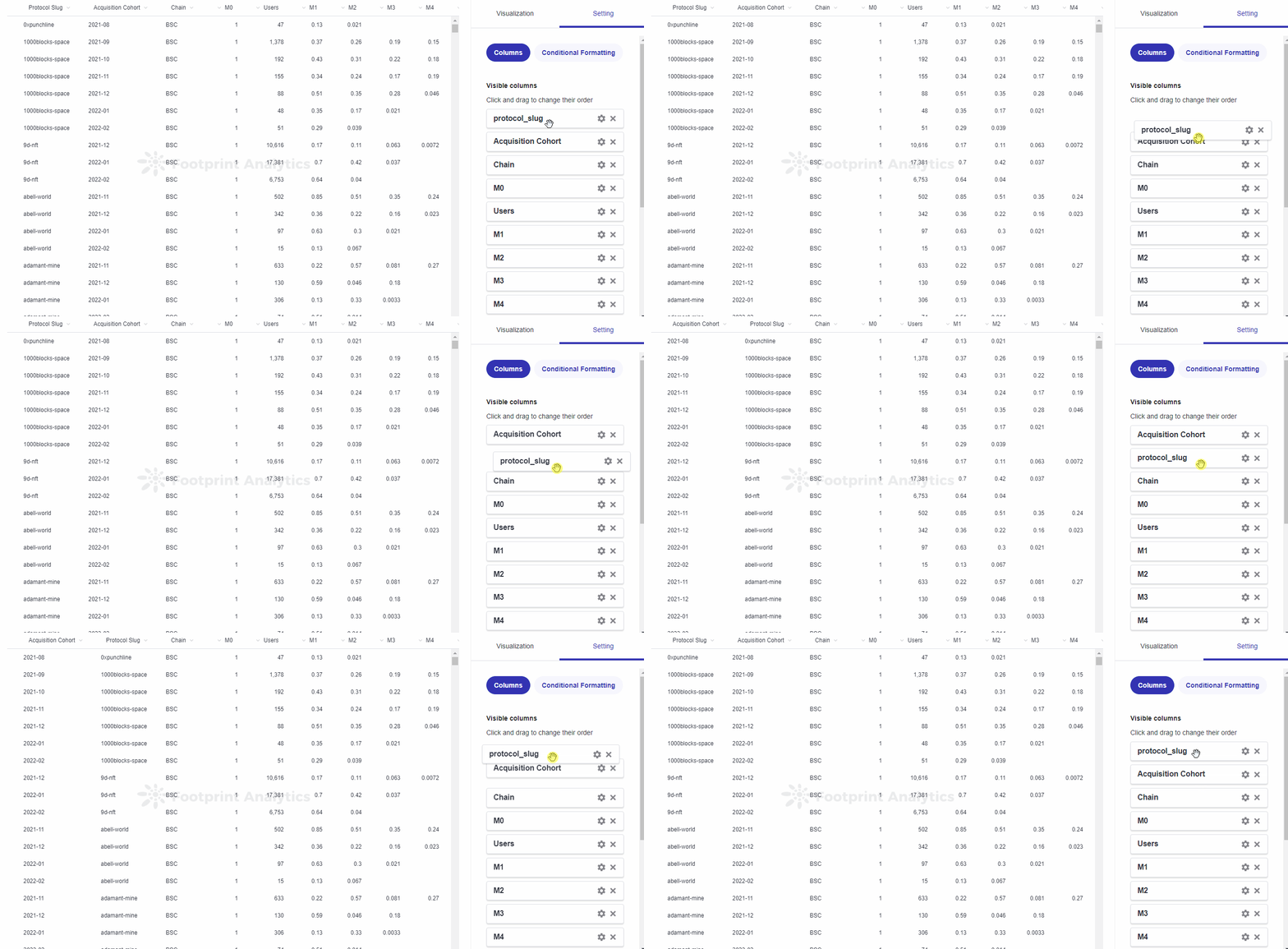
The gif above demonstrates how to click and drag columns up and down in your Table to rearrange them.
You can add rules to make the cells in your table to change color if they meet certain conditions. To change your table settings:
Step 1: Once on your chart or table, click on Visualization.
Step 2: Click on Setting.
Step 3: Click on Conditional Formatting.
Step 4: Click on Add a Rule and set as desired. To access or edit existing rules, scroll down and click on your desired rule.
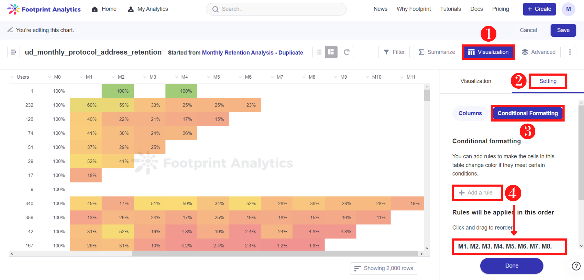
You can highlight cells or rows based on the values they contain, which makes it easier for you to see value ranges and outliers. There are two types of conditional formatting: Single Color and Color Range.
Single Color: When you want to color cells based on if the value in those cells meets a certain criteria, use the single color option.
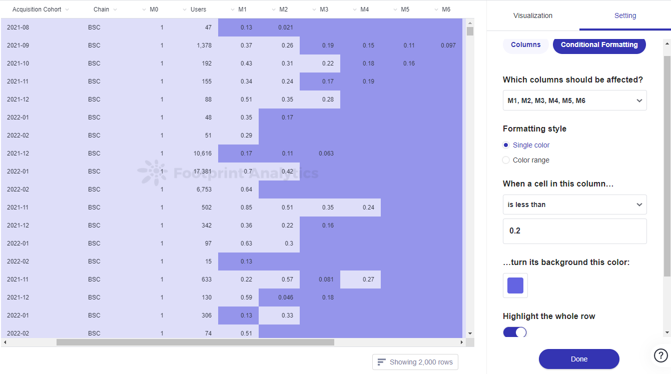
The image above shows users what a Single-Colored Table looks like.
Color range: If you want to show the value’s relative position in the range of values for a column (or multiple columns), use the color range option.
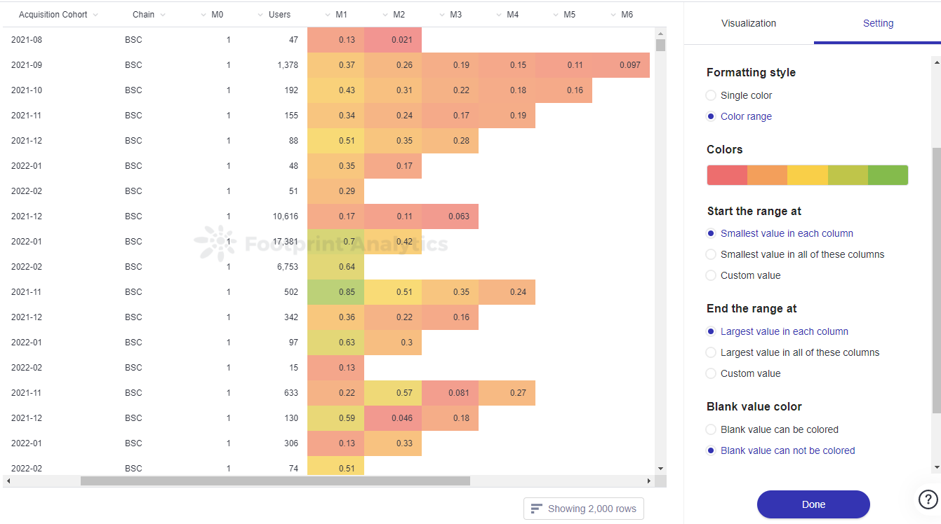
The image above shows users what a Color-Ranged Table looks like.
You can change the settings for each of the columns by clicking on the respective column’s gears icon under the Columns tab in Visualization Settings.
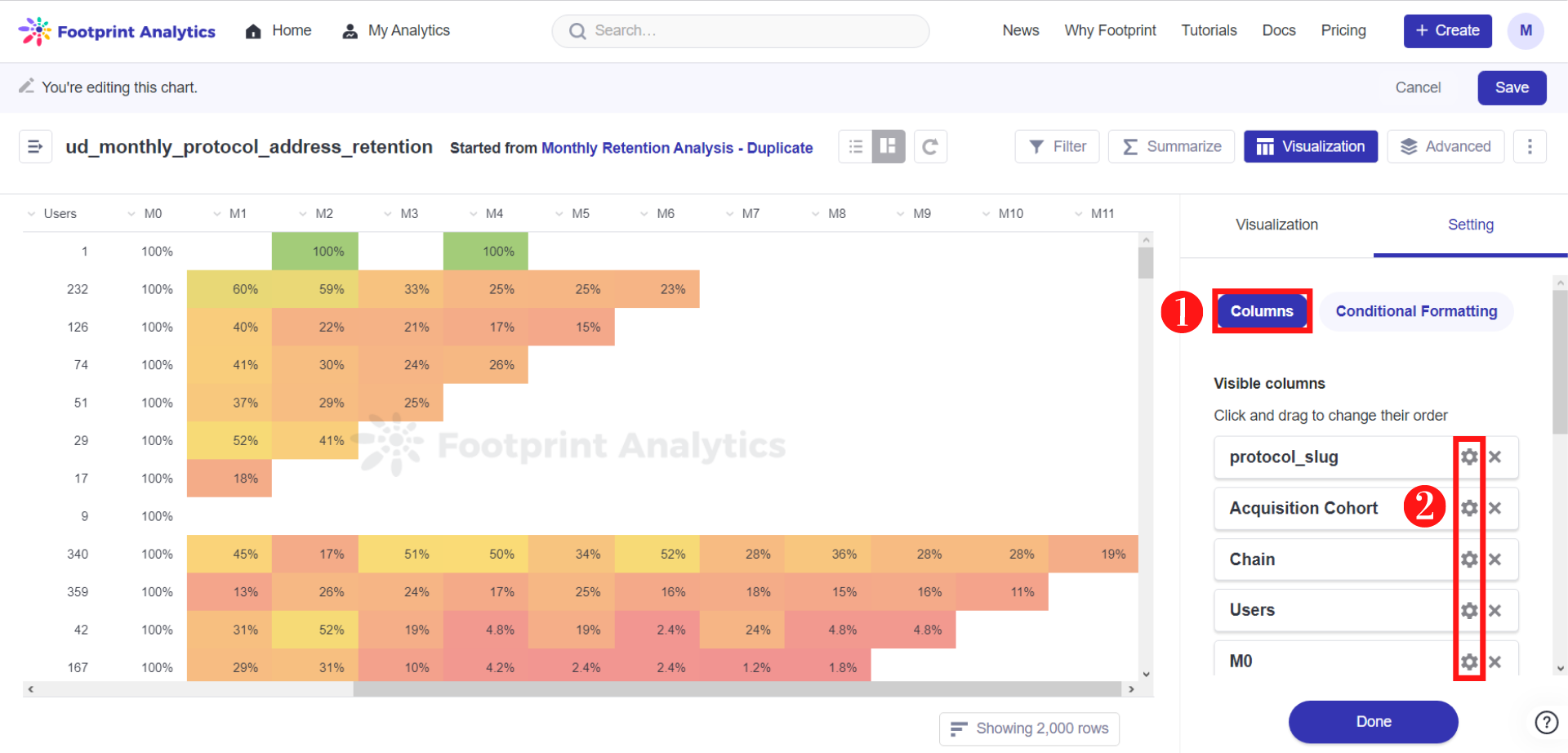
The image above shows users where the gear icons are under the Visualization tab if they want to change their column settings.
You can add a link to the fields in your table to reference data from anywhere else. To add a link:
Step 1: Click on the gear icon of the column you’d like to edit.
Step 2: Scroll down and click on the drop-down menu below View as link or image. Select Link. Another field will appear below.
Step 3: Fill in the necessary Link URL.
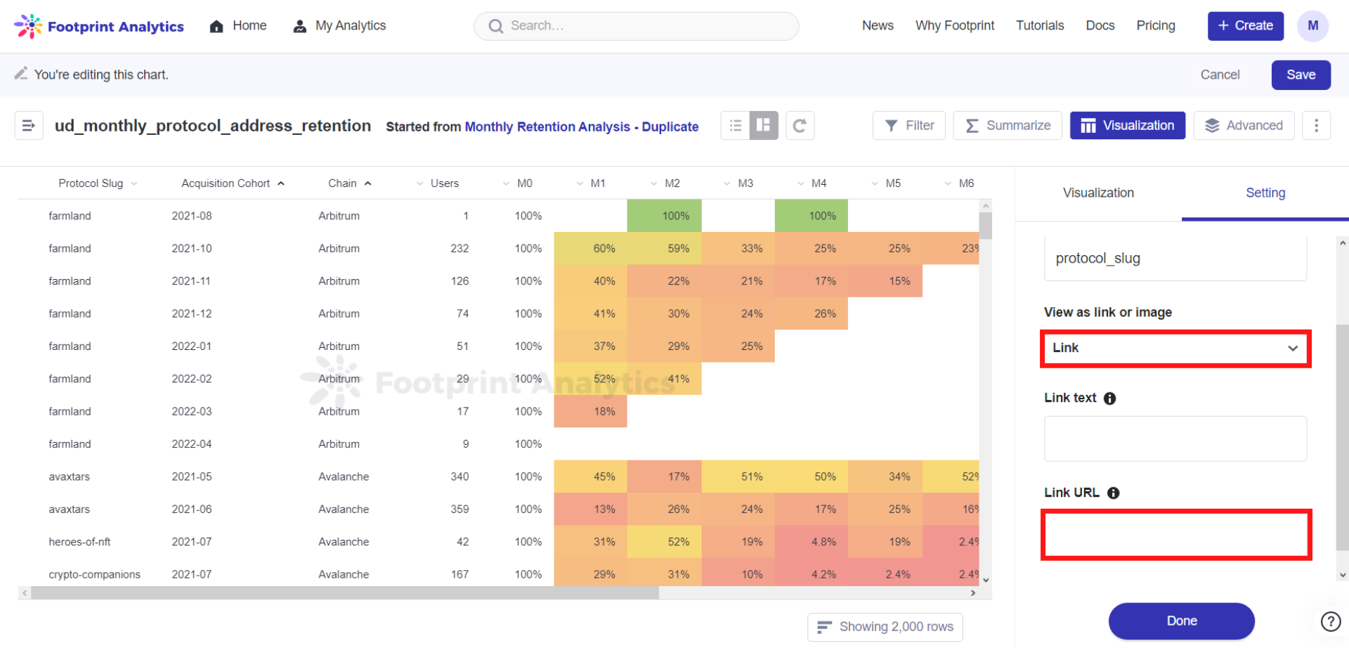
The image above shows users where to enable links being added to your fields and where to place your desired URLs.
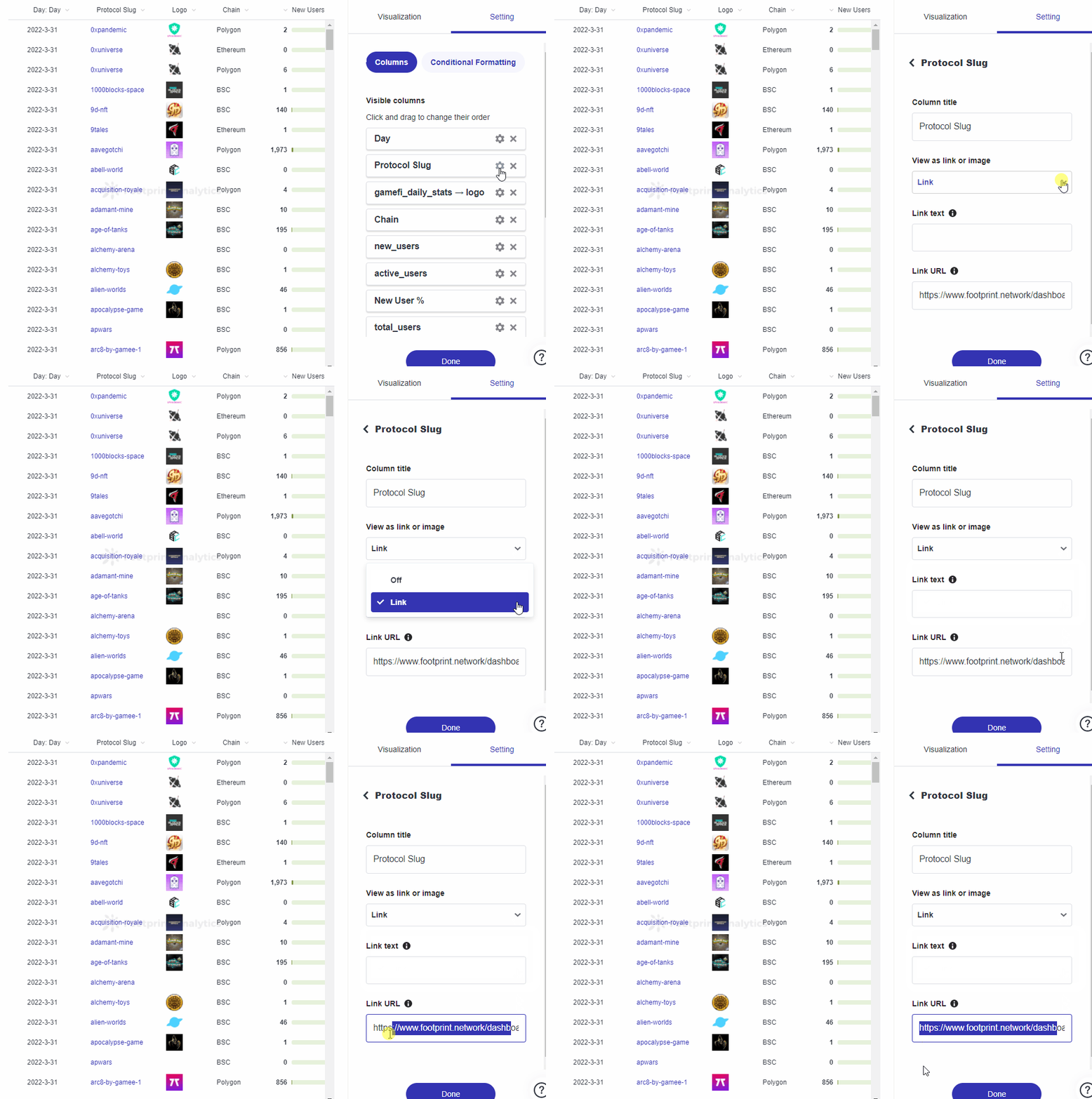
The gif above demonstrates Steps 1 to 3 of how to link your URLs into your Table fields.
For scalar values, you can add a Mini Bar Chart to show the value’s position within the range of values in the column. This function only applies to values or numbers.
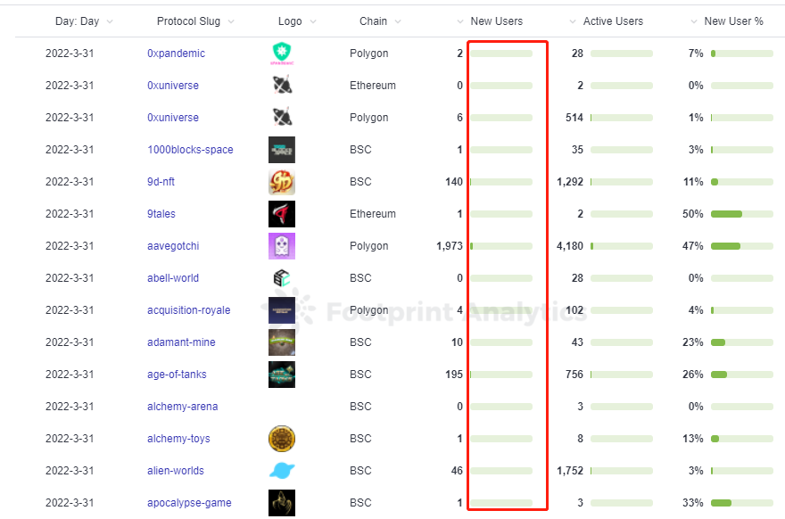
The image above shows Mini Bar Charts next to numerical data in a Table.
To add mini bar charts to the data within your table:
Step 1: Click on the gear icon of the column you’d like to edit.
Step 2: Click on the switch next to Show a mini bar chart.
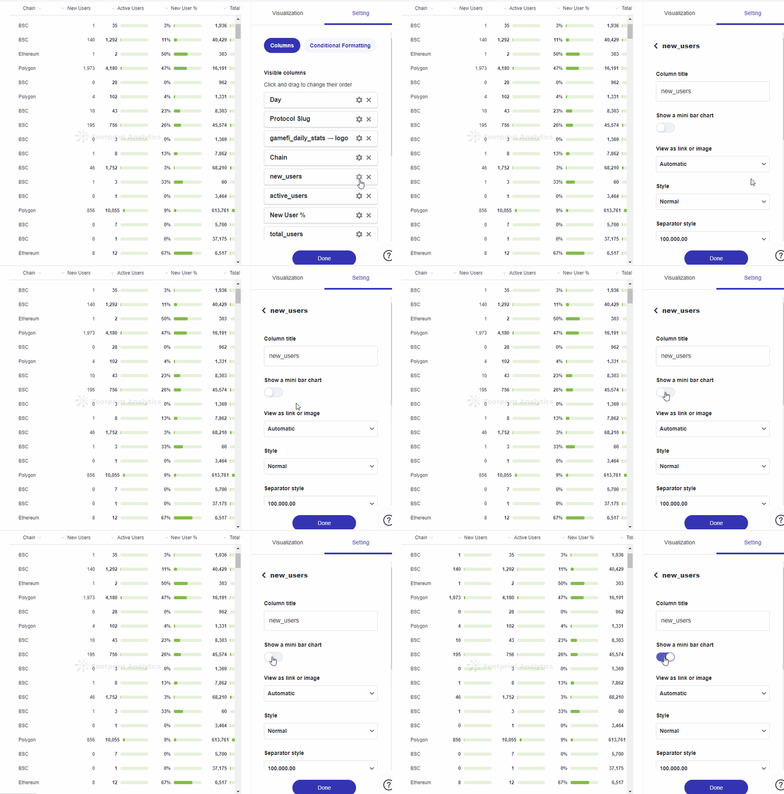
The gif above demonstrates to users how to enable a Mini Bar Chart for certain numerical columns in your Table.
Updated 6 months ago
