Design
With the dashboard ready, you can start designing a dashboard to personalise and organise it for a cleaner and more legible look.
Editing positions and sizes
You can move your charts and text boxes by simply clicking on them and then dragging them anywhere within the dashboard. Organize your dashboard items accordingly to improve readability.
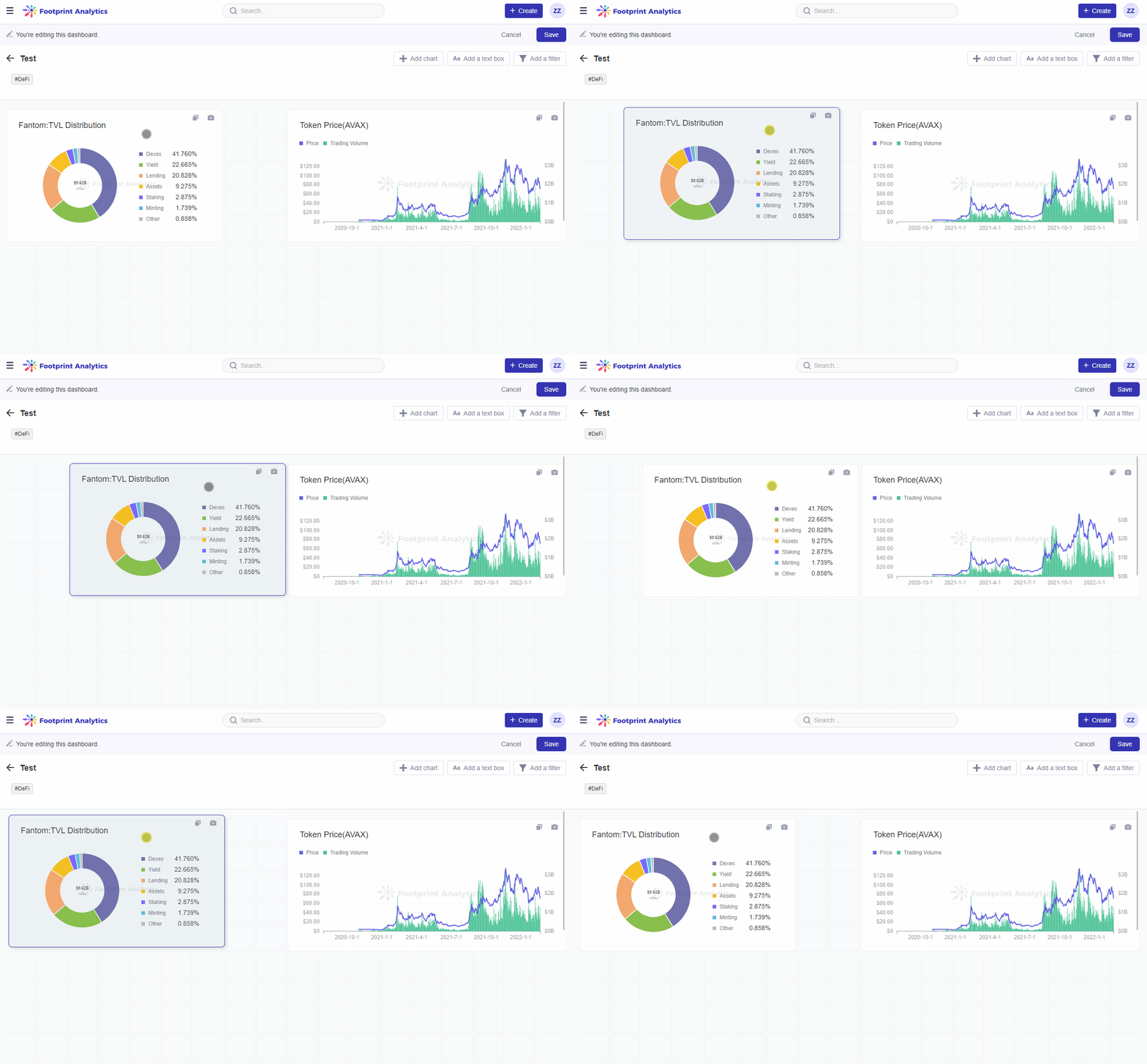
The gif above demonstrates how to move your dashboard items around
You can also resize your dashboard items using their bottom right corner handles. Click and drag the handle to resize and adjust your charts and text boxes.
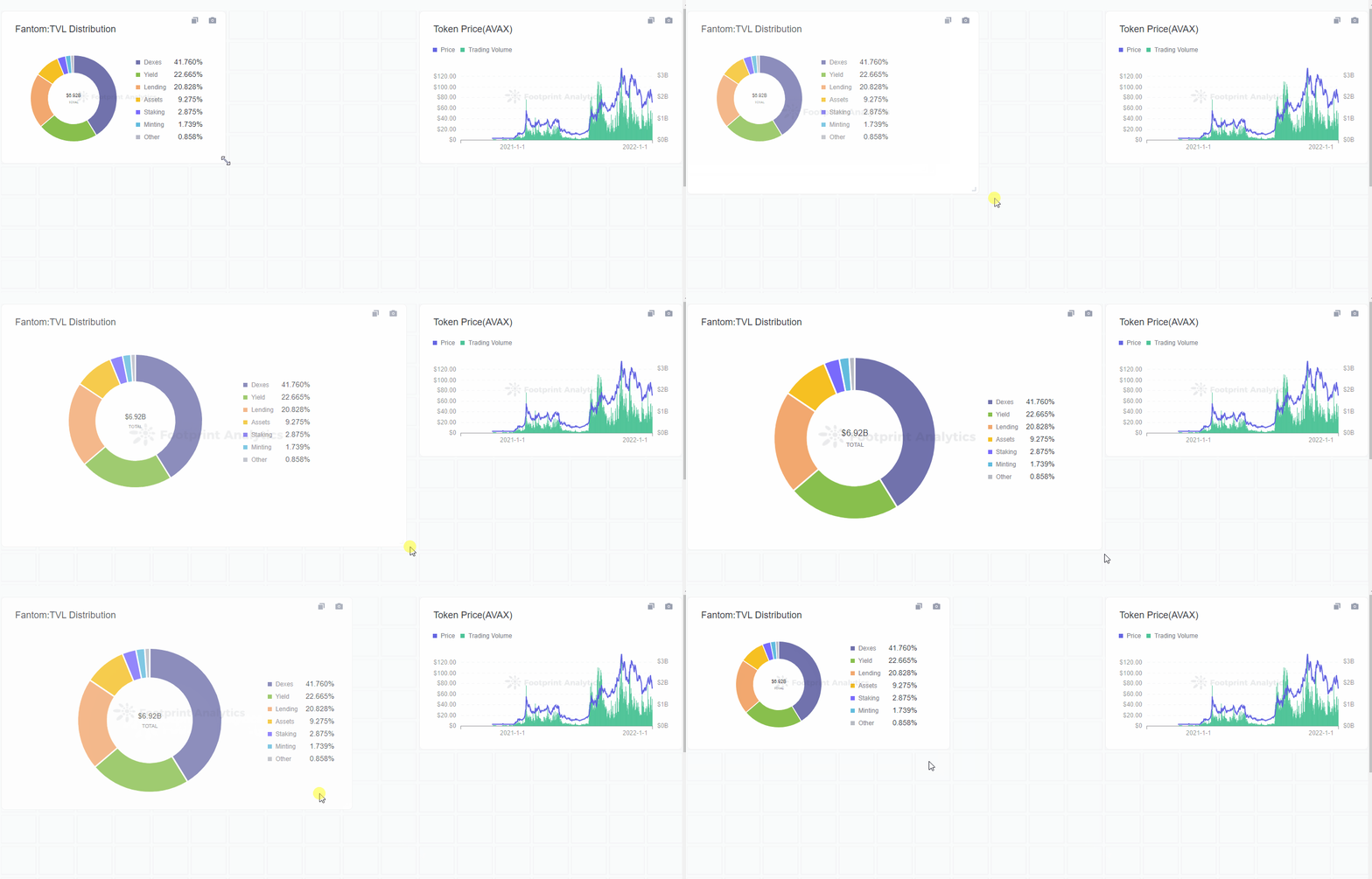
The gif above demonstrates how to resize your dashboard items.
Adding a Text Box
A Text Box provides a space for you to display plain text in your dashboard. This is a great tool to illustrate the logic of metrics calculation, add introduction text to the dashboard, add notes to correlate your charts, and more. To add a text box:
- Click on
Add a mediabox on the top right hand-side of the screen.
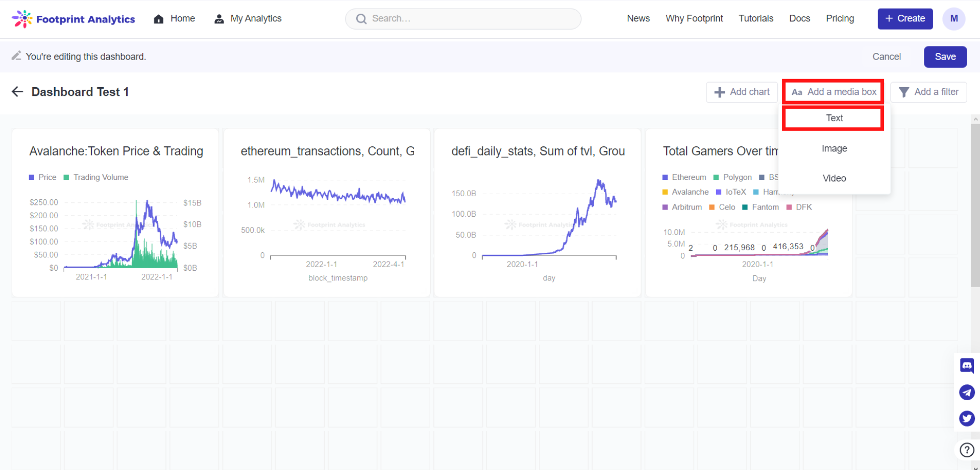
The image above shows where you can find the option to add a text box.
- Select
Text. A text box will appear on your dashboard. You can edit its position and size similar to charts, by dragging on their respective bottom-right handles.
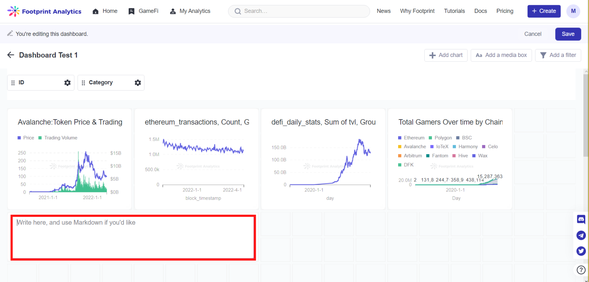
The image above shows what a text box would look like in your dashboard.
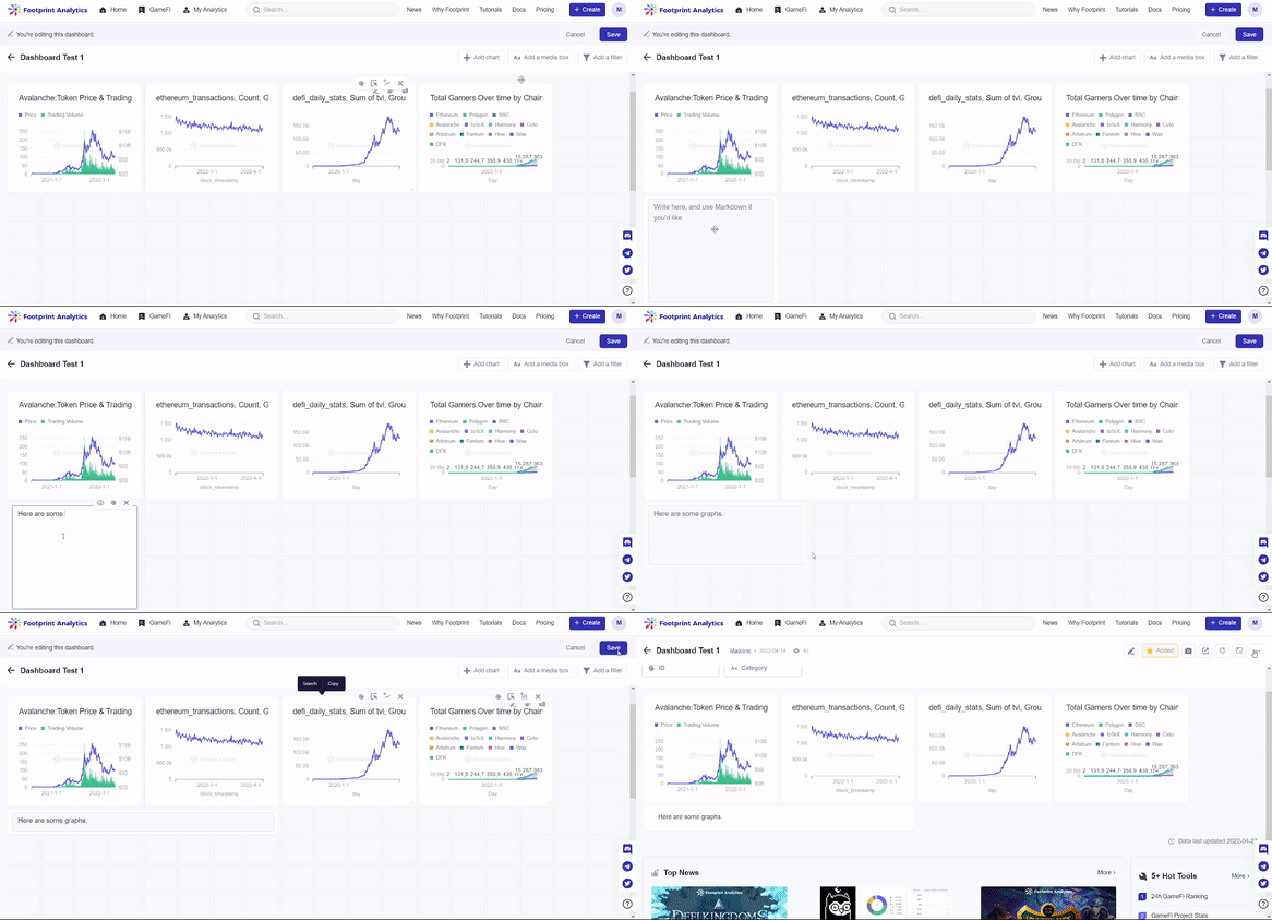
The gif above demonstrates how to add a text box from Step 1 to 2.
Visualisation options
Dashboard items each have a submenu that pops up on their top right corners upon hovering your mouse on them. One of the submenu items is the Visualisation options, which is used for modifying dashboard item attributes, such as its Display, Axes, and Labels. To use the Visualization option:
- Hover your mouse over your desired chart or text box. The submenu will pop up on the top right corner of this chart or text box.
- Click on the
Paletteicon.
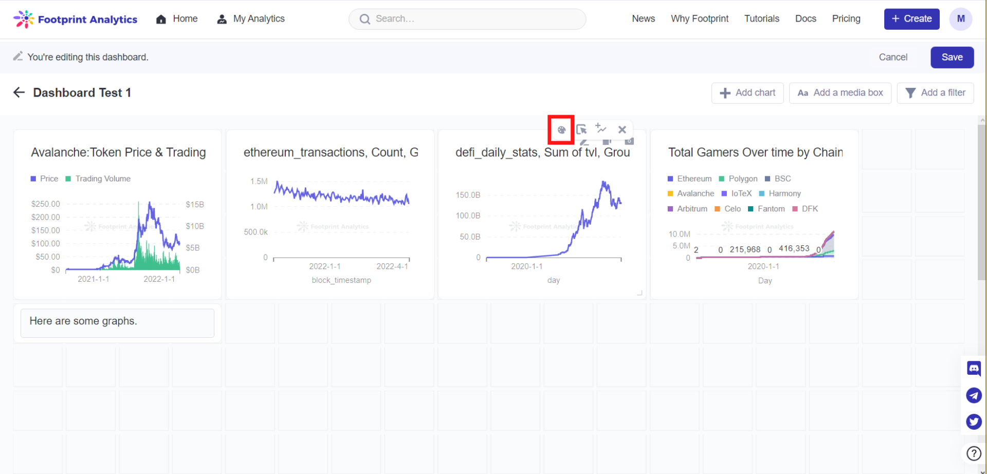
The image above shows users where the palette icon is on the submenu of the hovered chart or text box from Step 2.
- Pop-up settings will appear. You can set how you want your chart or text box to be presented in your dashboard with settings including
Display,AxesandLabels.
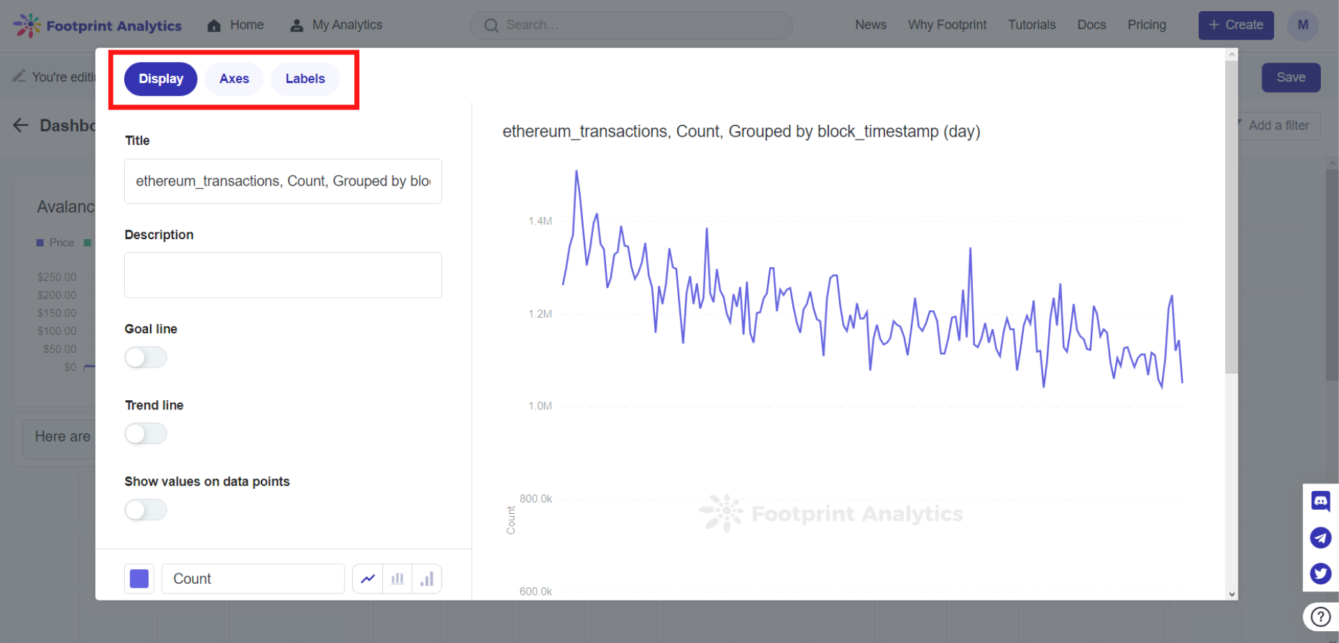
The image above shows the different options users can set upon clicking on the Visualization options as indicated by the palette icon in Step 1.
- Scroll down and make sure you click Done once finished with your settings to save any changes.
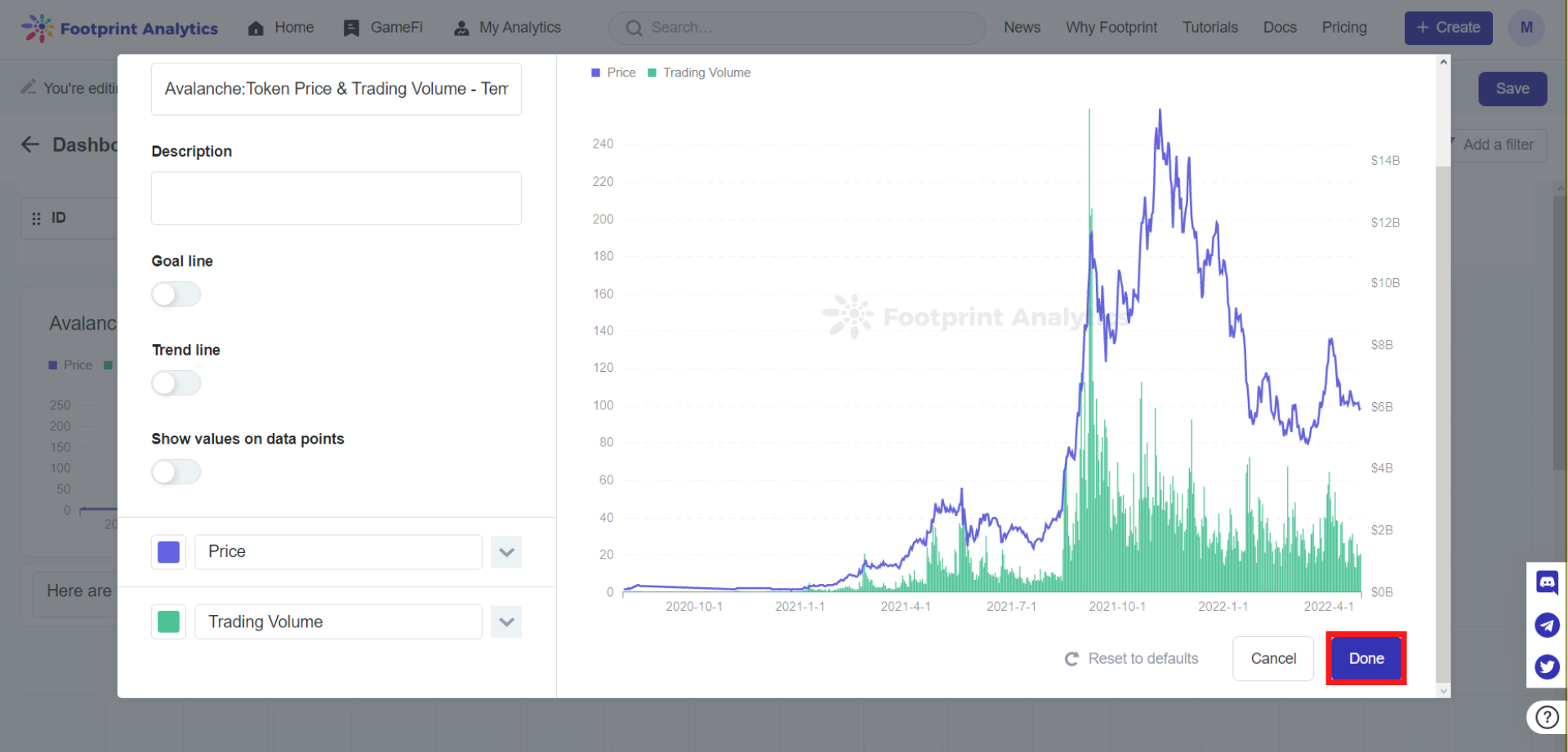
The image above shows users where to find the Done button based on Step 4.
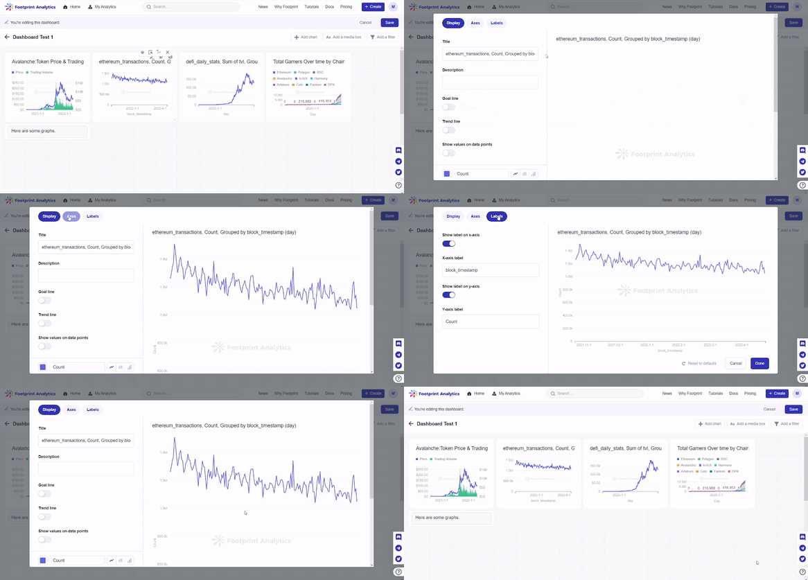
The gif above demonstrates how to access and navigate the visualization options in your charts.
Filter
Add
Filters can be added to our dashboards to allow for a wider range of applications, as well as to avoid any repetitive work.
To set up filters on a new dashboard:
- Create a dashboard without any filter.
Dashboard items can have filters individually, but for more complex applications, it is more practical to just create a dashboard filter that is applied to the items inside of it. You can then set which item you want to associate with the dashboard filter. If the charts you selected already have filters on them, you can delete the filters manually. To delete filters:
Step 1: Click on Advanced.
Step 2: Under Filter, click on the x mark on your unwanted filters.
Step 3: Make sure you Save to keep any changes made.
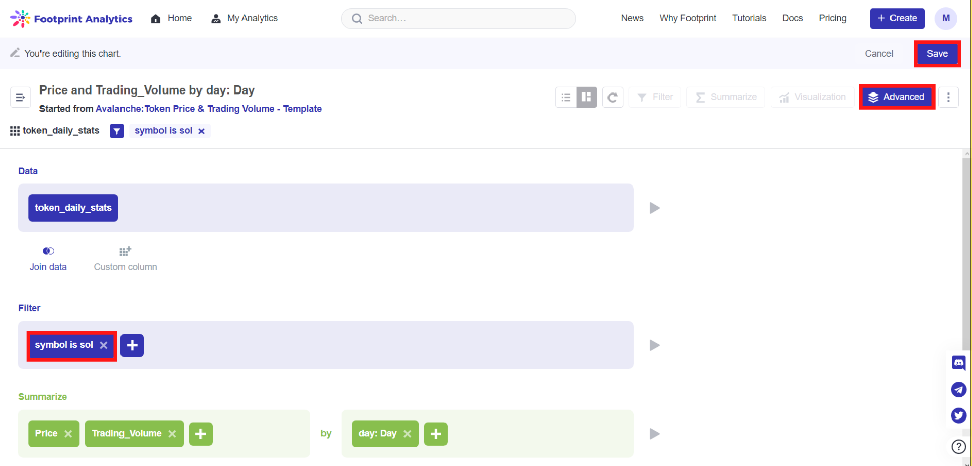
The image above shows users how to manually delete filters that may come with some charts.
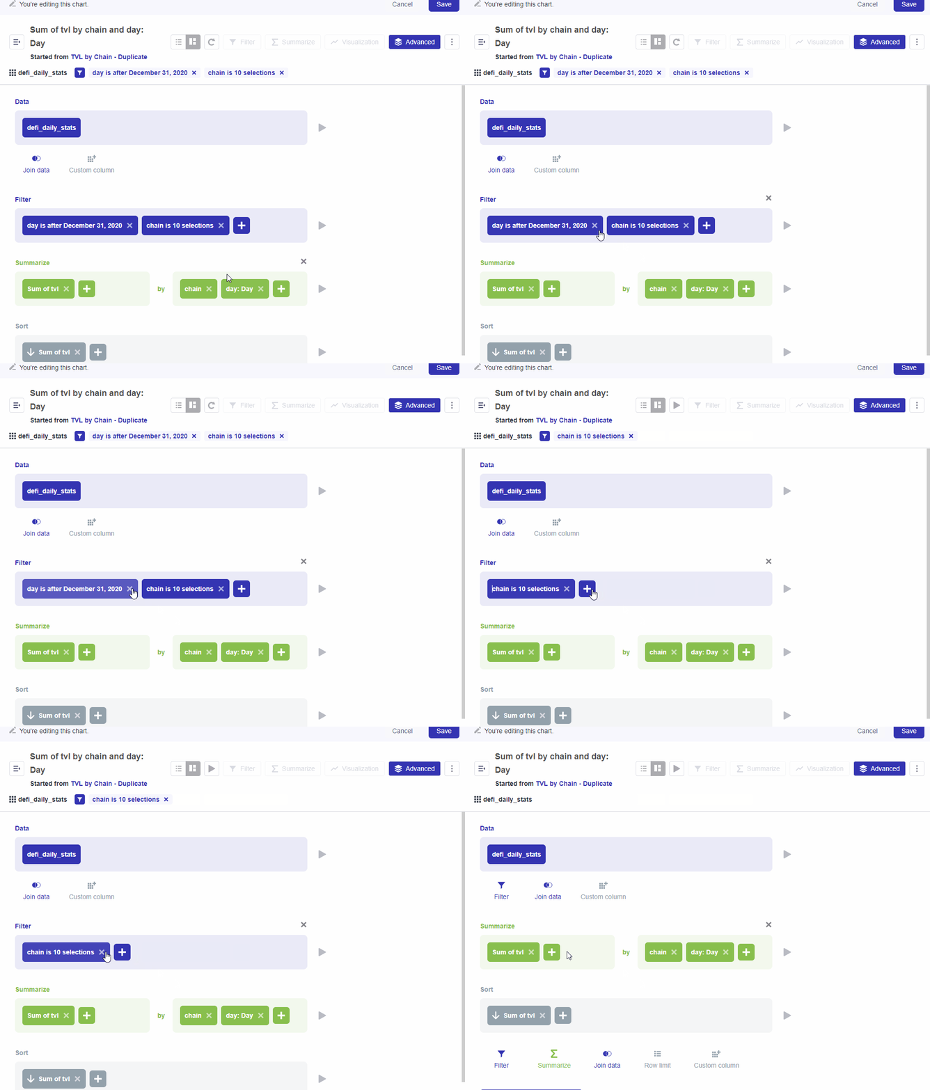
The gif above demonstrates how to delete filters from charts manually.
- For multiple charts, you can add a filter linkage. Click on
add a filteron the top right corner, and select the type of filter you would like. You can chooseTime,ID,Location, andOther Categories. For the purpose of this example, we will selectTime.
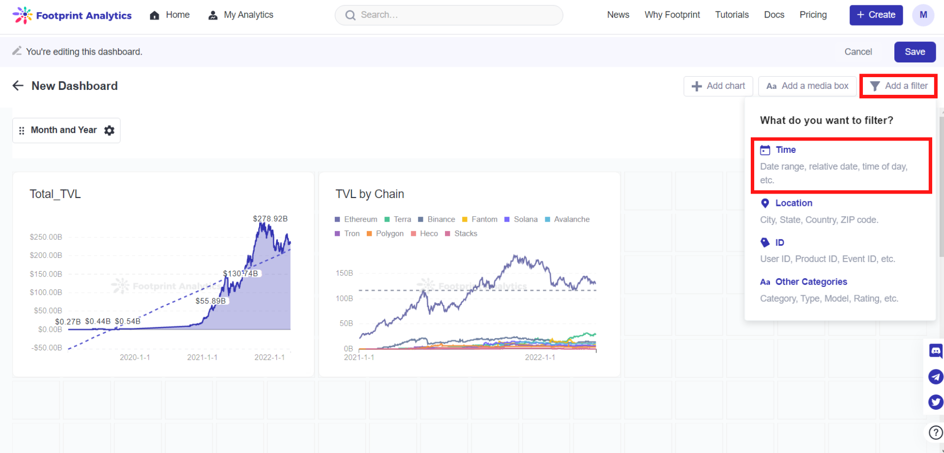
The image above shows where the Add a filter button is located and the available filters you can use.
- Select the type of filter. In this case, we will use
Month and Year. You will be provided with different options for each filter as well.
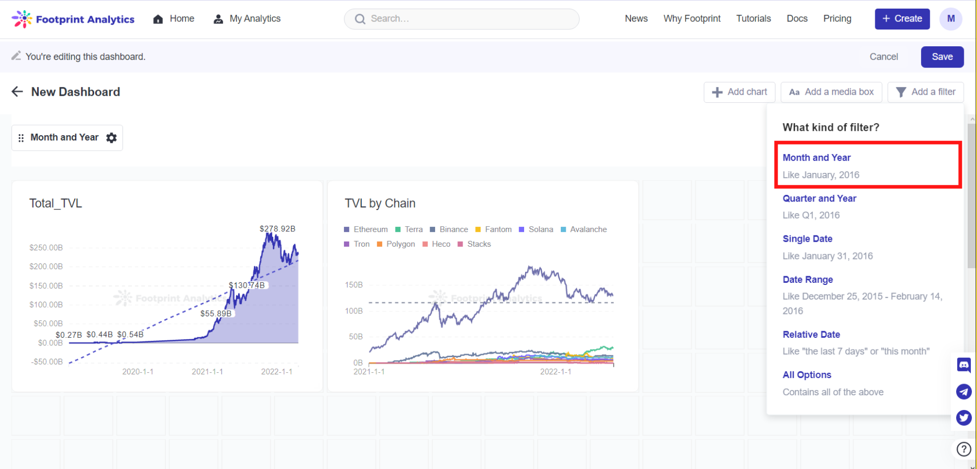
The image above shows that you need to further specify your filters, with this one being Month and Year.
- Select the chart you want to associate with the drop-down filters on each chart, then set your
Default Valueas needed before clickingDoneto finalize your settings.
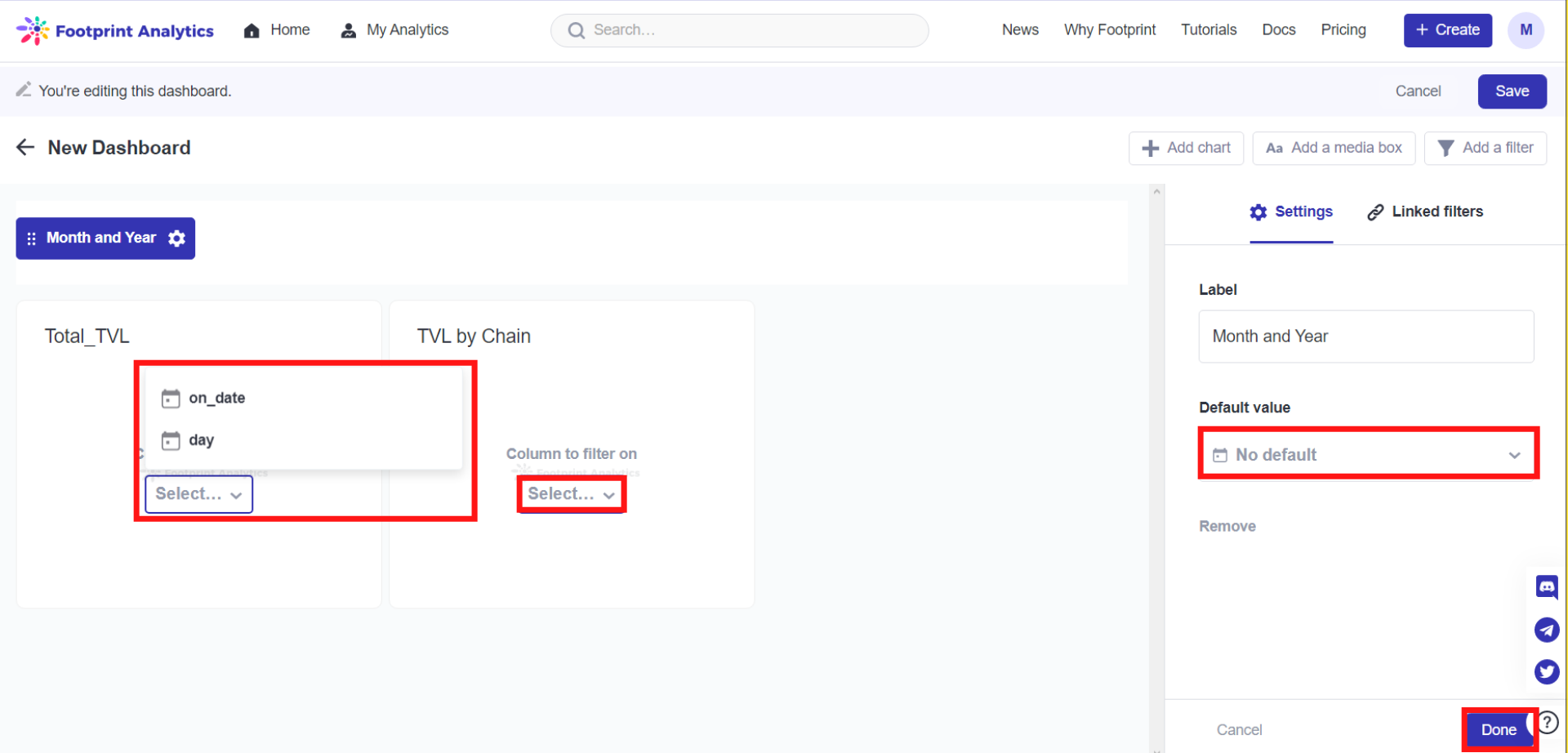
The image above shows users where to set their filters and default value.
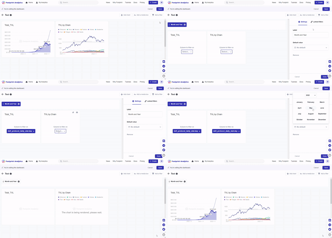
The gif above demonstrates how to link charts together using the same filter based on Steps 1 to 4.
Removing filters
You can also remove existing filters. To remove filters:
- Click on the filter name on the top left corner of your screen under your dashboard name.
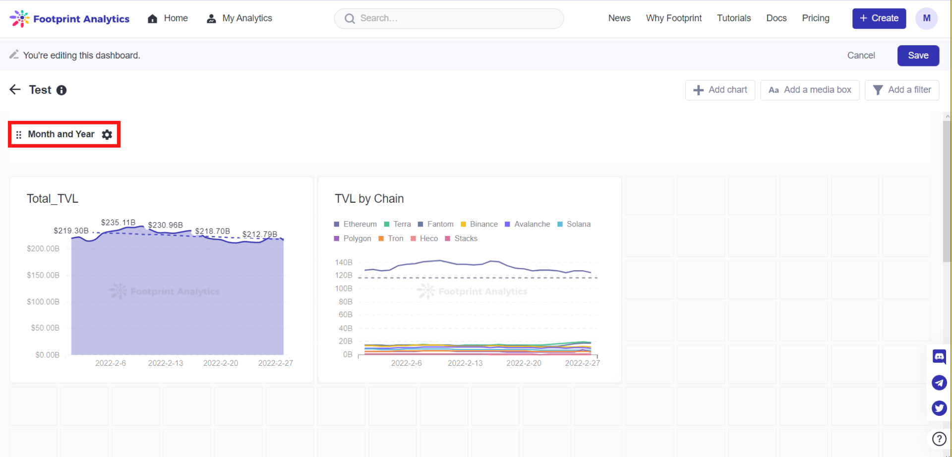
The image above shows where the filter name is in your dashboard.
- Click on the
Removebutton on the right hand-side of the screen underSettings. Don’t forget to clickDoneto save your settings.
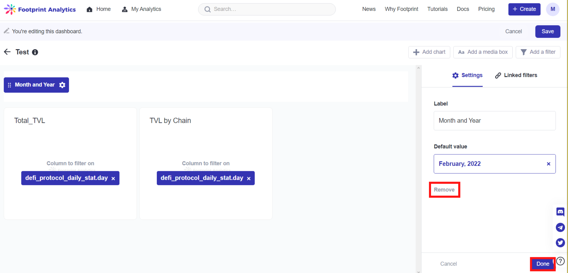
The image above shows where the Remove button is.
Always remember to Save your dashboard, even after saving your settings.
Updated 6 months ago
