Line chart
Line Chart
Line charts are used for plotting data captured in a sequence, whether the sequence is the passage of time or steps in a process or flow. Line charts are typically used to plot a time series: a set of markers connected by lines, with the x-axis showing time and the y-axis plotting the value of a metric at each moment.
This article will guide you through the different and detailed customizable options for your Line Chart.
Creation
To customize your line chart, you can click on the Visualization button in the upper right, then click on Settings. The table below briefly explains the different configurations you can set:.
| Configuration Property | Description |
|---|---|
| Data | This tab lets you set your data style for your x and y axes. |
| Display | This tab lets you customize desired information visibility on your chart, such as line color and style, replacing missing values, and more. |
| Axes | This tab lets you adjust the scale of your x and y axes. |
| Labels | This tab lets you change the chart labels on your x and y axes. |
Trend Lines and Goal Lines
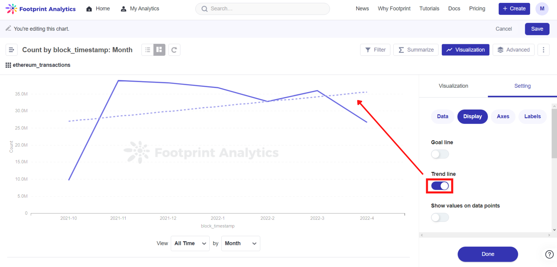
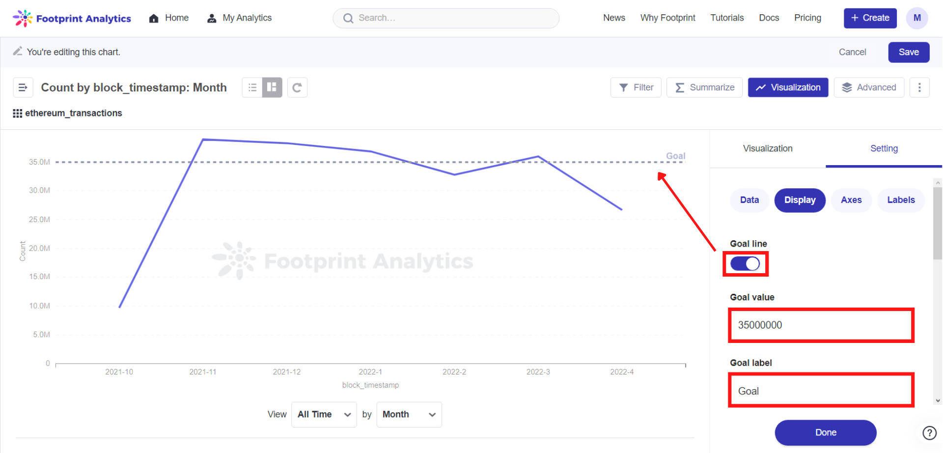
For time series, toggle the Trend line option and Footprint will auto-calculate a trend line for you. You can also add a goal line by specifying a value and a label.

The Goal line is another option you can toggle on and off under Settings. The goal line requires a valid number before it can show on the chart. You can set this number under Goal value and change the goal name under Goal label.

More on the Axes
For the x axis, you can select either time series or ordinal scales. Time series will limit the number of values displayed, whereas the ordinal scale will list each value in the series along the x axis. Use an ordinal scale if you’re plotting steps in a sequence.
For the y axis, you can select linear (the default), or power or log scales. Logarithmic scales are great for showing the rate of change over time, especially when your data has an exponential rise or decay.
Highlight Feature
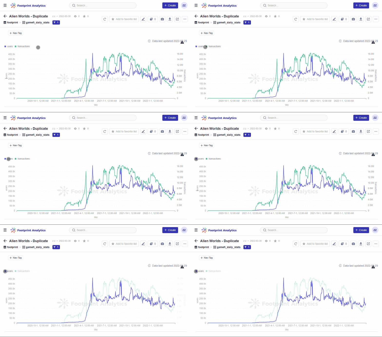
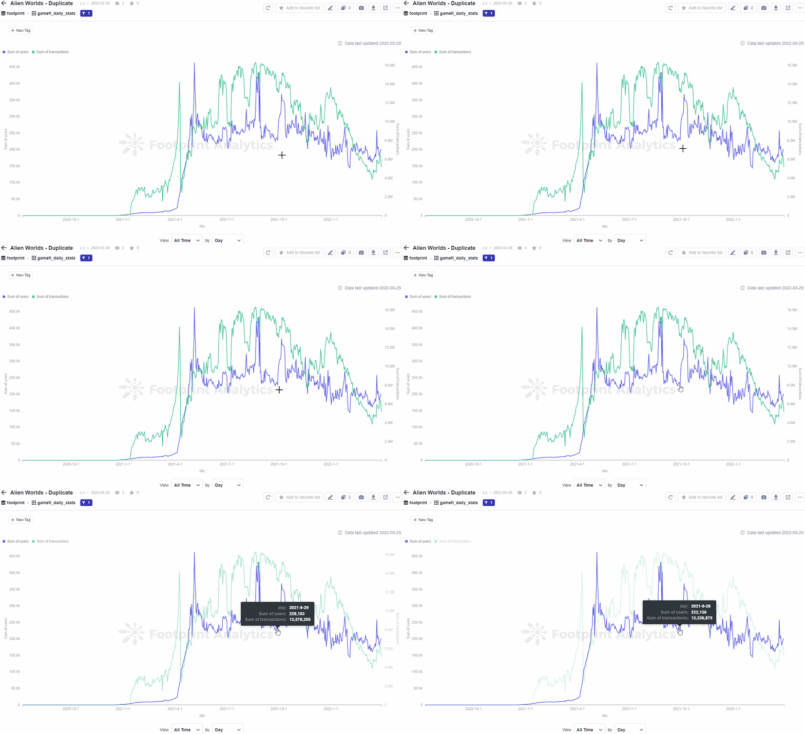
When your chart has several series in it, you can hover over the name of a series in the chart to highlight it and fade out the other series.

When you hover over the data on the chart, you can see the detailed information pop out from it.

Updated 6 months ago
